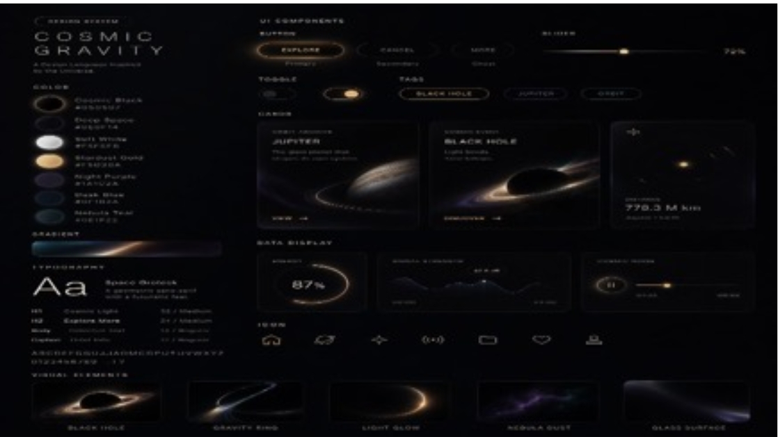
Cosmic Gravity Glass UI System
A premium glassmorphism design-system board for a space-themed app or dashboard, useful for showcasing futuristic UI components, cards, controls, and visual style.
This is a GPT Image 2 prompt case for Graphic & Poster. Use the copy-ready prompt below to generate similar visuals, and review Awesome GPT Image 2 Prompts attribution plus commercial-use rights before reuse.
Free 1K preview
Generate one preview image instantly, no sign-up required.
Prompt
Copy-ready prompt
{
  "type": "futuristic glassmorphism UI design system board",
  "theme": "deep-space planetary exploration dashboard with premium Apple-like industrial design",
  "style": {
    "background": "near-black matte canvas with subtle starfield haze",
    "lighting": "soft shadows, faint bloom, warm amber highlights, cool blue-violet accents, translucent glass panels",
    "material": "frosted glass, glossy dark surfaces, thin luminous strokes, soft refractions",
    "mood": "luxury sci-fi, minimal, cinematic, highly polished"
  },
  "layout": {
    "format": "single wide presentation board",
    "sections": [
      {
        "title": "COSMIC GRAVITY",
        "position": "left column",
        "count": 5,
        "labels": [
          "header branding block",
          "color palette swatches",
          "gradient bar",
          "typography specimen",
          "text scale list"
        ]
      },
      {
        "title": "UI ELEMENTS",
        "position": "upper center-right",
        "count": 7,
        "labels": [
          "EXPLORE button",
          "rounded tab 1",
          "rounded tab 2",
          "horizontal slider",
          "toggle switch",
          "BLACK HOLE pill button",
          "JUPITER pill button"
        ]
      },
      {
        "title": "CARDS",
        "position": "middle center-right",
        "count": 3,
        "labels": [
          "JUPITER card",
          "BLACK HOLE card",
          "small metric card"
        ]
      },
      {
        "title": "DATA DISPLAY",
        "position": "lower middle-right",
        "count": 3,
        "labels": [
          "87% circular progress card",
          "line graph card",
          "horizontal control card"
        ]
      },
      {
        "title": "bottom navigation",
        "position": "lower center",
        "count": 7,
        "labels": [
          "home icon",
          "cloud icon",
          "spark icon",
          "signal icon",
          "rounded rectangle icon",
          "heart icon",
          "tray icon"
        ]
      },
      {
        "title": "VISUAL EXAMPLES",
        "position": "bottom row",
        "count": 5,
        "labels": [
          "BLACK HOLE",
          "GRAVITY RING",
          "LIGHT GLOW",
          "NEBULA DUST",
          "GLASS SURFACE"
        ]
      }
    ],
    "centerpiece": "a dense arrangement of translucent dark cards and controls floating on a black canvas, organized like a premium design system poster"
  },
  "text": {
    "branding": "{argument name=\"headline text\" default=\"COSMIC GRAVITY\"}",
    "small labels": "tiny uppercase sans-serif microcopy throughout, mostly illegible but styled as technical UI annotations",
    "percentage": "87%",
    "distance": "779.3 M km",
    "right slider value": "79%"
  },
  "visuals": {
    "palette": [
      {
        "name": "bright white",
        "appearance": "soft glowing white swatch"
      },
      {
        "name": "warm sand",
        "appearance": "creamy beige swatch"
      },
      {
        "name": "muted plum",
        "appearance": "dusky violet swatch"
      },
      {
        "name": "deep navy",
        "appearance": "blue-black swatch"
      },
      {
        "name": "teal black",
        "appearance": "dark teal swatch"
      }
    ],
    "planets": [
      {
        "name": "Jupiter-like planet",
        "appearance": "banded gas giant with a thin glowing orbit ring"
      },
      {
        "name": "black hole / ringed void",
        "appearance": "dark circular center with bright accretion-like ring"
      },
      {
        "name": "distant star",
        "appearance": "small bright golden point with faint halo"
      }
    ],
    "chart motifs": [
      "glowing circular progress ring",
      "minimal mountain-like line graph",
      "horizontal value slider"
    ]
  },
  "typography": {
    "primary": "sleek geometric sans-serif in uppercase with wide tracking",
    "specimen": "large Aa sample in white",
    "secondary": "small clean sans-serif for labels and data"
  },
  "colorScheme": {
    "primary": "{argument name=\"accent color\" default=\"warm amber gold\"}",
    "secondary": "{argument name=\"secondary glow color\" default=\"deep blue-violet\"}",
    "surface": "charcoal black translucent glass",
    "text": "soft white and muted gray"
  },
  "camera": {
    "view": "straight-on flat lay poster view",
    "composition": "balanced grid with generous negative space and thin panel borders"
  },
  "rendering": "ultra-detailed modern product design mockup, high contrast, elegant glassmorphism, crisp UI kit presentation, subtle blur and glow, premium concept sheet for a sci-fi app or dashboard",
  "customization": {
    "product name": "{argument name=\"product name\" default=\"UI ELEMENTS\"}",
    "theme name": "{argument name=\"theme name\" default=\"deep-space exploration\"}"
  }
}
Prompt variables
Editable argument placeholders found in the prompt, with their default values.
Best for
- - Graphic & Poster visual exploration
- - Image generation and reference-image edits
- - Reusable briefs that keep source attribution visible
Change these parts
- - Subject, product, character, or scene
- - Aspect ratio, camera, lighting, and background
- - Brand, text, color, and output constraints
Recommended model and settings
- - Model: gpt-image-2
- - Input mode: Text to Image
- - Aspect ratio: source
- - Commercial status: review original source
How to use this prompt
- 1. Copy the prompt and preserve its structure for the first test.
- 2. Replace the subject, context, and publishing channel.
- 3. Change one camera, lighting, or style variable per iteration.
- 4. Inspect the output, source, text, and rights before reuse.
Limitations, source, and reuse cautions
- - Generated output is an editable draft, not factual, legal, or rights evidence.
- - Review the linked source, people, brands, logos, text, and third-party media before commercial use.
More cases in this category
Prioritized by category, input mode compatibility, quality, and lower risk.
Reuse and source notes
Use this prompt safely after previewing the case.
- 1.Copy the prompt or open it directly in Dovoo with the generation button.
- 2.Adjust variables, aspect ratio, and reference images for your own use case.
- 3.Before publishing or paid usage, verify source rights, attribution requirements, and brand or likeness risks.
Can I use this prompt commercially?
Commercial-use status is allowed. Review the original source, license, brand constraints, and legal requirements before paid usage.
Where does this case come from?
This case is imported from Awesome GPT Image 2 Prompts; keep attribution visible and check the source URL before reuse.