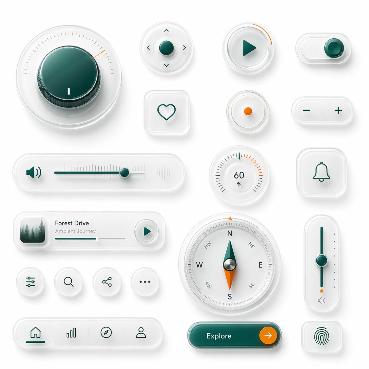
Glassmorphism UI Component Kit
A premium 3D glassmorphism interface board showcasing multiple futuristic UI controls, ideal for design-system mockups, product hero visuals, and app concept presentations.
This is a GPT Image 2 prompt case for Product & Commercial. Use the copy-ready prompt below to generate similar visuals, and review Awesome GPT Image 2 Prompts attribution plus commercial-use rights before reuse.
Free 1K preview
Generate one preview image instantly, no sign-up required.
Prompt
Copy-ready prompt
{
  "type": "glassmorphism UI component showcase",
  "style": "premium minimalist neumorphic interface kit, frosted translucent white acrylic, soft shadows, subtle reflections, rounded corners, clean white background, teal green and orange accent colors, ultra-detailed 3D product render, top-down view",
  "palette": {
    "background": "soft light gray-white",
    "primary": "deep teal green",
    "secondary": "bright orange",
    "material": "milky translucent glass with satin plastic details"
  },
  "layout": {
    "composition": "single canvas with evenly spaced floating UI widgets arranged in a clean design-system presentation",
    "sections": [
      {
        "title": "large dial",
        "position": "top left",
        "count": 1,
        "labels": [
          "circular rotary knob with radial tick marks and one orange indicator"
        ]
      },
      {
        "title": "direction pad",
        "position": "upper center",
        "count": 1,
        "labels": [
          "round four-way control with center button and four arrow icons"
        ]
      },
      {
        "title": "play button",
        "position": "upper center-right",
        "count": 1,
        "labels": [
          "round button with teal play triangle and orange progress arc"
        ]
      },
      {
        "title": "toggle switch",
        "position": "top right",
        "count": 1,
        "labels": [
          "horizontal pill toggle switched on"
        ]
      },
      {
        "title": "favorite button",
        "position": "mid upper center-left",
        "count": 1,
        "labels": [
          "rounded square tile with heart outline"
        ]
      },
      {
        "title": "status dot",
        "position": "mid upper center-right",
        "count": 1,
        "labels": [
          "small circular button with orange center dot"
        ]
      },
      {
        "title": "stepper",
        "position": "mid upper center-right",
        "count": 1,
        "labels": [
          "horizontal pill with minus and plus symbols"
        ]
      },
      {
        "title": "audio slider",
        "position": "center left",
        "count": 1,
        "labels": [
          "long horizontal volume slider with speaker icon on left and waveform emboss on right"
        ]
      },
      {
        "title": "percentage gauge",
        "position": "middle center-right",
        "count": 1,
        "labels": [
          "round gauge showing 60 % with radial ticks"
        ]
      },
      {
        "title": "notification tile",
        "position": "center right",
        "count": 1,
        "labels": [
          "rounded square tile with bell outline"
        ]
      },
      {
        "title": "music card",
        "position": "lower middle-left",
        "count": 1,
        "labels": [
          "media card with forest thumbnail, title {argument name=\"track title\" default=\"Forest Drive\"}, subtitle {argument name=\"track subtitle\" default=\"Ambient Journey\"}, progress bar, and circular play button"
        ]
      },
      {
        "title": "utility icons",
        "position": "lower left-center",
        "count": 4,
        "labels": [
          "sliders settings icon",
          "search icon",
          "share icon",
          "more menu icon"
        ]
      },
      {
        "title": "compass",
        "position": "lower center",
        "count": 1,
        "labels": [
          "large circular compass with N E S W markings and teal-orange needle"
        ]
      },
      {
        "title": "vertical slider",
        "position": "lower right-center",
        "count": 1,
        "labels": [
          "tall rounded slider with teal track, teal knob, orange endpoint, and small speaker icon"
        ]
      },
      {
        "title": "bottom navigation",
        "position": "lower left",
        "count": 1,
        "labels": [
          "pill navigation bar with 4 icons: home, bar chart, compass, profile"
        ]
      },
      {
        "title": "call to action",
        "position": "bottom center-right",
        "count": 1,
        "labels": [
          "pill button labeled {argument name=\"button text\" default=\"Explore\"} with orange circular arrow segment"
        ]
      },
      {
        "title": "biometric tile",
        "position": "lower right",
        "count": 1,
        "labels": [
          "rounded square tile with fingerprint icon"
        ]
      }
    ]
  },
  "rendering": {
    "lighting": "soft studio lighting from upper left",
    "shadow": "diffuse layered shadows for floating depth",
    "finish": "high-end consumer electronics aesthetic, polished yet minimal",
    "quality": "sharp, clean, realistic 3D interface mockup suitable for a design system hero image"
  }
}
Prompt variables
Editable argument placeholders found in the prompt, with their default values.
Best for
- - Product & Commercial visual exploration
- - Image generation and reference-image edits
- - Reusable briefs that keep source attribution visible
Change these parts
- - Subject, product, character, or scene
- - Aspect ratio, camera, lighting, and background
- - Brand, text, color, and output constraints
Recommended model and settings
- - Model: gpt-image-2
- - Input mode: Text to Image
- - Aspect ratio: source
- - Commercial status: review original source
How to use this prompt
- 1. Copy the prompt and preserve its structure for the first test.
- 2. Replace the subject, context, and publishing channel.
- 3. Change one camera, lighting, or style variable per iteration.
- 4. Inspect the output, source, text, and rights before reuse.
Limitations, source, and reuse cautions
- - Generated output is an editable draft, not factual, legal, or rights evidence.
- - Review the linked source, people, brands, logos, text, and third-party media before commercial use.
More cases in this category
Prioritized by category, input mode compatibility, quality, and lower risk.

Reuse and source notes
Use this prompt safely after previewing the case.
- 1.Copy the prompt or open it directly in Dovoo with the generation button.
- 2.Adjust variables, aspect ratio, and reference images for your own use case.
- 3.Before publishing or paid usage, verify source rights, attribution requirements, and brand or likeness risks.
Can I use this prompt commercially?
Commercial-use status is allowed. Review the original source, license, brand constraints, and legal requirements before paid usage.
Where does this case come from?
This case is imported from Awesome GPT Image 2 Prompts; keep attribution visible and check the source URL before reuse.