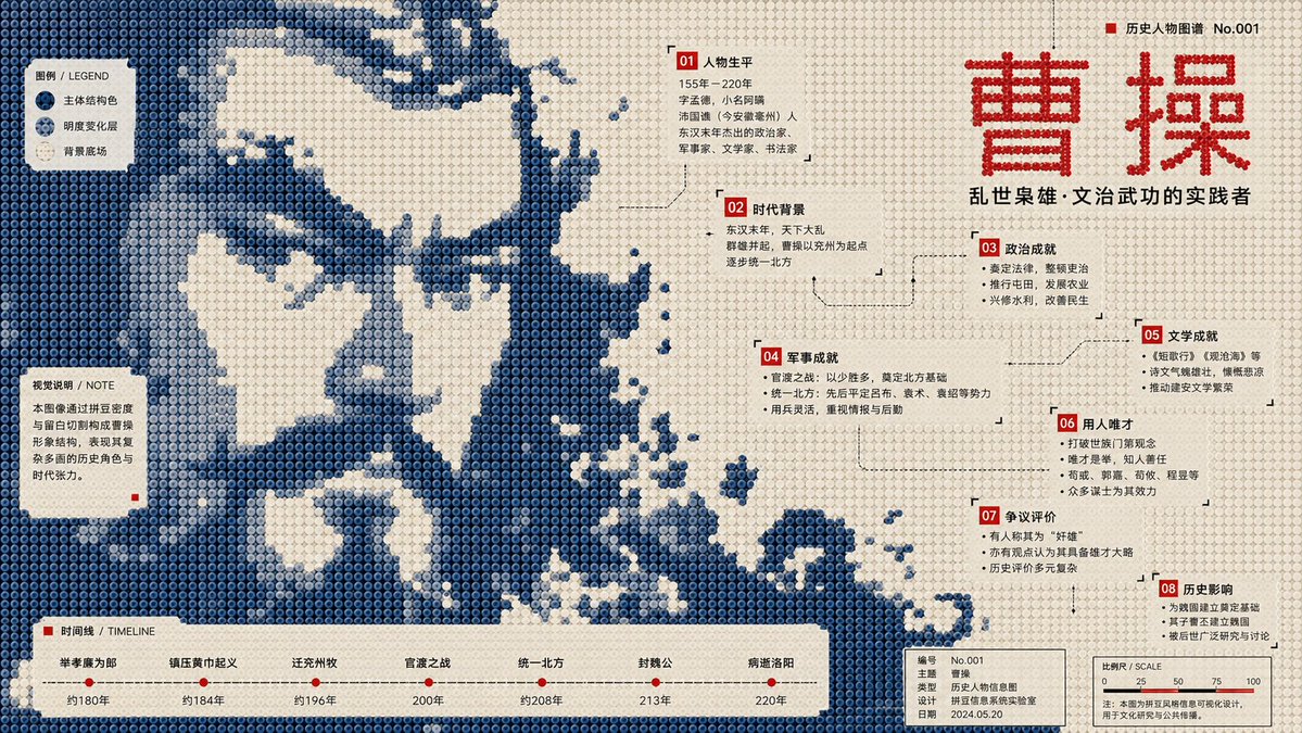
Perler Bead Pixel Infographic Poster
An incredibly comprehensive structural prompt for generating museum-style infographic posters using a Perler bead/pixel art aesthetic, focusing on layout, color layers, and data nodes.
這是一個平面設計和海報設計的GPT Image 2範例。請使用下方可直接使用的提示資訊產生類似的視覺素材,並在重複使用前查看Awesome GPT Image 2 Prompts署名和商業用途授權資訊。
需要完整的提示符號集?請使用 平面設計和海報設計 主題中心提供更多相關範例,或打開 GPT Image 2 提示庫 有關完整範例索引、可重複使用結構和來源歸屬的資訊。
Free 1K preview
Generate one preview image instantly, no sign-up required.
Free text preview doesn’t preserve reference-image consistency.
3422/4000
提示詞
可直接複製的提示
Generate a 16:9 horizontal infographic poster.

Subject: {argument name="subject" default="Pan Jinlian"}

Required Knowledge Points:
[Point 1] through [Point 8]

Visual Style Definition:
This is a structural flat infographic poster in the style of "Perler beads / fuse beads / pixel bead array." The image is composed of a large number of regularly arranged circular plastic beads, each with clear circular boundaries, a slight center indentation, uniform spacing, low-saturation plastic texture, and a stable grid order. The overall composition must maintain a front-view flat layout, resembling a public cultural infographic poster made of beads, rather than toy photography, 3D models, cartoon illustrations, or ordinary pixel art.

Core Composition:
Compress the subject into a large-scale monochromatic bead image field. The subject must surge in from the edges of the frame, crossing page boundaries and being cropped as if a larger bead media image fragment is entering the page. The subject occupies the main visual weight but is not fully presented; viewers must reconstruct the theme through silhouette, direction, missing areas, bead density, and local texture.

Subject Morphology:
The outer edges of the subject exhibit low-resolution bead steps, block fractures, hard-cut gaps, pixelated jagged outlines, missing bead cross-sections, and rough boundaries after sampling. Forbid smooth silhouettes, complete icon outlines, or realistic details. Use only different brightness levels of the same subject structural color within the body to form low-contrast image fragments, halftone noise, scan grains, material afterimages, archival textures, and local density variations.

Background and Negative Space:
The background uses a high-brightness light-colored bead field, close to unprinted paper, light creamy white plastic board, or pale grey-white bead arrays. The background is not a decorative base color but actively cuts back into the subject, forming large voids, winding channels, quiet text windows, reading pause areas, and knowledge point containers. White space must provide a sense of breath while cutting the subject's structure.

Color System:
Adopt a strict three-layer functional color scheme:
1. Light Background Field (60%–70%): Colors like old paper white, light beige, or cold grey-white for breathing and text windows.
2. Subject Structural Color (25%–35%): Defines the subject and mood. Choose based on the subject (e.g., deep blue/dark green for cold themes; ocher red/burnt orange for warm themes).
3. High-Contrast Information Color (3%–6%): Sharp colors like red, black, or bright blue for titles, numbering, and key annotations.

Infographic System:
Transform knowledge points 1 to 8 into bead information nodes (numbered labels, annotation boxes, legend blocks, coordinate lines, etc.). Nodes should be scattered along white space windows, color field boundaries, and subject gaps. Ensure a clear hierarchy of text sizes.

Typography:
Use narrow modern sans-serif fonts or monospace metadata fonts. Text must be arranged in white space windows and bottom information bars, never pressing against the center of the subject.

Bead Material:
All visual elements are made of beads. Surfaces have a matte plastic texture with slight manufacturing irregularities, faint grains, and minor wear. Structural color areas can show halftone-style density changes and a specialty overprint feel.
提示變數
提示符號中可編輯的參數佔位符及其預設值。
多變的
subject
預設
Pan Jinlian
Best for
- - 平面設計和海報設計 visual exploration
- - Image generation and reference-image edits
- - Reusable briefs that keep source attribution visible
Change these parts
- - Subject, product, character, or scene
- - Aspect ratio, camera, lighting, and background
- - Brand, text, color, and output constraints
Recommended model and settings
- - Model: gpt-image-2
- - Input mode: 圖生圖
- - Aspect ratio: source
- - Commercial status: review original source
How to use this prompt
- 1. Copy the prompt and preserve its structure for the first test.
- 2. Replace the subject, context, and publishing channel.
- 3. Change one camera, lighting, or style variable per iteration.
- 4. Inspect the output, source, text, and rights before reuse.
Limitations, source, and reuse cautions
- - Generated output is an editable draft, not factual, legal, or rights evidence.
- - Review the linked source, people, brands, logos, text, and third-party media before commercial use.
內容來自Awesome GPT Image 2 Prompts 。必須註明出處。商業用途狀態為allowed ;付費使用前請查看來源版權資訊。
此類案例更多
按類別、輸入模式相容性、品質和低風險進行優先排序。
重用和來源註釋
預覽案例後,請謹慎使用此提示。
- 1.複製提示或直接在 Dovoo 中使用生成按鈕開啟提示。
- 2.根據您的實際使用情況調整變數、寬高比和參考影像。
- 3.發布或付費使用前,請確認版權、署名要求以及品牌或肖像權風險。