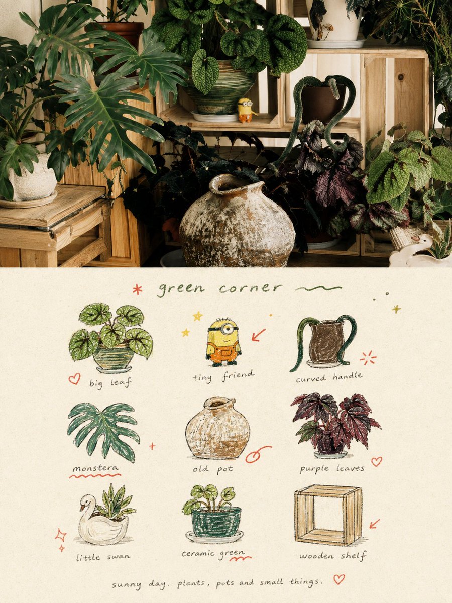
Hand-Drawn Doodle Grid Poster
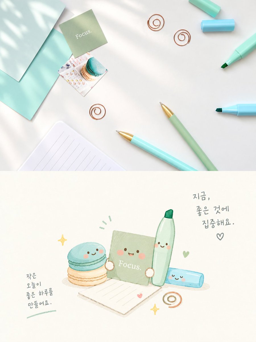
A creative prompt for transforming uploaded photos into a split-layout poster featuring the original image on top and a hand-drawn 3x3 doodle grid on the bottom.
這是一個平面設計和海報設計的GPT Image 2範例。請使用下方可直接使用的提示資訊產生類似的視覺素材,並在重複使用前查看Awesome GPT Image 2 Prompts署名和商業用途授權資訊。
需要完整的提示符號集?請使用 平面設計和海報設計 主題中心提供更多相關範例,或打開 GPT Image 2 提示庫 有關完整範例索引、可重複使用結構和來源歸屬的資訊。
此提示符號適用於多張參考圖。我們將開啟 Dovoo,並顯示提示符號和可用的預覽圖;在生成影像之前,請在 Dovoo 中新增其餘參考圖。
Free 1K preview
Generate one preview image instantly, no sign-up required.
Free text preview doesn’t preserve reference-image consistency.
4000/4000
提示詞
可直接複製的提示
Please transform each photo I upload into an individual high-end design poster, outputting each photo separately without stitching multiple images. The overall composition uses a 3:4 vertical format, with the top and bottom sections strictly 1:1 in height, each occupying 50% of the screen. The upper part retains the original photo, maintaining the subject's identity, structure, posture, realistic texture, natural light and shadow, and original color atmosphere, with only slight professional color grading to give it the texture of an art magazine, independent publication, or exhibition image. The environment background can be naturally extended to fit the frame, but the subject must not be stretched, distorted, or changed. The lower part extracts the most recognizable subjects, local elements, action clues, object details, and narrative relationships from the photo, reconstructing them into a visual system of 3x3 modular icon grid + naive hand-drawn doodle illustrations + crayon/colored pencil grainy texture + handwritten text. Do not trace the original image completely or create realistic illustrations; instead, compress complex information into 9 visual units most worth remembering: these can be the subject itself, local features, personal belongings, plants, food, modes of transport, gestures, emotional symbols, or small memory points in the scene. Each unit should be a semantic extension of the same image above, making people feel at a glance that they belong to the same photo's 'memory checklist'. The composition uses an implicit 3x3 loose grid. The nine-square grid serves only as the underlying order and does not need to be drawn too neatly; the position, size, angle, and placement of each icon can be slightly shifted, creating a sense of loose grid / organic grid that is orderly but not mechanical. A short handwritten title can be added at the top, along with a few relaxed wavy lines, stars, or symbols; a tiny handwritten caption can be added at the bottom, making the whole thing look like a page from a private notebook, visual diary, or collection sheet. White space must be sufficient, and the layout should be relaxed, cute, restrained, and not cluttered. The art style uses Naïve Hand-drawn Doodle Illustration: simple forms, a bit naive, with slightly shaky outlines of uneven thickness that are not completely closed, retaining intentional imperfections. The coloring should not be filled too full, allowing paper texture, white particles, and rough edges to be seen. A mixture of thin black outlines, colored pencil/crayon filling, and small local color blocks can be used, not relying on realistic light and shadow but establishing graphic relationships through flat color / spot color. If grid auxiliary lines appear, they should be extremely faint, like pencil drafts lightly drawn, rather than computer-drawn regular tables. The color scheme uses a low-saturation retro candy palette, with warm off-white coarse-textured paper as the base, keeping colors soft, light, friendly, and high-end. It can refine and translate colors from the original image into comprehensive color relationships like sage green, mint green, pastel blue, cobalt blue, cream yellow, dusty pink, strawberry pink, and coral orange: usually with blue-green as the primary color, yellow-pink for object filling, and orange-red for very little emphasis. The overall control is a large area of off-white background, moderate blue-green primary color, small areas of yellow-pink secondary colors, and minimal orange-red accents, making the picture rich but not messy. Add a layer of minimal hand-drawn red annotation elements, such as circles, arrows, hearts, starbursts, small crosses, wavy lines, or emphasis marks, transforming the work from a regular icon page into a more editorial and personal visual diary. However, these annotations must be few and precise, serving only as a second touch, not overpowering the main subjects. The text content and language are not restricted; a few truly meaningful words should be freely generated based on the photo's theme, mood, location, action, or sense of life. Use a light, loose, handwritten font with slight writing pauses and spacing shifts for titles and descriptive text, making the writing look like casual notes naturally written on paper rather than commercial typography titles. The overall text remains sparse, small, with ample white space, forming a natural text-image mix with icons and annotations. The overall presentation gives a visual temperament of being naive, relaxed, retro, healing, light, friendly, and having a sense of editorial design, like a seriously collected private notebook, happiness list, or life observation page. Avoid clean vector feelings, realistic light and shadow, complex textures, heavy shadows, overly neat UI icon feelings, commercial template feelings, and children's cartoonization.
Best for
- - 平面設計和海報設計 visual exploration
- - Image generation and reference-image edits
- - Reusable briefs that keep source attribution visible
Change these parts
- - Subject, product, character, or scene
- - Aspect ratio, camera, lighting, and background
- - Brand, text, color, and output constraints
Recommended model and settings
- - Model: gpt-image-2
- - Input mode: 多圖轉影像
- - Aspect ratio: source
- - Commercial status: review original source
How to use this prompt
- 1. Copy the prompt and preserve its structure for the first test.
- 2. Replace the subject, context, and publishing channel.
- 3. Change one camera, lighting, or style variable per iteration.
- 4. Inspect the output, source, text, and rights before reuse.
Limitations, source, and reuse cautions
- - Generated output is an editable draft, not factual, legal, or rights evidence.
- - Review the linked source, people, brands, logos, text, and third-party media before commercial use.
內容來自Awesome GPT Image 2 Prompts 。必須註明出處。商業用途狀態為allowed ;付費使用前請查看來源版權資訊。
此類案例更多
按類別、輸入模式相容性、品質和低風險進行優先排序。
重用和來源註釋
預覽案例後,請謹慎使用此提示。
- 1.複製提示或直接在 Dovoo 中使用生成按鈕開啟提示。
- 2.根據您的實際使用情況調整變數、寬高比和參考影像。
- 3.發布或付費使用前,請確認版權、署名要求以及品牌或肖像權風險。