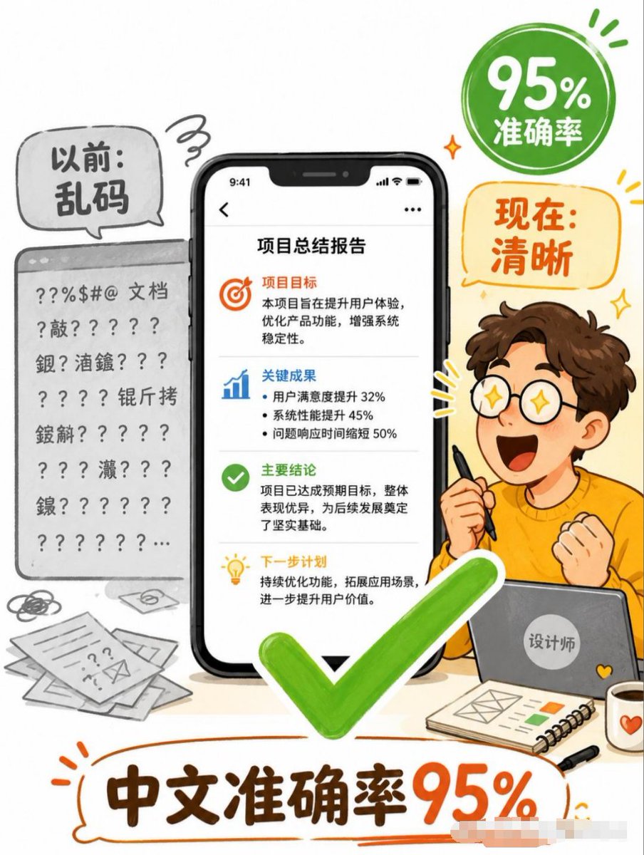
Chinese Text Accuracy Infographic
Creates a vertical Chinese social-media infographic showing AI-generated Chinese text improving from garbled output to 95% accuracy.
這是一個平面設計和海報設計的GPT Image 2範例。請使用下方可直接使用的提示資訊產生類似的視覺素材,並在重複使用前查看Awesome GPT Image 2 Prompts署名和商業用途授權資訊。
需要完整的提示符號集?請使用 平面設計和海報設計 主題中心提供更多相關範例,或打開 GPT Image 2 提示庫 有關完整範例索引、可重複使用結構和來源歸屬的資訊。
Free 1K preview
Generate one preview image instantly, no sign-up required.
3766/4000
提示詞
可直接複製的提示
Objective: Create a vertical Chinese commercial infographic poster explaining that AI image generation has achieved high accuracy in Chinese text, transforming messy text into clear deliverables.

Canvas: 3:4 vertical poster, simple white background, using a fun hand-drawn editorial style, accented with orange, green, black, and gray. Use bold outline sketches, circular speech bubbles, and vibrant doodle marks to create a friendly tech explanation style.

Layout: The composition centers on a large smartphone model displaying a clear Chinese report page. On the left, show a gray “Before” document panel filled with garbled symbols and unidentifiable pseudo-Chinese text. On the right, show a cute cartoon designer sitting behind a laptop, holding a stylus, making an excited fist-pumping gesture. Add a large bright green checkmark centered and in the foreground below the phone. Add a green circular badge in the upper right corner and an orange speech bubble below it. The large bottom title is placed within an orange hand-drawn outline bubble.

Text Content: Use 5 main text areas. 1) Left gray bubble: “Before: Gibberish.” 2) Upper right green badge: “95% Accuracy.” 3) Right orange bubble: “Now: Clear.” 4) Phone screen title: “Project Summary Report.” 5) Large bottom title: “Chinese Accuracy 95%.”

Phone Screen Details: Display a black iPhone-style smartphone with a notch and a status bar time of 9:41. The report page contains 4 stacked content areas separated by thin gray dividing lines. Part 1 contains an orange target icon and the title “Project Goals,” followed by brief Chinese text about improving user experience, optimizing product functionality, and strengthening system stability. Part 2 contains a blue bar chart icon and the title “Key Results,” followed by 3 bullet points: User satisfaction increased by 32%, system performance increased by 45%, and problem response time decreased by 50%. Part 3 contains a green checkmark icon and the title “Key Conclusions,” followed by text stating that the project achieved its expected goals and laid a solid foundation. Part 4 contains a yellow light bulb icon and the title “Next Steps,” followed by text about continuous optimization and expanding application scenarios.

Left “Before” Area: Render a gray browser/document card with a top bar, containing multiple lines of corrupted characters, question marks, punctuation, and scattered Chinese characters, clearly visible and unreadable. Add messy paper, doodles, and envelope icons in the lower left corner to emphasize the document’s disordered state.

Right Character Details: Create a cute young male cartoon designer with brown curly hair, fair skin, and an orange sweater, with a simple and lively pose; the face can be left blank or softened. He is holding a black stylus in one hand and sitting behind a gray laptop with a circular sticker that says “Designer.” Add 3 foreground accessories on the desk: a spiral notebook with a simple layout sketch and color blocks, a black pen, and a white mug with an orange heart.

Visual Style: A friendly Chinese social media explanation poster, combining semi-flat vector illustrations with marker-style hand-drawn lines, soft shadows, rounded shapes, high readability, emphasizing a vibrant green checkmark and orange titles. The composition is rich but clear and easy to read, without using photographic realism.

Constraints: Strictly preserve the specified Chinese text, maintain the clarity and readability of the phone report text, and use only one central phone, one messy document card on the left, one designer character, one green checkmark, one green badge, one orange speech bubble, and one large bottom title. Do not add watermarks, logos, QR codes, or additional core claims.
Best for
- - 平面設計和海報設計 visual exploration
- - Image generation and reference-image edits
- - Reusable briefs that keep source attribution visible
Change these parts
- - Subject, product, character, or scene
- - Aspect ratio, camera, lighting, and background
- - Brand, text, color, and output constraints
Recommended model and settings
- - Model: gpt-image-2
- - Input mode: 文生圖
- - Aspect ratio: source
- - Commercial status: review original source
How to use this prompt
- 1. Copy the prompt and preserve its structure for the first test.
- 2. Replace the subject, context, and publishing channel.
- 3. Change one camera, lighting, or style variable per iteration.
- 4. Inspect the output, source, text, and rights before reuse.
Limitations, source, and reuse cautions
- - Generated output is an editable draft, not factual, legal, or rights evidence.
- - Review the linked source, people, brands, logos, text, and third-party media before commercial use.
內容來自Awesome GPT Image 2 Prompts 。必須註明出處。商業用途狀態為allowed ;付費使用前請查看來源版權資訊。
此類案例更多
按類別、輸入模式相容性、品質和低風險進行優先排序。
重用和來源註釋
預覽案例後,請謹慎使用此提示。
- 1.複製提示或直接在 Dovoo 中使用生成按鈕開啟提示。
- 2.根據您的實際使用情況調整變數、寬高比和參考影像。
- 3.發布或付費使用前,請確認版權、署名要求以及品牌或肖像權風險。