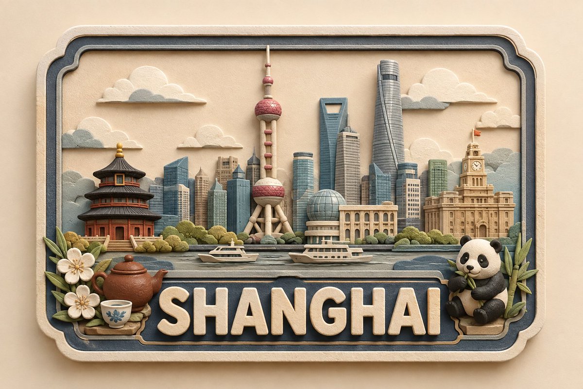
3D Handcrafted Clay Destination Plaque
A complex technical prompt for generating a series of consistent handcrafted 3D paper and clay destination plaques for global locations.
Bu Ürün ve Ticari için bir GPT Image 2 örnek senaryosudur. Benzer görseller oluşturmak için aşağıdaki hazır metni kullanın ve yeniden kullanmadan önce Awesome GPT Image 2 Prompts atıfını ve ticari kullanım haklarını inceleyin.
Tüm komut istemi setine mi ihtiyacınız var? Şunu kullanın: Ürün ve Ticari Daha fazla ilgili örnek için konu merkezini ziyaret edin veya açın. GPT Image 2 istem kataloğu Tam örnek dizin, yeniden kullanılabilir yapılar ve kaynak atfı için.
Free 1K preview
Generate one preview image instantly, no sign-up required.
2849/4000
İpucu
Kopyalamaya hazır istemi
Create a premium, cute, handcrafted 3D paper-and-soft-clay destination plaque for {argument name="location" default="[LOCATION]"}, designed as part of one consistent global collectible series.

COMPOSITION & GEOMETRY: Use a fixed horizontal framed layout on a normalized 100×100 grid. Frame: x=5–95, y=8–92. Landmark zone: y=18–58. Foreground: y=48–67. Location-name zone: y=68–88. Bottom margin: y=88–92. Keep these proportions identical for every location.

LANDMARK HIERARCHY: Place 1 centered hero landmark at x=50, occupying 34–38% height; 2 supporting landmarks at x=25 and x=75, each 22–28% height; 2–4 smaller background elements across x=10–90, each 12–20% height; and 1–3 subtle local foreground details, no more than 14% height. Use only the most recognizable and geographically appropriate features of {argument name="location" default="[LOCATION]"}. Preserve defining silhouettes while simplifying details and avoiding clutter, clichés, or stereotypes.

TYPOGRAPHY: Display exactly “{argument name="location text" default="[LOCATION]"}”, centered and unobstructed. The lettering should span approximately 82–86% of the plaque width and 17–20% of the canvas height. Use large, raised, embossed, rounded sans-serif lettering in warm ivory with a matte finish. Maintain consistent weight, spacing, alignment, and baseline across the entire series.

MATERIAL & STYLE: Approximately 70% layered paper and 30% soft matte clay. Create a shallow-relief handcrafted appearance with visible paper fibers, subtle clay texture, rounded handmade edges, delicate layer shadows, and small natural imperfections. Avoid glossy plastic, metallic materials, photorealism, or a generic CGI appearance.

COLOR PALETTE: Warm ivory/cream foundation, soft beige and natural paper tones, muted blue-gray secondary accents, plus minimal muted colors inspired by the specific location.

CAMERA & LIGHTING: Straight-on centered camera with fixed perspective and scale. Use a warm neutral background, soft diffused studio lighting, gentle shadows, consistent depth, and subtle dimensional separation. No reflections, dramatic perspective, or surrounding environment.

SERIES CONSISTENCY: Keep the frame, composition, grid, typography, landmark scale, hierarchy, object density, materials, palette, lighting, camera angle, depth, shadows, and negative space identical across every location. Change only the landmarks, culturally/environmentally relevant details, and restrained location-specific accent colors.

FINAL QUALITY CHECK: {argument name="location text" default="[LOCATION]"} must be instantly recognizable, correctly spelled, visually balanced, and free of unnecessary text. Maintain the fixed landmark hierarchy, unobstructed lettering, consistent proportions, premium handcrafted texture, cute collectible aesthetic, and cohesive global-series identity.
İstem değişkenleri
Komut isteminde bulunan, düzenlenebilir argüman yer tutucuları ve varsayılan değerleri.
Değişken
location
Varsayılan
[LOCATION]
Değişken
location text
Varsayılan
[LOCATION]
Best for
- - Ürün ve Ticari visual exploration
- - Image generation and reference-image edits
- - Reusable briefs that keep source attribution visible
Change these parts
- - Subject, product, character, or scene
- - Aspect ratio, camera, lighting, and background
- - Brand, text, color, and output constraints
Recommended model and settings
- - Model: gpt-image-2
- - Input mode: Metinden görsele
- - Aspect ratio: source
- - Commercial status: review original source
How to use this prompt
- 1. Copy the prompt and preserve its structure for the first test.
- 2. Replace the subject, context, and publishing channel.
- 3. Change one camera, lighting, or style variable per iteration.
- 4. Inspect the output, source, text, and rights before reuse.
Limitations, source, and reuse cautions
- - Generated output is an editable draft, not factual, legal, or rights evidence.
- - Review the linked source, people, brands, logos, text, and third-party media before commercial use.
Awesome GPT Image 2 Prompts kaynağından içe aktarılmıştır. Kaynak belirtilmesi zorunludur. Ticari kullanım durumu allowed şeklindedir; ücretli kullanım öncesinde kaynak haklarını inceleyin.
Bu kategoride daha fazla vaka
Kategoriye, giriş modu uyumluluğuna, kaliteye ve düşük riske göre önceliklendirilmiştir.
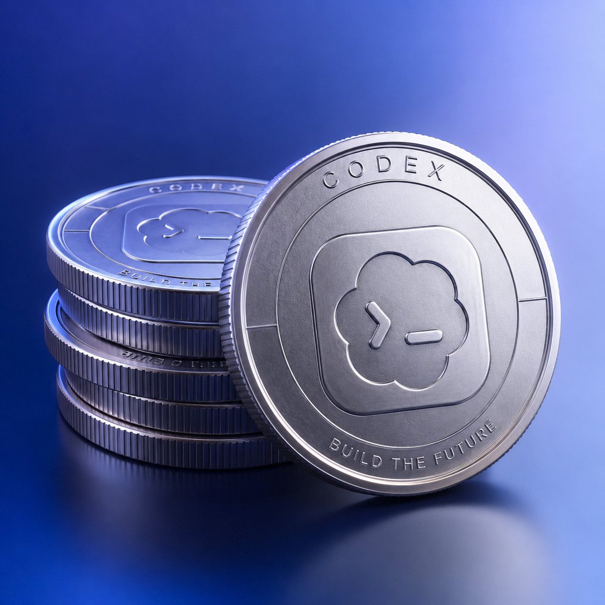
Codex Silver Token Product Shot
Metinden görsele
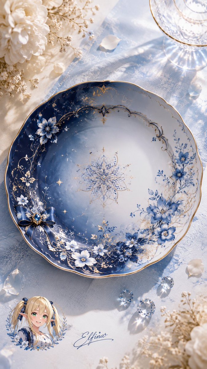
Elfina Fantasy Porcelain Plate
Metinden görsele
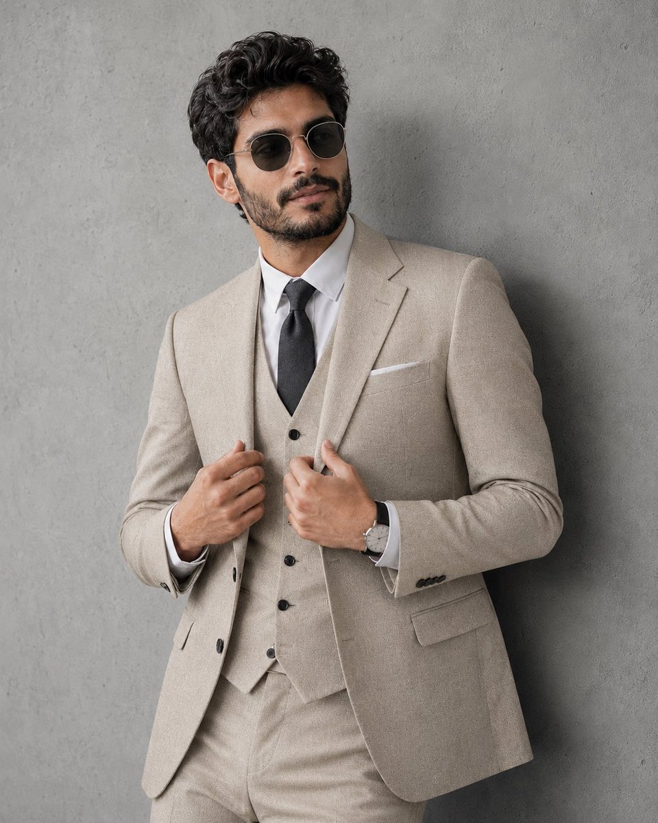
Professional Studio Portrait in Tweed Suit
Metinden görsele
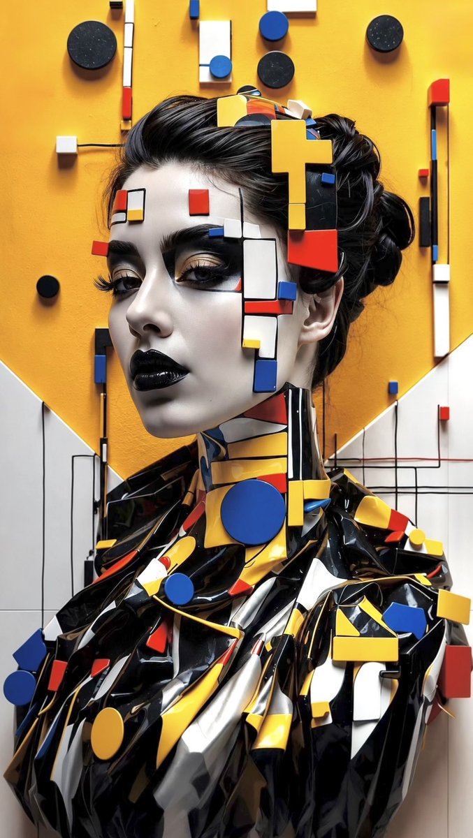
Avant-Garde Bauhaus Fashion Portrait
Metinden görsele
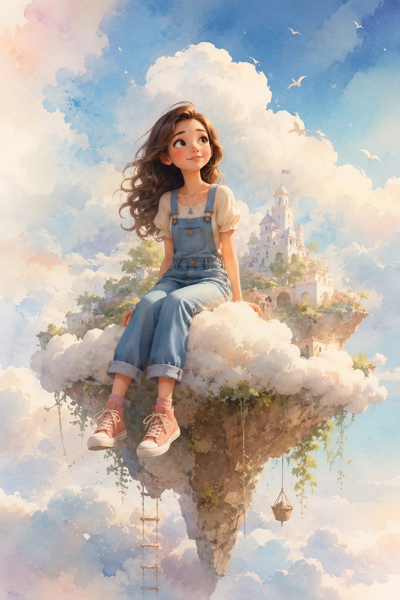
Dreamy Whimsical 3D Cartoon Render
Metinden görseleOrta risk
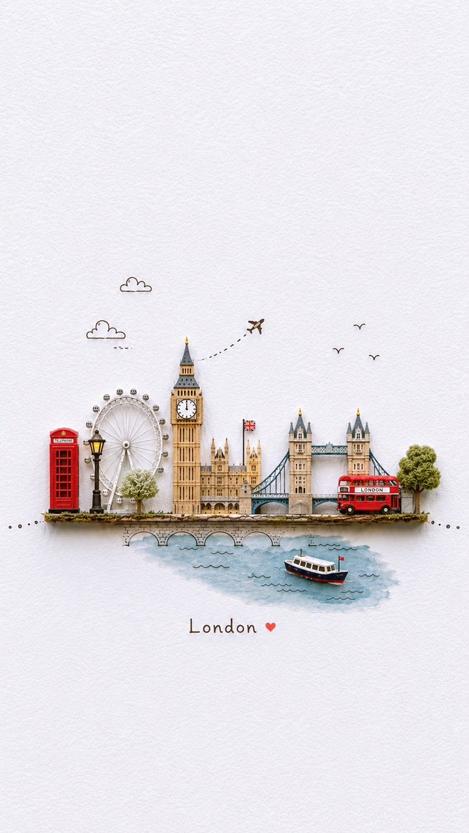
Miniature London Paper-Craft Diorama
Metinden görsele
Yeniden kullanım ve kaynak notları
Vaka önizlemesini yaptıktan sonra bu istemi güvenle kullanın.
- 1.Komut istemini kopyalayın veya oluşturma düğmesini kullanarak doğrudan Dovoo'da açın.
- 2.Değişkenleri, en boy oranını ve referans görselleri kendi kullanım durumunuza göre ayarlayın.
- 3.Yayınlamadan veya ücretli kullanımdan önce, kaynak haklarını, atıf gerekliliklerini ve marka veya benzerlik risklerini doğrulayın.