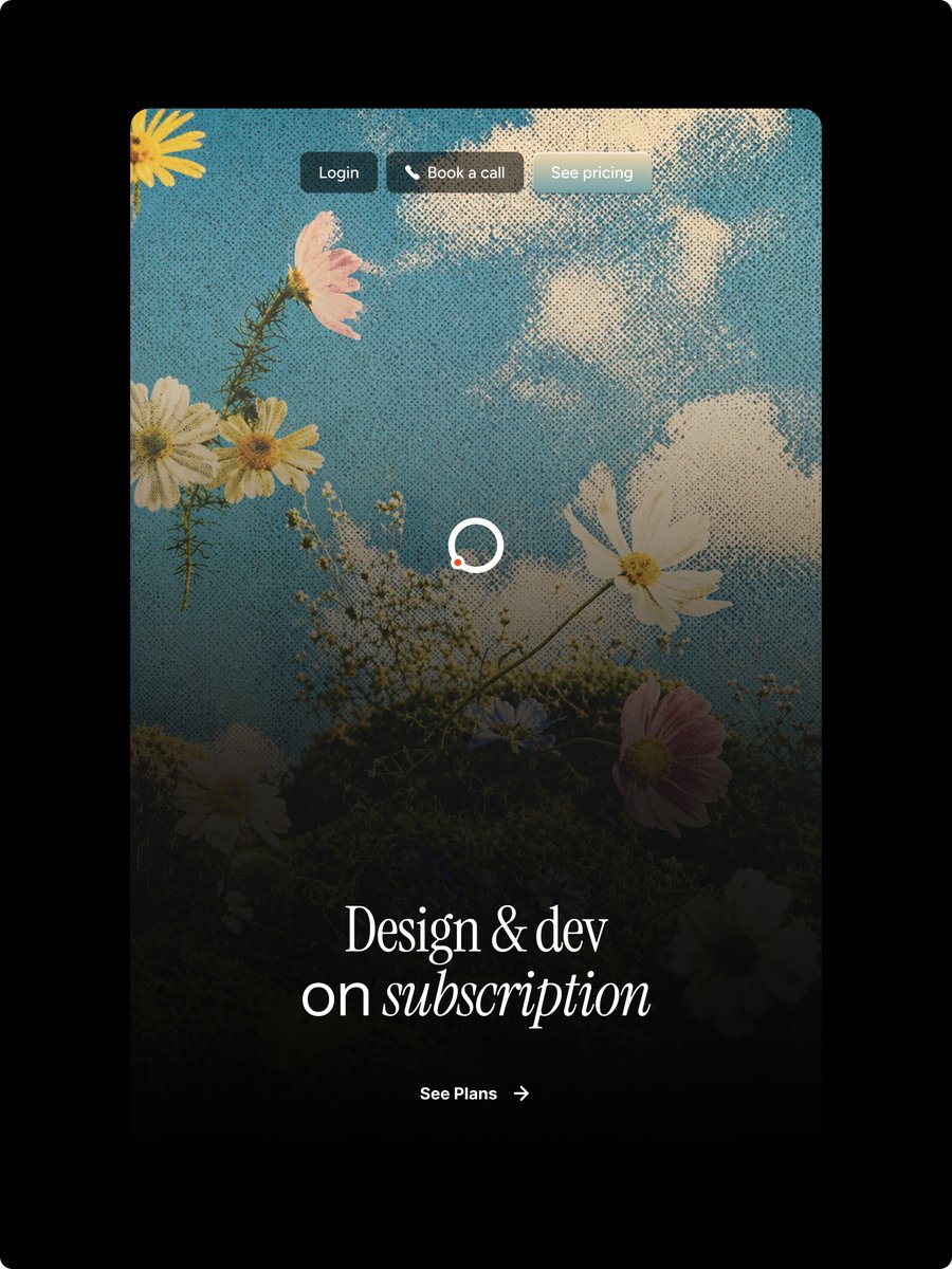
Yarı Tonlu Çiçek Desenli Açılış Sayfası Kahramanı
Bir tasarım abonelik açılış sayfası için vintage tarzı, yarı tonlu çiçek desenli bir web sitesi ana görseli oluşturur.
Bu Ürün ve Ticari için bir GPT Image 2 örnek senaryosudur. Benzer görseller oluşturmak için aşağıdaki hazır metni kullanın ve yeniden kullanmadan önce Awesome GPT Image 2 Prompts atıfını ve ticari kullanım haklarını inceleyin.
Tüm komut istemi setine mi ihtiyacınız var? Şunu kullanın: Ürün ve Ticari Daha fazla ilgili örnek için konu merkezini ziyaret edin veya açın. GPT Image 2 istem kataloğu Tam örnek dizin, yeniden kullanılabilir yapılar ve kaynak atfı için.
Free 1K preview
Generate one preview image instantly, no sign-up required.
2762/4000
İpucu
Kopyalamaya hazır istemi
Goal: Create a polished vertical landing-page hero mockup for a design subscription service, with a nostalgic halftone editorial look and Figma-style web design precision.

Canvas: Portrait 3:4 image on a pure black outer background. Center a tall rounded-rectangle website card with large corner radius, occupying most of the frame and leaving thick black margins around it.

Main visual: Inside the card, use a dreamy upward-looking photograph-style scene of wildflowers against a blue sky with soft white clouds. Apply a strong vintage halftone dot texture across the entire card image. Add a dark black gradient overlay rising from the bottom so the lower half becomes moody and readable while the top remains bright sky blue. Visible floral elements should include exactly 9 main blossoms: 1 partial yellow flower in the top-left corner, 1 pink flower near the upper-left, 2 white daisies clustered left-middle, 1 large white cosmos on the right-middle, 1 white daisy near the bottom-left, 1 small bluish flower near lower center, 1 pink flower at lower-right, and 1 dark partially hidden white flower at the bottom-right edge, plus thin stems and tiny baby's-breath buds.

Top navigation: Place exactly 3 small pill buttons centered near the top of the card with subtle glass/blur styling and soft shadows. Button 1 text: "{argument name="login button text" default="Login"}" on a dark charcoal pill. Button 2 text: "{argument name="booking button text" default="Book a call"}" with a small white phone icon before the text on a warm dark translucent pill. Button 3 text: "{argument name="pricing button text" default="See pricing"}" on a pale frosted gray-blue pill. Use small clean sans-serif white text.

Center detail: Add one loading spinner in the middle of the card, made from a white circular ring with a small orange-red dot on the lower-left part of the ring. Keep it simple and crisp.

Hero typography: Near the lower third, center a large elegant white serif headline reading "{argument name="headline text" default="Design & dev\non subscription"}". The first line says “Design & dev”; the second line says “on subscription,” with the word “subscription” in italic serif. Use refined high-contrast type, generous letter spacing, and a luxurious editorial feel.

Call to action: Below the headline, center a small white CTA reading "{argument name="call to action text" default="See Plans"}" followed by a thin right arrow. Keep it minimal and aligned with the headline.

Style constraints: High-end web hero design, realistic floral sky background, halftone print texture, dark cinematic bottom fade, rounded card corners, no browser chrome, no extra logos, no watermark, no additional text beyond the 3 nav buttons, the headline, and the CTA.
İstem değişkenleri
Komut isteminde bulunan, düzenlenebilir argüman yer tutucuları ve varsayılan değerleri.
Değişken
login button text
Varsayılan
Login
Değişken
booking button text
Varsayılan
Book a call
Değişken
pricing button text
Varsayılan
See pricing
Değişken
headline text
Varsayılan
Design & dev\non subscription
Değişken
call to action text
Varsayılan
See Plans
Best for
- - Ürün ve Ticari visual exploration
- - Image generation and reference-image edits
- - Reusable briefs that keep source attribution visible
Change these parts
- - Subject, product, character, or scene
- - Aspect ratio, camera, lighting, and background
- - Brand, text, color, and output constraints
Recommended model and settings
- - Model: gpt-image-2
- - Input mode: Metinden görsele
- - Aspect ratio: source
- - Commercial status: review original source
How to use this prompt
- 1. Copy the prompt and preserve its structure for the first test.
- 2. Replace the subject, context, and publishing channel.
- 3. Change one camera, lighting, or style variable per iteration.
- 4. Inspect the output, source, text, and rights before reuse.
Limitations, source, and reuse cautions
- - Generated output is an editable draft, not factual, legal, or rights evidence.
- - Review the linked source, people, brands, logos, text, and third-party media before commercial use.
Awesome GPT Image 2 Prompts kaynağından içe aktarılmıştır. Kaynak belirtilmesi zorunludur. Ticari kullanım durumu allowed şeklindedir; ücretli kullanım öncesinde kaynak haklarını inceleyin.
Bu kategoride daha fazla vaka
Kategoriye, giriş modu uyumluluğuna, kaliteye ve düşük riske göre önceliklendirilmiştir.
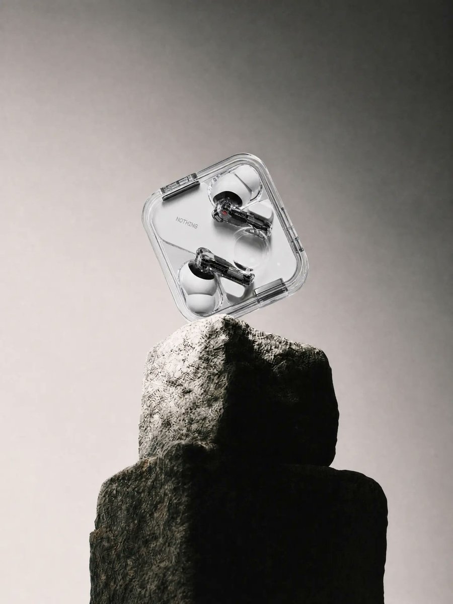
Transparent Earbuds on Stone Pedestal
Metinden görsele
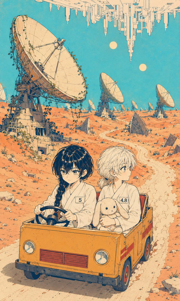
Manga Desert Radio Telescope Road Trip
Metinden görsele
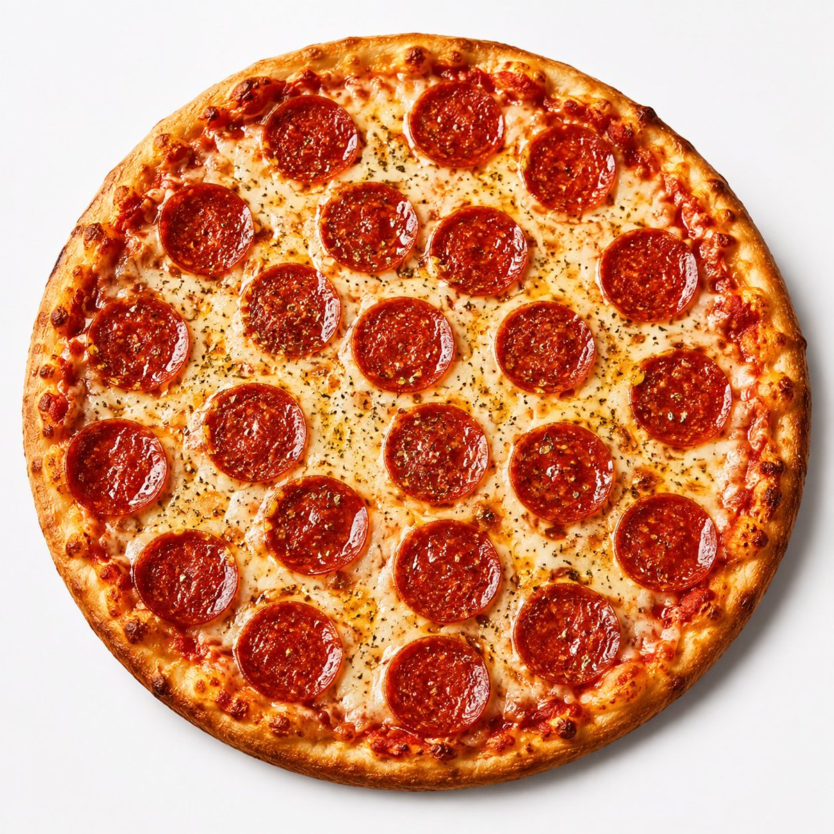
Overhead Pepperoni Pizza Photo
Metinden görsele
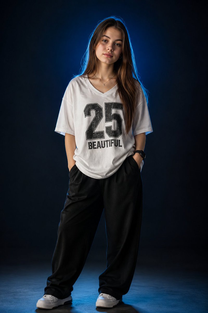
Fashion Studio Portrait with Blue Rim Lighting
Metinden görsele
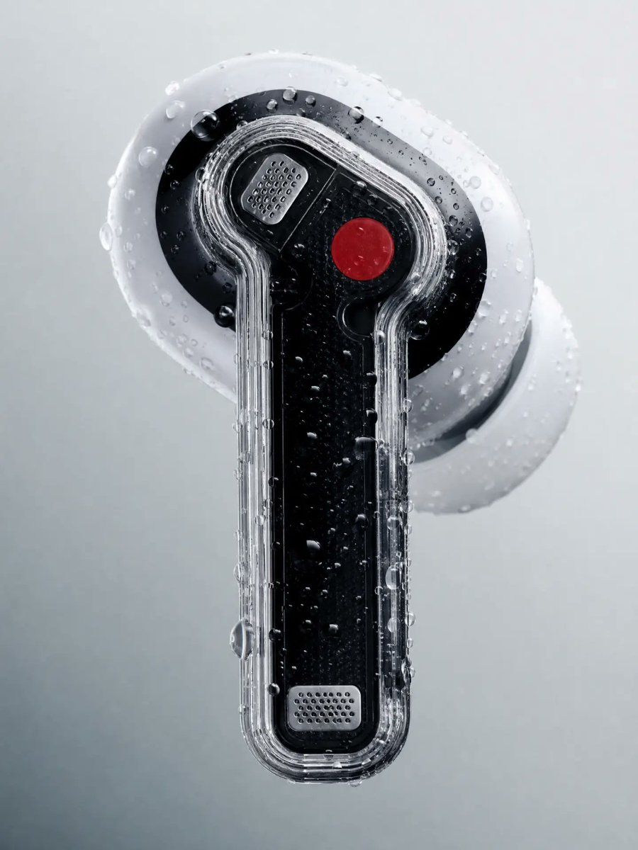
Wet Transparent Earbud Macro
Metinden görsele
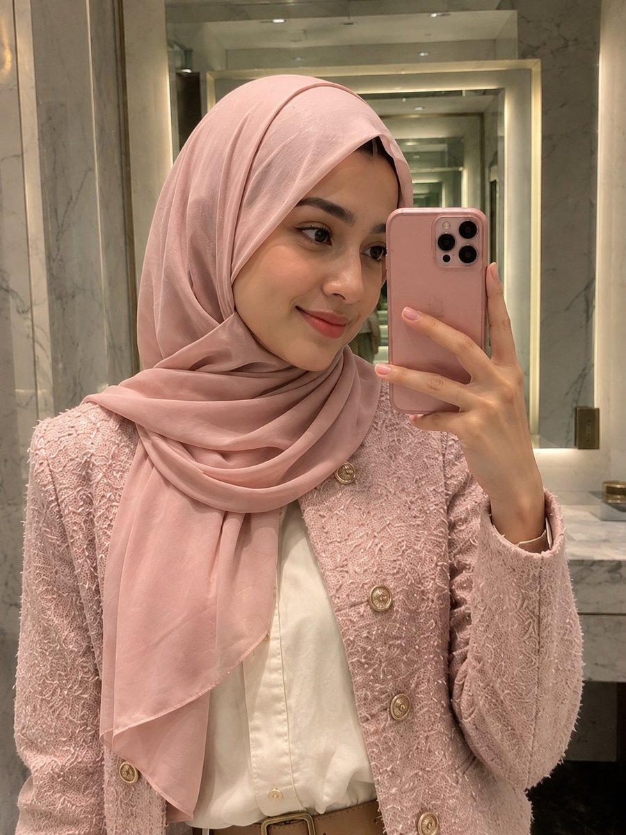
Pink Hijab Mirror Selfie Portrait
Metinden görsele
Yeniden kullanım ve kaynak notları
Vaka önizlemesini yaptıktan sonra bu istemi güvenle kullanın.
- 1.Komut istemini kopyalayın veya oluşturma düğmesini kullanarak doğrudan Dovoo'da açın.
- 2.Değişkenleri, en boy oranını ve referans görselleri kendi kullanım durumunuza göre ayarlayın.
- 3.Yayınlamadan veya ücretli kullanımdan önce, kaynak haklarını, atıf gerekliliklerini ve marka veya benzerlik risklerini doğrulayın.