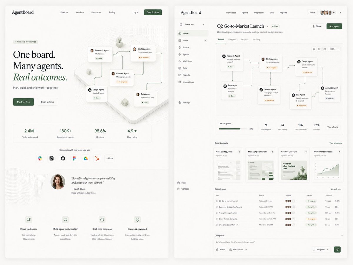
AgentBoard SaaS Landing and Dashboard UI
Generates a refined side-by-side SaaS landing page and dashboard mockup for an AI agent workspace, useful for product design exploration.
นี่คือตัวอย่างข้อความแจ้งเตือน GPT Image 2 สำหรับ ผลิตภัณฑ์และเชิงพาณิชย์ ใช้ข้อความแจ้งเตือนที่พร้อมใช้งานด้านล่างเพื่อสร้างภาพที่คล้ายกัน และตรวจสอบการอ้างอิง Awesome GPT Image 2 Prompts รวมถึงสิทธิ์ในการใช้งานเชิงพาณิชย์ก่อนนำไปใช้ซ้ำ
ต้องการชุดข้อความแจ้งเตือนทั้งหมดหรือไม่? ใช้... ผลิตภัณฑ์และเชิงพาณิชย์ ศูนย์รวมหัวข้อสำหรับตัวอย่างที่เกี่ยวข้องเพิ่มเติม หรือเปิดดูได้เลย GPT Image 2 แคตตาล็อกพร้อมท์ สำหรับดัชนีตัวอย่างฉบับเต็ม โครงสร้างที่นำกลับมาใช้ใหม่ได้ และการอ้างอิงแหล่งที่มา
Free 1K preview
Generate one preview image instantly, no sign-up required.
4000/4000
พรอมป์
ข้อความแจ้งเตือนพร้อมสำหรับการคัดลอก
Goal: Create a polished editorial SaaS product exploration image for an AI agent collaboration platform called {argument name="product name" default="AgentBoard"}, showing two large web UI screens side by side on a warm off-white background: a marketing landing page on the left and the product dashboard on the right. Use refined startup design, soft shadows, rounded cards, thin gray dividers, lots of whitespace, muted forest-green accents, black serif display typography for the landing headline, and small clean sans-serif UI text.

Canvas: Wide 4:3 composition, approximately 1200×900. Place two tall browser-like panels with rounded corners and subtle drop shadows, separated by a narrow gutter. Background is light cream with faint grain and very soft vignette.

Left screen, marketing landing page: Top navigation bar with the logo text “AgentBoard” at top left, 4 centered nav links labeled Product, Solutions, Resources, Pricing, then Log in and a dark green “Start for free” button on the right. Hero area has a small pill label “AI-NATIVE WORKSPACE”, a large three-line headline reading “One board. Many agents. Real outcomes.” with “Real outcomes.” italic and green, supporting line “Plan, build, and ship work—together.”, and 2 CTA buttons: dark green “Start for free” and light outlined “Book a demo”. To the right of the hero text, show an isometric workflow board with exactly 5 connected agent cards: Research Agent, Strategy Agent, Content Agent, Design Agent, and Data Agent, linked by curved connector lines with small status chips such as Done and In progress. Below, include exactly 4 metric tiles: “2.4M+ Tasks automated”, “180K+ Agents this month”, “98.6% On-time”, and “4.9★ User rating”. Under the metrics, include a row labeled “Connects with the tools you use” with exactly 7 integration icons/buttons: Slack, Notion, GitHub, Figma, Google Drive, HubSpot, and “+ More”. Add a testimonial block with a circular female headshot and the quote “AgentBoard gives us complete visibility and keeps our team aligned.” credited to Sarah Chen, Head of Product, Northline. At the bottom, include exactly 4 feature blurbs with tiny line icons: Visual workspace, Multi-agent collaboration, Real-time progress, and Secure & governed.

Right screen, product dashboard: Create a dense but elegant web app interface. Top app bar shows “AgentBoard” on the left, main tabs Workspace, Agents, Integrations, Data, Reports, plus an Invite button, a row of 5 small user avatars, a “+3” badge, and a dropdown chevron. Left sidebar for workspace “Acme Inc.” with exactly 11 navigation items: Home, Inbox with an 8 badge, Boards, Agents, Workflows, Data, Reports, Integrations, Settings, Help, and Collapse. Main page title reads {argument name="dashboard title" default="Q2 Go-to-Market Launch"} with a green “Live” pill and subtitle “Coordinating agents across research, strategy, content, design, and ops.” Include Share and dark green Add agent buttons.

Dashboard content: Below the title, show exactly 4 tabs: Board, Progress, Outputs, Activity, with Board active. The main board canvas contains exactly 6 connected workflow cards arranged left-to-right with curved connector lines: Research Agent “Market & audience research” Done; Data Agent “Performance analysis” Done; Strategy Agent “Go-to-market plan” In progress; Content Agent “Messaging & content framework” In progress; Design Agent “Creative concepts & brand” In progress; Ops Agent “Launch readiness & checklist” In progress; Analytics Agent “Performance forecast” Queued. Include small board controls at top right: search icon, layout icon, fit icon, zoom “100%”, and dropdown.

Under the board, add a KPI strip with exactly 5 items: Live progress 72% with green progress bar, 9 Active agents, 24 Tasks running, 156 Tasks completed, and 92% On-time, plus a “View all runs” button. Add a Recent outputs section with exactly 4 document cards: GTM Strategy Brief, Messaging Framework, Creative Concepts, and Performance Forecast, each with a small preview thumbnail and update time. Add a Recent runs table with exactly 5 rows: Q2 Go-to-Market Launch, Customer Onboarding Revamp, Pricing Strategy Analysis, Brand Refresh Campaign, and Enterprise Sales Playbook; include tiny agent avatar clusters, colored status pills, started times, and durations. At the bottom, include a Composer input bar with placeholder “What would you like the agents to work on?”, buttons for Attach and Add context, an “All agents” dropdown, and a green send button.

Visual style: Premium minimal product mockup, realistic UI proportions, crisp vector-like rendering, tiny legible interface text where possible, subtle dotted background texture, pale beige cards, green status indicators, fine connector lines, modern editorial SaaS aesthetic suitable for a product-design exploration tweet.

Constraints: Use exactly 2 main screens, exactly 5 agent cards on the landing hero, exactly 4 metric tiles, exactly 7 integration icons, exactly 4 bottom feature blurbs, exactly 11 sidebar items, exactly 4 dashboard tabs, exactly 6 workflow agent cards on the dashboard board plus the queued Analytics card as the seventh endpoint, exactly 5 KPI items, exactly 4 output cards, and exactly 5 table rows. Do not add extra panels, watermarks, browser chrome, or decorative text beyond the described UI.
ตัวแปรพร้อมท์
ตัวอย่างค่าอาร์กิวเมนต์ที่แก้ไขได้ซึ่งพบในข้อความแจ้งเตือน พร้อมค่าเริ่มต้น
ตัวแปร
product name
ค่าเริ่มต้น
AgentBoard
ตัวแปร
dashboard title
ค่าเริ่มต้น
Q2 Go-to-Market Launch
Best for
- - ผลิตภัณฑ์และเชิงพาณิชย์ visual exploration
- - Image generation and reference-image edits
- - Reusable briefs that keep source attribution visible
Change these parts
- - Subject, product, character, or scene
- - Aspect ratio, camera, lighting, and background
- - Brand, text, color, and output constraints
Recommended model and settings
- - Model: gpt-image-2
- - Input mode: ข้อความเป็นรูปภาพ
- - Aspect ratio: source
- - Commercial status: review original source
How to use this prompt
- 1. Copy the prompt and preserve its structure for the first test.
- 2. Replace the subject, context, and publishing channel.
- 3. Change one camera, lighting, or style variable per iteration.
- 4. Inspect the output, source, text, and rights before reuse.
Limitations, source, and reuse cautions
- - Generated output is an editable draft, not factual, legal, or rights evidence.
- - Review the linked source, people, brands, logos, text, and third-party media before commercial use.
นำเข้าจาก Awesome GPT Image 2 Prompts จำเป็นต้องระบุแหล่งที่มา สถานะการใช้งานเชิงพาณิชย์คือ allowed โปรดตรวจสอบสิทธิ์แหล่งที่มาก่อนใช้งานแบบเสียค่าใช้จ่าย
กรณีเพิ่มเติมในหมวดหมู่นี้
จัดลำดับความสำคัญตามหมวดหมู่ ความเข้ากันได้กับโหมดการป้อนข้อมูล คุณภาพ และความเสี่ยงที่ต่ำกว่า



หมายเหตุเกี่ยวกับการนำกลับมาใช้ใหม่และแหล่งที่มา
ใช้ข้อความแจ้งเตือนนี้อย่างปลอดภัยหลังจากดูตัวอย่างกรณีแล้ว
- 1.คัดลอกข้อความแจ้งเตือน หรือเปิดโดยตรงใน Dovoo โดยใช้ปุ่มสร้างข้อความ
- 2.ปรับตัวแปร อัตราส่วนภาพ และภาพอ้างอิงให้เหมาะสมกับกรณีการใช้งานของคุณ
- 3.ก่อนเผยแพร่หรือใช้งานโดยเสียค่าใช้จ่าย โปรดตรวจสอบสิทธิ์ในแหล่งที่มา ข้อกำหนดการอ้างอิง และความเสี่ยงด้านแบรนด์หรือภาพลักษณ์