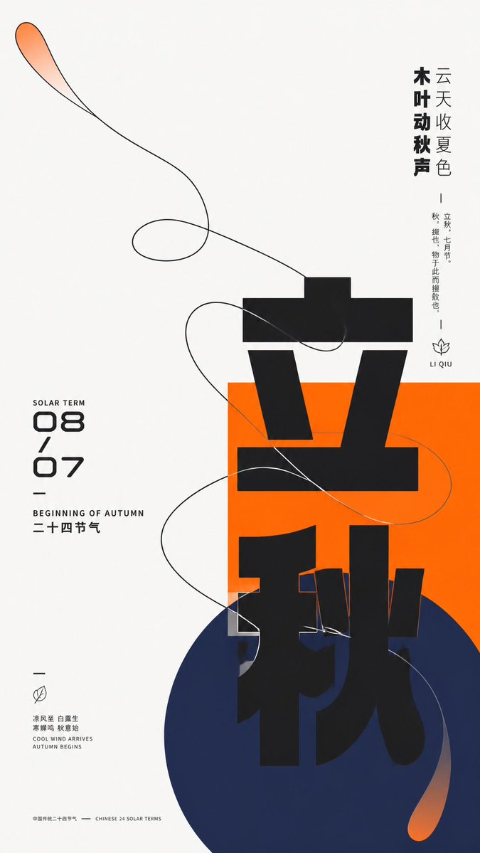
Modern Chinese Graphic Design Layout
A sophisticated prompt for creating modern Chinese graphic design featuring geometric shapes, organic outlines, and bold typography with balanced negative space.
To jest przykładowy przykład GPT Image 2 dla Grafika i plakat . Skorzystaj z poniższego przykładu gotowego do skopiowania, aby wygenerować podobne materiały wizualne i sprawdź atrybucję Awesome GPT Image 2 Prompts oraz prawa do użytku komercyjnego przed ponownym wykorzystaniem.
Free 1K preview
Generate one preview image instantly, no sign-up required.
Free text preview doesn’t preserve reference-image consistency.
Opis
Monit o przygotowanie do kopiowania
Construct a modern graphic visual around {argument name="subject" default="any theme object"} by intersecting giant Chinese thematic characters, geometric color blocks, and single-line organic outlines. Maintain high brightness and a pure background overall, leaving more than two-thirds of the space white, with an off-center cluster bearing the main weight: a saturated {argument name="main color" default="main theme color"} rectangle establishes a stable plane, a deeper low-brightness cool-toned circle overlaps from below and extends beyond the boundary, and the core Chinese theme character advances vertically with oversized heavy black geometric strokes across the white base, rectangle, and circle, forming strong scale jumps through incomplete occlusion and cropping; the left side features a compact digital column of dates and bilingual sub-headers, while the right side balances the weight with two levels of vertical short sentences, and small micro-descriptions, short dashes, and linear symbols are scattered at the edges, creating a three-level reading rhythm from the main character to side notes and then to details. Abstract the dynamic relationship derived from the theme into a continuous organic outline, using clear near-black single lines to outline a broad swirling form that enters the color blocks from large areas of white space and crosses the edges, with curves intersecting multiple times but maintaining a discernible single path; the interior of the outline mostly retains the base color, with only local transparent thematic main color fades added at the tips and extensions, creating tension between the light lines and the heavy giant characters. Colors are adaptively selected by theme: the largest area is borne by a clean high-brightness neutral base, the main theme color remains bright and highly saturated for rectangles and local transparent gradients, the circle uses a deep cold supporting color pulled away from the main color's hue, blending into the main color at the end to form soft diffusion, and text and outlines use near-black, with a very small amount of light-colored text pressed against the main color block; fix unequal areas, light/dark levels, and saturation differences, without fixing specific color names. All elements present a flat surface like matte digital printing, with sharp outline edges, gradients only slowly feathered in two parts, and no three-dimensional shadows, paper grain, or global lighting effects. The font maintains a low-contrast, thick, near-geometric sans-serif skeleton, with main characters allowed to have components elongated, displaced, cut, or changing background across color blocks; numbers use a rounded futuristic structure, and small text is enclosed by narrow bodies and loose letter-spacing; brand names, advertising copy, and specific dates are all replaced by new theme information. Finally, preserve extreme white space, geometric gathering below center, vertical and horizontal text pulling against each other, and the moment organic lines cross rigid graphics, avoiding filling parts evenly or simplifying outlines into isolated decorations.Zmienne monitujące
Edytowalne symbole zastępcze argumentów znalezione w monicie, wraz z ich wartościami domyślnymi.
Best for
- - Grafika i plakat visual exploration
- - Image generation and reference-image edits
- - Reusable briefs that keep source attribution visible
Change these parts
- - Subject, product, character, or scene
- - Aspect ratio, camera, lighting, and background
- - Brand, text, color, and output constraints
Recommended model and settings
- - Model: gpt-image-2
- - Input mode: Obraz na obraz
- - Aspect ratio: source
- - Commercial status: review original source
How to use this prompt
- 1. Copy the prompt and preserve its structure for the first test.
- 2. Replace the subject, context, and publishing channel.
- 3. Change one camera, lighting, or style variable per iteration.
- 4. Inspect the output, source, text, and rights before reuse.
Limitations, source, and reuse cautions
- - Generated output is an editable draft, not factual, legal, or rights evidence.
- - Review the linked source, people, brands, logos, text, and third-party media before commercial use.
Więcej przypadków w tej kategorii
Priorytety według kategorii, zgodności trybu wprowadzania, jakości i niższego ryzyka.
Ponowne wykorzystanie i źródło notatek
Użyj tego monitu bezpiecznie po zapoznaniu się ze sprawą.
- 1.Skopiuj monit lub otwórz go bezpośrednio w Dovoo za pomocą przycisku generowania.
- 2.Dostosuj zmienne, proporcje obrazu i obrazy referencyjne do własnego przypadku użycia.
- 3.Przed publikacją lub płatnym wykorzystaniem należy sprawdzić prawa autorskie do źródła, wymogi dotyczące atrybucji oraz ryzyko związane z marką lub podobizną.