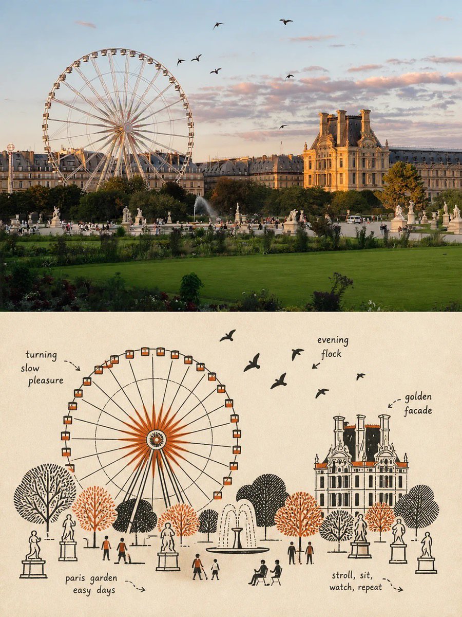
Premium poster split composition
Creates a vertical poster divided into two halves: a realistic photo on top and a schematic line-art illustration on the bottom.
Dette er et tilfelle av en GPT Image 2 -ledetekst for Grafikk og plakat . Bruk den kopieringsklare ledeteksten nedenfor for å generere lignende visuelle elementer, og gjennomgå Awesome GPT Image 2 Prompts -attribusjonen pluss kommersielle bruksrettigheter før gjenbruk.
Trenger du hele settet med ledetekster? Bruk Grafikk og plakat emnehub for flere relaterte eksempler, eller åpne GPT Image 2 rask katalog for den fullstendige eksempelindeksen, gjenbrukbare strukturer og kildeattribusjon.
Free 1K preview
Generate one preview image instantly, no sign-up required.
Free text preview doesn’t preserve reference-image consistency.
2863/4000
Spørsmål
Klar til kopiering
Please create a separate, independently designed premium poster from each uploaded photo. Do not combine multiple photos into one composition; output one individual poster for each photo. Use a vertical 3:4 composition, with the upper and lower sections strictly divided 1:1, each occupying exactly 50% of the total height.

Upper Half:
Preserve the original photograph, maintaining the subject’s identity, structure, pose, realistic texture, natural lighting, and original color atmosphere. Apply only subtle, sophisticated color grading to give it the visual quality of an art magazine, independent publication, or exhibition image. To adapt the image to the 3:4 format, the surrounding background may be naturally extended, but do not stretch, distort, or alter the subject.

Lower Half:
Extract the most recognizable subject, silhouette, structure, pose, and narrative relationship from the photograph and reconstruct it in the style of Mid-century vernacular graphic illustration + schematic line drawing + two-color spot printing.

Do not completely trace or replicate the photograph. Instead, use diagrammatic abstraction to compress complex objects into a small number of clear geometric shapes, functional contours, and essential structural elements. The result should resemble an illustration from an old instruction manual, advertising card, technical label, or vernacular print: immediately recognizable, yet more direct, humorous, and symbolic than the realistic object itself.

Emphasize economy of line: if a structure can be explained with a single line, do not use unnecessary strokes. Use direct black pen outlines, rectangles, circles, diamonds, straight lines, and simple planes to describe the objects. People, animals, and objects may have slightly exaggerated proportions, while machines, buildings, and complex structures should be simplified into clear boxes, openings, panels, and silhouette relationships.

Use a flat, schematic diagrammatic perspective rather than realistic lighting or strictly accurate spatial depth. The visual language should exist somewhere between illustration and technical diagram, maintaining this distinctive character throughout the composition.

Reorganize the composition according to the most important narrative relationship in the original image. Maintain one clear primary subject, while using a small number of supporting objects, guide lines, directional relationships, or structural symbols to reinforce the story.

Pay close attention to visual hierarchy, geometric order, scale contrast, positive and negative space, and intentional whitespace. The image may feel slightly naïve, awkward, or handmade in a vernacular way, but it must never feel cluttered. Every visual element should appear to exist for the purpose of “explaining what is happening”, rather than simply serving as decoration.
Best for
- - Grafikk og plakat visual exploration
- - Image generation and reference-image edits
- - Reusable briefs that keep source attribution visible
Change these parts
- - Subject, product, character, or scene
- - Aspect ratio, camera, lighting, and background
- - Brand, text, color, and output constraints
Recommended model and settings
- - Model: gpt-image-2
- - Input mode: Bilde til bilde
- - Aspect ratio: source
- - Commercial status: review original source
How to use this prompt
- 1. Copy the prompt and preserve its structure for the first test.
- 2. Replace the subject, context, and publishing channel.
- 3. Change one camera, lighting, or style variable per iteration.
- 4. Inspect the output, source, text, and rights before reuse.
Limitations, source, and reuse cautions
- - Generated output is an editable draft, not factual, legal, or rights evidence.
- - Review the linked source, people, brands, logos, text, and third-party media before commercial use.
Importert fra Awesome GPT Image 2 Prompts . Attribusjon kreves. Status for kommersiell bruk er allowed ; sjekk kilderettighetene før betalt bruk.
Flere saker i denne kategorien
Prioritert etter kategori, kompatibilitet med inndatamodus, kvalitet og lavere risiko.
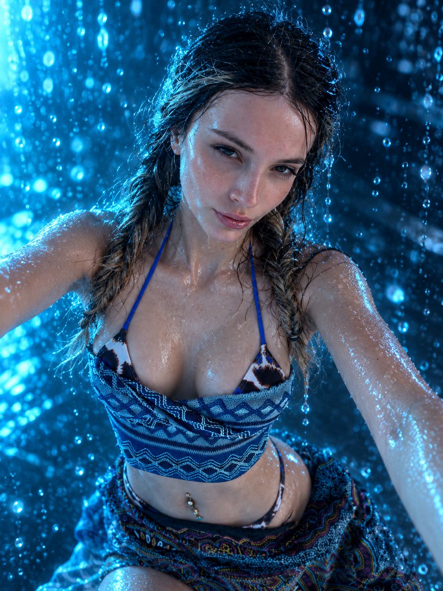
Sci-Fi Cyan Lighting Effect
Bilde til bilde
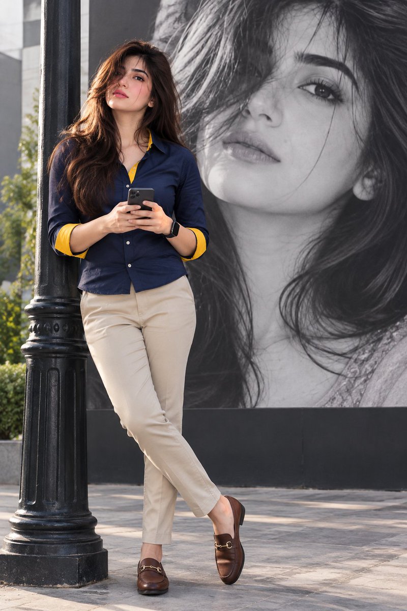
Stylish Man Street Lamp Portrait
Bilde til bilde
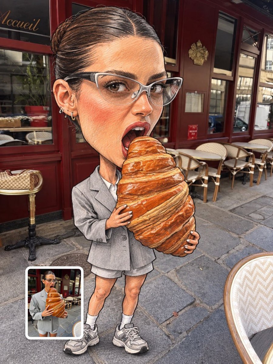
Oversized Head Cartoon Caricature Prompt
Bilde til bildeMiddels risiko
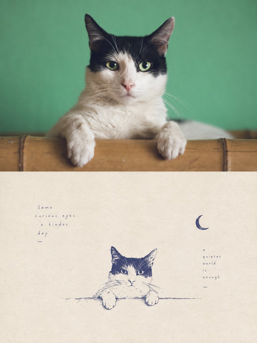
Tuxedo Cat Photo and Line Art Diptych
Tekst til bilde
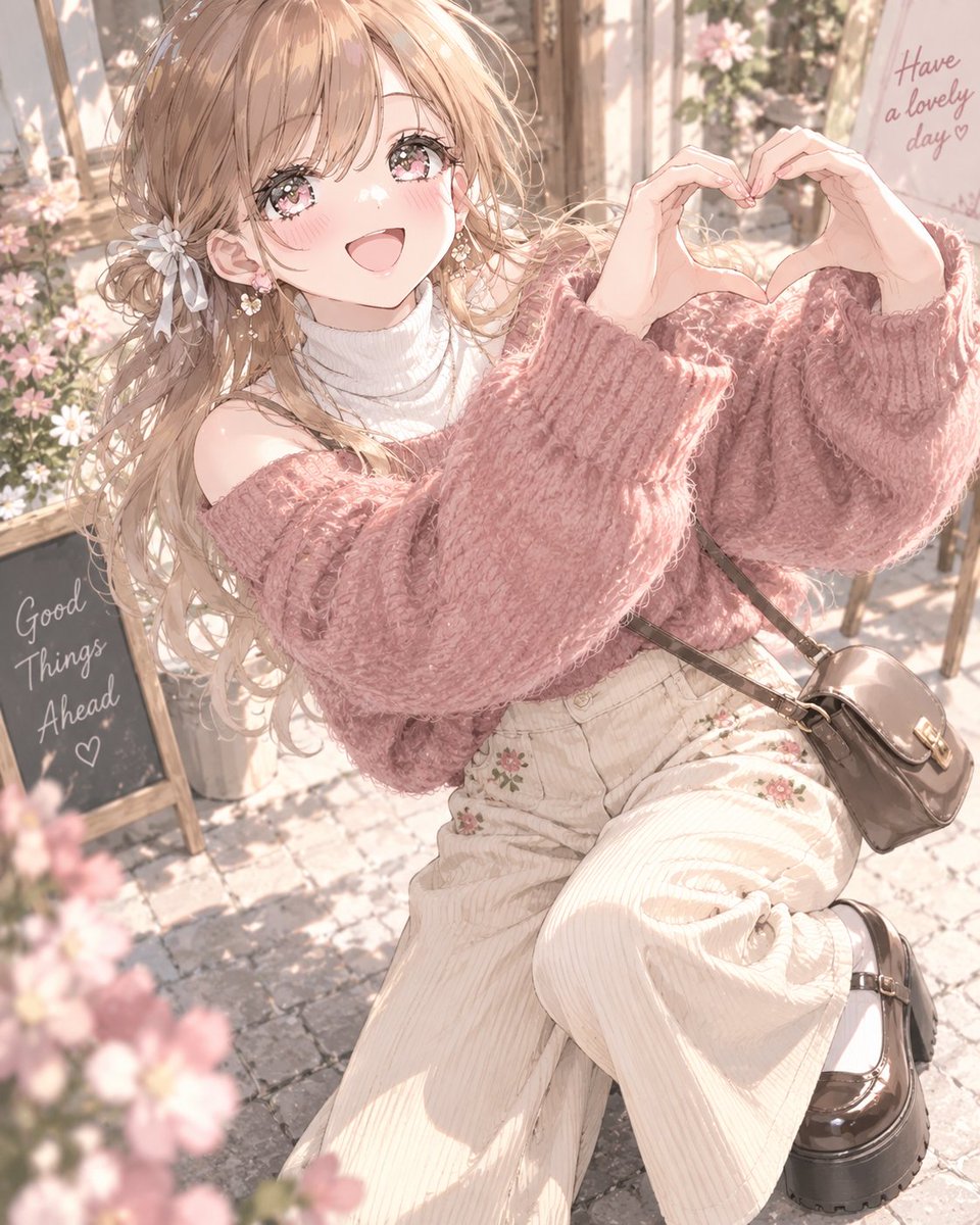
Autumn Cozy Casual Outfit Prompt
Tekst til bilde
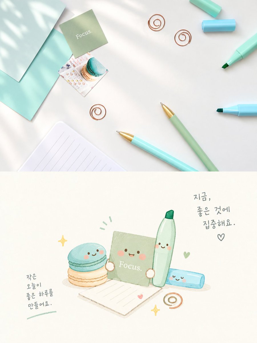
Cute Focus Desk Flat Lay and Kawaii Illustration
Tekst til bilde
Gjenbruk og kildenotater
Bruk denne ledeteksten på en trygg måte etter at du har forhåndsvist saken.
- 1.Kopier ledeteksten eller åpne den direkte i Dovoo med genereringsknappen.
- 2.Juster variabler, sideforhold og referansebilder for ditt eget brukstilfelle.
- 3.Før publisering eller betalt bruk, kontroller kilderettigheter, krav til kreditering og risikoer knyttet til merkevare eller likhet.