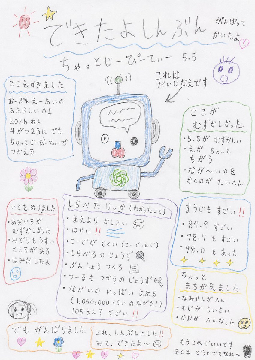
Håndtegnet barnehageavis
En kreativ oppfordring til å generere et bilde som etterligner en «barneavis» tegnet av en førskolebarn med fargestifter og blyanter. Den fremhever sjarmerende ufullkommenheter, rotete linjer og ujevn tekst for et autentisk utseende.
Dette er et tilfelle av en GPT Image 2 -ledetekst for Illustrasjon og kunst . Bruk den kopieringsklare ledeteksten nedenfor for å generere lignende visuelle elementer, og gjennomgå Awesome GPT Image 2 Prompts -attribusjonen pluss kommersielle bruksrettigheter før gjenbruk.
Free 1K preview
Generate one preview image instantly, no sign-up required.
Free text preview doesn’t preserve reference-image consistency.
Spørsmål
Klar til kopiering
Please make the results of the research on {argument name="topic" default="ChatGPT 5.5"} look like a 'children's newspaper' made by a preschooler. It should look like it was drawn on white paper using colored pencils and lead pencils. It is a newspaper, but not a proper one. A child worked hard to make it look like a newspaper. In the center, there is a poorly drawn picture that tried to copy an original image. Please do not make it a clean picture. Do not make it a good drawing. Do not make it cute or tidy. Do not make it a skillful child-style illustration. Please make it look like a truly bad drawing that a kindergartner would make. Please make the title look like it was written by a child. Use a strange title at the top like '{argument name="title" default="I Made a Newspaper"}', 'I worked hard on this', or 'This is an important drawing'. The text should be mostly hiragana. The sizes of the letters should be inconsistent. They should not be lined up straight. They should be slightly tilted. Sometimes a letter is too big, sometimes too small. Inside the newspaper, there are poorly written headings. They should say things like '{argument name="heading" default="I wrote this part"}', 'This part was hard', 'I colored it in', 'I made a small mistake', or 'But I did my best'. The lines should be wiggly. Square boxes should not be straight. Circled parts should be weird ovals. Arrows should point in strange directions. It was meant to mimic an original image, but it didn't turn out well at all. Shapes are not proper. Sizes are inconsistent. Large parts are too big, small parts are too small. Eyes, mouths, or bodies are in slightly weird places. The placement is shifted. Something is just a bit off. Colors should bleed out of the lines. There should be uncolored spots. Some areas are colored heavily, others lightly. There should be visible marks from scrubbing hard with colored pencils. In the corner of the newspaper, there should be small, poorly drawn pictures like a sun, star, flower, heart, a weird face, or unidentifiable circles. But please do not make it clean. Do not organize the layout. Do not make it look like professional design. Do not make it like a professional newspaper or a well-done classroom newsletter. Make it look like a child is showing it to you, saying, 'I made this into a newspaper!' or 'Look, I finished it!'. It is a bit bad. Quite bad. The writing is bad. The drawing is bad. The boxes are bad. But the child worked hard to make it. The background is just plain white paper. Finally, just let it be since they worked hard on it. Let the rest happen as it may.Promptvariabler
Redigerbare argumentplassholdere funnet i ledeteksten, med standardverdiene.
Best for
- - Illustrasjon og kunst visual exploration
- - Image generation and reference-image edits
- - Reusable briefs that keep source attribution visible
Change these parts
- - Subject, product, character, or scene
- - Aspect ratio, camera, lighting, and background
- - Brand, text, color, and output constraints
Recommended model and settings
- - Model: gpt-image-2
- - Input mode: Bilde til bilde
- - Aspect ratio: source
- - Commercial status: review original source
How to use this prompt
- 1. Copy the prompt and preserve its structure for the first test.
- 2. Replace the subject, context, and publishing channel.
- 3. Change one camera, lighting, or style variable per iteration.
- 4. Inspect the output, source, text, and rights before reuse.
Limitations, source, and reuse cautions
- - Generated output is an editable draft, not factual, legal, or rights evidence.
- - Review the linked source, people, brands, logos, text, and third-party media before commercial use.
Flere saker i denne kategorien
Prioritert etter kategori, kompatibilitet med inndatamodus, kvalitet og lavere risiko.
Gjenbruk og kildenotater
Bruk denne ledeteksten på en trygg måte etter at du har forhåndsvist saken.
- 1.Kopier ledeteksten eller åpne den direkte i Dovoo med genereringsknappen.
- 2.Juster variabler, sideforhold og referansebilder for ditt eget brukstilfelle.
- 3.Før publisering eller betalt bruk, kontroller kilderettigheter, krav til kreditering og risikoer knyttet til merkevare eller likhet.