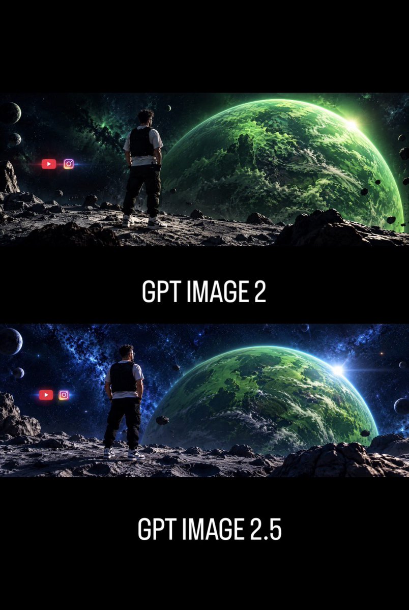
GPT Image 2 vs 2.5 Space Comparison
A vertical comparison poster showing two cinematic sci-fi space scenes labeled as different GPT Image versions for social media discussion.
Dette er et tilfelle av en GPT Image 2 -ledetekst for Grafikk og plakat . Bruk den kopieringsklare ledeteksten nedenfor for å generere lignende visuelle elementer, og gjennomgå Awesome GPT Image 2 Prompts -attribusjonen pluss kommersielle bruksrettigheter før gjenbruk.
Denne ledeteksten er utformet for flere referansebilder. Vi åpner Dovoo med ledeteksten og det tilgjengelige forhåndsvisningsbildet; legg til de resterende referansene i Dovoo før generering.
Free 1K preview
Generate one preview image instantly, no sign-up required.
Free text preview doesn’t preserve reference-image consistency.
Spørsmål
Klar til kopiering
Goal: Create a vertical social-media comparison graphic showing two cinematic AI-image generations of the same sci-fi scene, emphasizing improved art direction between versions.

Canvas: Portrait 2:3 format, black background, high-contrast cinematic presentation with wide letterboxed image strips. Use a stacked layout with exactly 2 panoramic sci-fi image panels separated by thick black bands.

Layout: Top panel: a wide cinematic space landscape occupying the upper third. Center band below it contains the large white label “{argument name="top label" default="GPT IMAGE 2"}”. Bottom panel: a second wide cinematic space landscape occupying the middle-lower third. Bottom band contains the large white label “{argument name="bottom label" default="GPT IMAGE 2.5"}”. Keep the typography centered, tall condensed sans-serif, all caps, white, clean, and glowing slightly against black.

Scene content in each panel: Show the same composition in both panels: one man viewed from behind, standing on a rocky moon-like surface, looking toward a huge green Earth-like planet filling the right side of the sky. The man is centered-left, wearing a white short-sleeve shirt, black vest, dark pants, and white sneakers. The terrain is gray, cratered, and covered with jagged rocks. The background is deep outer space with stars, nebula clouds, small moons, and scattered asteroids. A bright sun flare appears near the right edge of the large green planet.

Panel differences: The top panel should look slightly darker, rougher, less refined, with a greener color cast and a more chaotic, lower-polish atmosphere. The bottom panel should look more polished, sharper, more balanced, with richer blue space tones, better light direction, clearer composition, crisper rocks, stronger planet detail, and a more cinematic lens flare.

Discrete visible elements to include: exactly 2 image panels; exactly 2 text labels; exactly 1 human figure in each panel, for 2 total human figures; exactly 1 large green planet in each panel, for 2 total large planets; exactly 2 social media icons in each panel, for 4 total icons. In both panels, place the two icons to the left of the man: a red YouTube play-button icon and a pink-purple Instagram camera icon, glowing slightly and floating in space.

Visual style: Ultra-wide cinematic sci-fi concept art, photorealistic digital matte painting, dramatic rim lighting, high detail, strong depth, black letterbox bands, poster-like comparison layout, no watermark, no extra captions beyond the two version labels. Use {argument name="main color palette" default="emerald green planets, blue-black space, gray lunar rocks, white typography"}.
Promptvariabler
Redigerbare argumentplassholdere funnet i ledeteksten, med standardverdiene.
Best for
- - Grafikk og plakat visual exploration
- - Image generation and reference-image edits
- - Reusable briefs that keep source attribution visible
Change these parts
- - Subject, product, character, or scene
- - Aspect ratio, camera, lighting, and background
- - Brand, text, color, and output constraints
Recommended model and settings
- - Model: gpt-image-2
- - Input mode: Flerbilde til bilde
- - Aspect ratio: source
- - Commercial status: review original source
How to use this prompt
- 1. Copy the prompt and preserve its structure for the first test.
- 2. Replace the subject, context, and publishing channel.
- 3. Change one camera, lighting, or style variable per iteration.
- 4. Inspect the output, source, text, and rights before reuse.
Limitations, source, and reuse cautions
- - Generated output is an editable draft, not factual, legal, or rights evidence.
- - Review the linked source, people, brands, logos, text, and third-party media before commercial use.
Flere saker i denne kategorien
Prioritert etter kategori, kompatibilitet med inndatamodus, kvalitet og lavere risiko.
Gjenbruk og kildenotater
Bruk denne ledeteksten på en trygg måte etter at du har forhåndsvist saken.
- 1.Kopier ledeteksten eller åpne den direkte i Dovoo med genereringsknappen.
- 2.Juster variabler, sideforhold og referansebilder for ditt eget brukstilfelle.
- 3.Før publisering eller betalt bruk, kontroller kilderettigheter, krav til kreditering og risikoer knyttet til merkevare eller likhet.