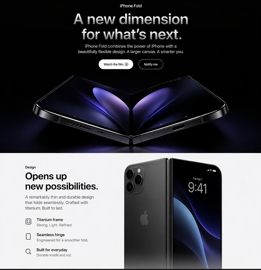
Apple-Style iPhone Fold Landing Page
Creates a premium Apple-inspired web landing page mockup for a fictional foldable iPhone product reveal.
이것은 제품 및 상업 에 대한 GPT Image 2 프롬프트 사례입니다. 아래의 복사 가능한 프롬프트를 사용하여 유사한 시각 자료를 생성하고, 재사용하기 전에 Awesome GPT Image 2 Prompts 의 저작자 표시 및 상업적 사용 권한을 검토하십시오.
전체 프롬프트 세트가 필요하신가요? 다음을 사용하세요. 제품 및 상업 더 많은 관련 예시를 보려면 주제 허브를 열거나 다음을 열어보세요. GPT Image 2 프롬프트 카탈로그 전체 예제 색인, 재사용 가능한 구조 및 출처 표기는 다음을 참조하십시오.
Free 1K preview
Generate one preview image instantly, no sign-up required.
3321/4000
프롬프트
복사 준비 프롬프트
Goal: Create a polished Apple-style product landing page hero for a fictional {argument name="product name" default="iPhone Fold"}, presenting a premium foldable smartphone with dramatic black-and-white contrast and photorealistic device renders.

Canvas: Square 1:1 web mockup, approximately 850 × 850 px. Split into exactly 2 horizontal sections: a dark cinematic hero section on the top taking about 58% of the canvas, and a bright white design section on the bottom taking about 42%.

Top section: Use a pure black background with subtle blue-purple glow near the bottom. Center all typography. At the very top, small label text reads “iPhone Fold”. Below it, a large bold Apple-like headline reads “{argument name="headline text" default="A new dimension for what’s next."}” in white-to-silver gradient lettering. Under the headline, add a short centered paragraph: “{argument name="subheadline text" default="iPhone Fold combines the power of iPhone with a beautifully flexible design. A larger canvas. A smarter you."}” Place exactly 2 pill buttons below the paragraph: first button is white with black text “Watch the film” plus a small play-circle icon; second button is black/dark with a thin white outline and white text “Notify me”.

Top product render: Beneath the buttons, show one large photorealistic foldable iPhone opened like a shallow V on a glossy black surface. The device has black titanium edges, visible speaker holes and charging port along the lower edges, a central hinge at the fold, rounded corners, and a dark inner display with abstract purple-blue petal-like light shapes mirrored across the fold. Use cinematic rim lighting, high contrast, and a faint reflection below the phone.

Bottom section: Clean white Apple product-page layout. On the left, create a text block with the small label “Design”, then a large bold headline: “{argument name="design headline" default="Opens up new possibilities."}” Add the paragraph: “A remarkably thin and durable design that folds seamlessly. Crafted with titanium. Built to last.” Below it, include exactly 3 feature rows with minimalist black outline icons and two lines of text each: 1) “Titanium frame” with subtext “Strong. Light. Refined.” 2) “Seamless hinge” with subtext “Engineered for a smoother fold.” 3) “Built for everyday” with subtext “Durable inside and out.”

Bottom product render: On the right side, show a second photorealistic product composition: a closed or partially folded black iPhone Fold standing upright, with the rear panel and triple camera cluster visible on the left half and the front display visible on the right half. The front display shows the time “9:41”, small date text “Tue Apr 1”, tiny status icons, and a dark blue-purple abstract wallpaper. Use a vertical hinge between the halves, soft shadows, and realistic glass reflections.

Visual style: Minimal luxury Apple keynote aesthetic, San Francisco-like typography, precise alignment, generous whitespace, glossy black titanium materials, subtle gradients, realistic lighting, no clutter.

Constraints: Include exactly 2 sections, exactly 2 call-to-action buttons, exactly 3 feature rows, and exactly 2 main product render compositions. Do not add navigation menus, extra logos beyond a faint Apple logo on the device back, watermarks, or unrelated text.
프롬프트 변수
프롬프트에 있는 편집 가능한 인수 자리 표시자와 해당 기본값입니다.
변하기 쉬운
product name
기본
iPhone Fold
변하기 쉬운
headline text
기본
A new dimension for what’s next.
변하기 쉬운
subheadline text
기본
iPhone Fold combines the power of iPhone with a beautifully flexible design. A larger canvas. A smarter you.
변하기 쉬운
design headline
기본
Opens up new possibilities.
Best for
- - 제품 및 상업 visual exploration
- - Image generation and reference-image edits
- - Reusable briefs that keep source attribution visible
Change these parts
- - Subject, product, character, or scene
- - Aspect ratio, camera, lighting, and background
- - Brand, text, color, and output constraints
Recommended model and settings
- - Model: gpt-image-2
- - Input mode: 텍스트 to 이미지
- - Aspect ratio: source
- - Commercial status: review original source
How to use this prompt
- 1. Copy the prompt and preserve its structure for the first test.
- 2. Replace the subject, context, and publishing channel.
- 3. Change one camera, lighting, or style variable per iteration.
- 4. Inspect the output, source, text, and rights before reuse.
Limitations, source, and reuse cautions
- - Generated output is an editable draft, not factual, legal, or rights evidence.
- - Review the linked source, people, brands, logos, text, and third-party media before commercial use.
Awesome GPT Image 2 Prompts 에서 가져왔습니다. 출처 표기가 필요합니다. 상업적 이용 가능 여부는 allowed 입니다. 유료 사용 전에 원저작권 정보를 확인하세요.
이 범주에 속하는 더 많은 사례
범주, 입력 방식 호환성, 품질 및 위험도에 따라 우선순위가 정해집니다.




재사용 및 출처 참고 사항
사례를 미리 확인한 후 이 안내 메시지를 안전하게 사용하십시오.
- 1.프롬프트를 복사하거나 Dovoo의 생성 버튼을 사용하여 직접 엽니다.
- 2.사용 사례에 맞게 변수, 화면 비율 및 참조 이미지를 조정하십시오.
- 3.출판 또는 유료 사용 전에 저작권, 출처 표기 요건 및 브랜드 또는 초상권 관련 위험을 확인하십시오.