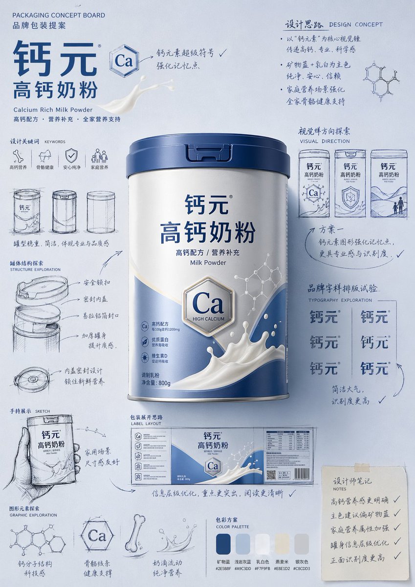
패키지 디자인 제안 게시판 안내
전문적인 손 그림 스타일의 제품 패키지 디자인 제안 및 컨셉 무드 보드를 제작하기 위한 매우 상세한 지침입니다.
이것은 제품 및 상업 에 대한 GPT Image 2 프롬프트 사례입니다. 아래의 복사 가능한 프롬프트를 사용하여 유사한 시각 자료를 생성하고, 재사용하기 전에 Awesome GPT Image 2 Prompts 의 저작자 표시 및 상업적 사용 권한을 검토하십시오.
전체 프롬프트 세트가 필요하신가요? 다음을 사용하세요. 제품 및 상업 더 많은 관련 예시를 보려면 주제 허브를 열거나 다음을 열어보세요. GPT Image 2 프롬프트 카탈로그 전체 예제 색인, 재사용 가능한 구조 및 출처 표기는 다음을 참조하십시오.
Free 1K preview
Generate one preview image instantly, no sign-up required.
Free text preview doesn’t preserve reference-image consistency.
4000/4000
프롬프트
복사 준비 프롬프트
Please generate a "hand-drawn packaging proposal board style" product introduction poster for {argument name="product name" default="milk powder"}.

If I provide a product image, please use it as the main reference, retaining the core visual characteristics, packaging form, colors, materials, brand identity, and overall temperament of the product. Prioritize the main color tone and color relationships from the product image for the design.
If I do not provide a product image, please automatically generate a product appearance and packaging design that fits the positioning of {argument name="product name" default="milk powder"}, and automatically match natural and reasonable main, auxiliary, and background colors based on the product attributes, category characteristics, and temperament.

Overall poster style requirements:
This is not a standard e-commerce detail page or a simple studio-shot poster, but a creative proposal board that integrates "product finished image + packaging design sketches + brand concept development process." The overall presentation is a high-aesthetic, high-completion brand design display image, as if a designer is presenting a packaging concept proposal.

Visual requirements:
- Vertical composition
- Use a unified background with a brand feel; the background color should be naturally determined by the product itself and not fixed to any one color.
- Color schemes should coordinate with product attributes: if there is a reference image, prioritize inheriting its main and brand colors; if not, automatically generate a reasonable color scheme based on the product name.
- Place the most complete and eye-catching product main visual in the center, with realistic textures, 3D lighting, and commercial finish effects.
- Surround the product with multiple auxiliary visual elements: packaging sketches from different angles, structural sketches, local form explorations, hand-held display drafts, packaging unfolding ideas, and brand lettering layout experiments.
- Add natural and casual black or dark hand-drawn line art, arrows, circles, symbols, and handwritten Chinese annotations to give the image a strong sense of "design process" and "creative proposal."
- The finished product image should be relatively refined and realistic, while the sketch parts should be relatively casual and dynamic, creating a contrast between the "finished product + design sketches."
- The layout should look relaxed and free, but overall it must have order, rhythm, and a visual center, reflecting a high-end graphic design feel.
- Small graphics, symbols, or interesting elements related to the product can be added appropriately to enhance brand memory points.
- The final effect should have a sense of branding, creativity, process, and visual impact.

Color principles:
- Do not fix a yellow background.
- Automatically select the main color tone based on product type, material, use, consumer experience, and brand temperament.
- The background color, product color, text color, and sketch line art color should coordinate with each other.
- High-saturation monochromatic backgrounds or soft, unified color schemes can be used, as long as the overall image has a brand feel and visual impact.
- Colors should naturally serve the product rather than overshadow it.

Style keywords:
Packaging design proposal board, brand concept development, hand-drawn sketches, design process feel, moodboard, creative review draft, product finished rendering, visual experimentation, commercial design poster.

Special notes:
- If there is a reference product image, prioritize following it and do not deviate from the product itself.
- If there is no reference image, automatically generate reasonable product appearance, packaging, and color schemes based on the product name, maintaining overall style consistency.
- The focus of the image is "product introduction + creative design process display."
- Do not make it look like a common e-commerce detail page, a promotional poster, or overly neat and stiff; do not lack sketches and handwritten annotations; avoid a cheap feel or an immature cartoon style.
프롬프트 변수
프롬프트에 있는 편집 가능한 인수 자리 표시자와 해당 기본값입니다.
변하기 쉬운
product name
기본
milk powder
Best for
- - 제품 및 상업 visual exploration
- - Image generation and reference-image edits
- - Reusable briefs that keep source attribution visible
Change these parts
- - Subject, product, character, or scene
- - Aspect ratio, camera, lighting, and background
- - Brand, text, color, and output constraints
Recommended model and settings
- - Model: gpt-image-2
- - Input mode: 이미지 to 이미지
- - Aspect ratio: source
- - Commercial status: review original source
How to use this prompt
- 1. Copy the prompt and preserve its structure for the first test.
- 2. Replace the subject, context, and publishing channel.
- 3. Change one camera, lighting, or style variable per iteration.
- 4. Inspect the output, source, text, and rights before reuse.
Limitations, source, and reuse cautions
- - Generated output is an editable draft, not factual, legal, or rights evidence.
- - Review the linked source, people, brands, logos, text, and third-party media before commercial use.
Awesome GPT Image 2 Prompts 에서 가져왔습니다. 출처 표기가 필요합니다. 상업적 이용 가능 여부는 allowed 입니다. 유료 사용 전에 원저작권 정보를 확인하세요.
이 범주에 속하는 더 많은 사례
범주, 입력 방식 호환성, 품질 및 위험도에 따라 우선순위가 정해집니다.
재사용 및 출처 참고 사항
사례를 미리 확인한 후 이 안내 메시지를 안전하게 사용하십시오.
- 1.프롬프트를 복사하거나 Dovoo의 생성 버튼을 사용하여 직접 엽니다.
- 2.사용 사례에 맞게 변수, 화면 비율 및 참조 이미지를 조정하십시오.
- 3.출판 또는 유료 사용 전에 저작권, 출처 표기 요건 및 브랜드 또는 초상권 관련 위험을 확인하십시오.