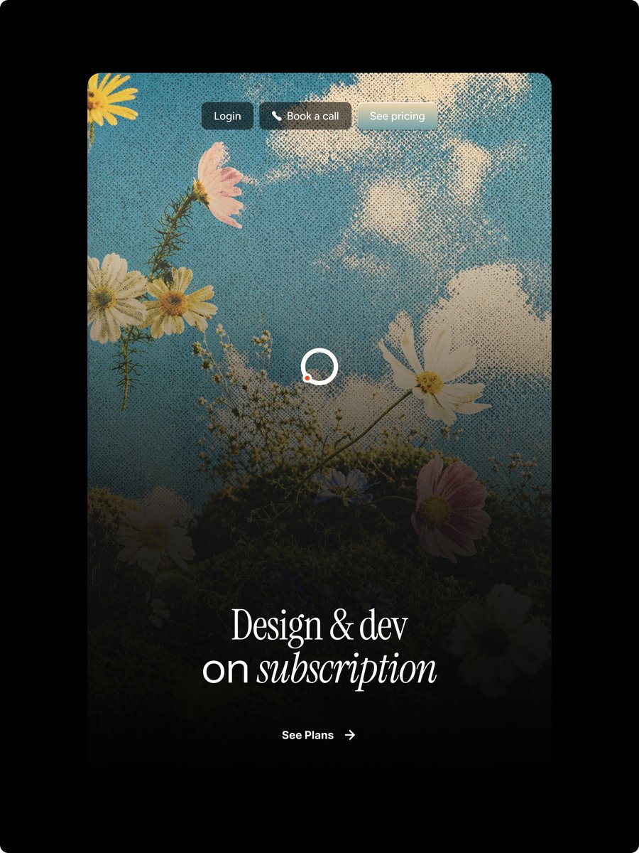
하프톤 플로럴 랜딩 페이지 히어로
디자인 구독 랜딩 페이지를 위한 빈티지 하프톤 플로럴 웹사이트 메인 이미지를 생성합니다.
이것은 제품 및 상업 에 대한 GPT Image 2 프롬프트 사례입니다. 아래의 복사 가능한 프롬프트를 사용하여 유사한 시각 자료를 생성하고, 재사용하기 전에 Awesome GPT Image 2 Prompts 의 저작자 표시 및 상업적 사용 권한을 검토하십시오.
전체 프롬프트 세트가 필요하신가요? 다음을 사용하세요. 제품 및 상업 더 많은 관련 예시를 보려면 주제 허브를 열거나 다음을 열어보세요. GPT Image 2 프롬프트 카탈로그 전체 예제 색인, 재사용 가능한 구조 및 출처 표기는 다음을 참조하십시오.
Free 1K preview
Generate one preview image instantly, no sign-up required.
2762/4000
프롬프트
복사 준비 프롬프트
Goal: Create a polished vertical landing-page hero mockup for a design subscription service, with a nostalgic halftone editorial look and Figma-style web design precision.

Canvas: Portrait 3:4 image on a pure black outer background. Center a tall rounded-rectangle website card with large corner radius, occupying most of the frame and leaving thick black margins around it.

Main visual: Inside the card, use a dreamy upward-looking photograph-style scene of wildflowers against a blue sky with soft white clouds. Apply a strong vintage halftone dot texture across the entire card image. Add a dark black gradient overlay rising from the bottom so the lower half becomes moody and readable while the top remains bright sky blue. Visible floral elements should include exactly 9 main blossoms: 1 partial yellow flower in the top-left corner, 1 pink flower near the upper-left, 2 white daisies clustered left-middle, 1 large white cosmos on the right-middle, 1 white daisy near the bottom-left, 1 small bluish flower near lower center, 1 pink flower at lower-right, and 1 dark partially hidden white flower at the bottom-right edge, plus thin stems and tiny baby's-breath buds.

Top navigation: Place exactly 3 small pill buttons centered near the top of the card with subtle glass/blur styling and soft shadows. Button 1 text: "{argument name="login button text" default="Login"}" on a dark charcoal pill. Button 2 text: "{argument name="booking button text" default="Book a call"}" with a small white phone icon before the text on a warm dark translucent pill. Button 3 text: "{argument name="pricing button text" default="See pricing"}" on a pale frosted gray-blue pill. Use small clean sans-serif white text.

Center detail: Add one loading spinner in the middle of the card, made from a white circular ring with a small orange-red dot on the lower-left part of the ring. Keep it simple and crisp.

Hero typography: Near the lower third, center a large elegant white serif headline reading "{argument name="headline text" default="Design & dev\non subscription"}". The first line says “Design & dev”; the second line says “on subscription,” with the word “subscription” in italic serif. Use refined high-contrast type, generous letter spacing, and a luxurious editorial feel.

Call to action: Below the headline, center a small white CTA reading "{argument name="call to action text" default="See Plans"}" followed by a thin right arrow. Keep it minimal and aligned with the headline.

Style constraints: High-end web hero design, realistic floral sky background, halftone print texture, dark cinematic bottom fade, rounded card corners, no browser chrome, no extra logos, no watermark, no additional text beyond the 3 nav buttons, the headline, and the CTA.
프롬프트 변수
프롬프트에 있는 편집 가능한 인수 자리 표시자와 해당 기본값입니다.
변하기 쉬운
login button text
기본
Login
변하기 쉬운
booking button text
기본
Book a call
변하기 쉬운
pricing button text
기본
See pricing
변하기 쉬운
headline text
기본
Design & dev\non subscription
변하기 쉬운
call to action text
기본
See Plans
Best for
- - 제품 및 상업 visual exploration
- - Image generation and reference-image edits
- - Reusable briefs that keep source attribution visible
Change these parts
- - Subject, product, character, or scene
- - Aspect ratio, camera, lighting, and background
- - Brand, text, color, and output constraints
Recommended model and settings
- - Model: gpt-image-2
- - Input mode: 텍스트 to 이미지
- - Aspect ratio: source
- - Commercial status: review original source
How to use this prompt
- 1. Copy the prompt and preserve its structure for the first test.
- 2. Replace the subject, context, and publishing channel.
- 3. Change one camera, lighting, or style variable per iteration.
- 4. Inspect the output, source, text, and rights before reuse.
Limitations, source, and reuse cautions
- - Generated output is an editable draft, not factual, legal, or rights evidence.
- - Review the linked source, people, brands, logos, text, and third-party media before commercial use.
Awesome GPT Image 2 Prompts 에서 가져왔습니다. 출처 표기가 필요합니다. 상업적 이용 가능 여부는 allowed 입니다. 유료 사용 전에 원저작권 정보를 확인하세요.
이 범주에 속하는 더 많은 사례
범주, 입력 방식 호환성, 품질 및 위험도에 따라 우선순위가 정해집니다.
재사용 및 출처 참고 사항
사례를 미리 확인한 후 이 안내 메시지를 안전하게 사용하십시오.
- 1.프롬프트를 복사하거나 Dovoo의 생성 버튼을 사용하여 직접 엽니다.
- 2.사용 사례에 맞게 변수, 화면 비율 및 참조 이미지를 조정하십시오.
- 3.출판 또는 유료 사용 전에 저작권, 출처 표기 요건 및 브랜드 또는 초상권 관련 위험을 확인하십시오.