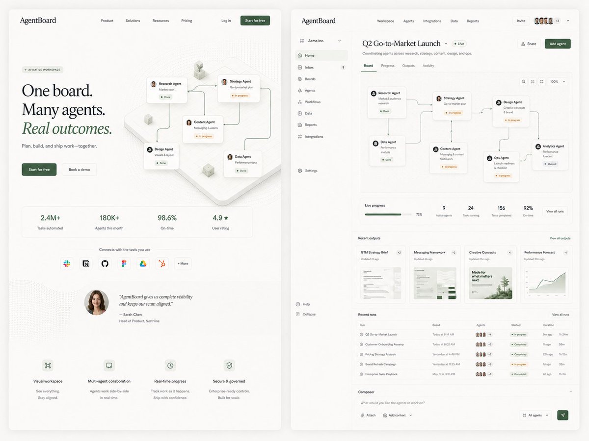
AgentBoard SaaS Landing and Dashboard UI
Generates a refined side-by-side SaaS landing page and dashboard mockup for an AI agent workspace, useful for product design exploration.
이것은 제품 및 상업 에 대한 GPT Image 2 프롬프트 사례입니다. 아래의 복사 가능한 프롬프트를 사용하여 유사한 시각 자료를 생성하고, 재사용하기 전에 Awesome GPT Image 2 Prompts 의 저작자 표시 및 상업적 사용 권한을 검토하십시오.
전체 프롬프트 세트가 필요하신가요? 다음을 사용하세요. 제품 및 상업 더 많은 관련 예시를 보려면 주제 허브를 열거나 다음을 열어보세요. GPT Image 2 프롬프트 카탈로그 전체 예제 색인, 재사용 가능한 구조 및 출처 표기는 다음을 참조하십시오.
Free 1K preview
Generate one preview image instantly, no sign-up required.
4000/4000
프롬프트
복사 준비 프롬프트
Goal: Create a polished editorial SaaS product exploration image for an AI agent collaboration platform called {argument name="product name" default="AgentBoard"}, showing two large web UI screens side by side on a warm off-white background: a marketing landing page on the left and the product dashboard on the right. Use refined startup design, soft shadows, rounded cards, thin gray dividers, lots of whitespace, muted forest-green accents, black serif display typography for the landing headline, and small clean sans-serif UI text.

Canvas: Wide 4:3 composition, approximately 1200×900. Place two tall browser-like panels with rounded corners and subtle drop shadows, separated by a narrow gutter. Background is light cream with faint grain and very soft vignette.

Left screen, marketing landing page: Top navigation bar with the logo text “AgentBoard” at top left, 4 centered nav links labeled Product, Solutions, Resources, Pricing, then Log in and a dark green “Start for free” button on the right. Hero area has a small pill label “AI-NATIVE WORKSPACE”, a large three-line headline reading “One board. Many agents. Real outcomes.” with “Real outcomes.” italic and green, supporting line “Plan, build, and ship work—together.”, and 2 CTA buttons: dark green “Start for free” and light outlined “Book a demo”. To the right of the hero text, show an isometric workflow board with exactly 5 connected agent cards: Research Agent, Strategy Agent, Content Agent, Design Agent, and Data Agent, linked by curved connector lines with small status chips such as Done and In progress. Below, include exactly 4 metric tiles: “2.4M+ Tasks automated”, “180K+ Agents this month”, “98.6% On-time”, and “4.9★ User rating”. Under the metrics, include a row labeled “Connects with the tools you use” with exactly 7 integration icons/buttons: Slack, Notion, GitHub, Figma, Google Drive, HubSpot, and “+ More”. Add a testimonial block with a circular female headshot and the quote “AgentBoard gives us complete visibility and keeps our team aligned.” credited to Sarah Chen, Head of Product, Northline. At the bottom, include exactly 4 feature blurbs with tiny line icons: Visual workspace, Multi-agent collaboration, Real-time progress, and Secure & governed.

Right screen, product dashboard: Create a dense but elegant web app interface. Top app bar shows “AgentBoard” on the left, main tabs Workspace, Agents, Integrations, Data, Reports, plus an Invite button, a row of 5 small user avatars, a “+3” badge, and a dropdown chevron. Left sidebar for workspace “Acme Inc.” with exactly 11 navigation items: Home, Inbox with an 8 badge, Boards, Agents, Workflows, Data, Reports, Integrations, Settings, Help, and Collapse. Main page title reads {argument name="dashboard title" default="Q2 Go-to-Market Launch"} with a green “Live” pill and subtitle “Coordinating agents across research, strategy, content, design, and ops.” Include Share and dark green Add agent buttons.

Dashboard content: Below the title, show exactly 4 tabs: Board, Progress, Outputs, Activity, with Board active. The main board canvas contains exactly 6 connected workflow cards arranged left-to-right with curved connector lines: Research Agent “Market & audience research” Done; Data Agent “Performance analysis” Done; Strategy Agent “Go-to-market plan” In progress; Content Agent “Messaging & content framework” In progress; Design Agent “Creative concepts & brand” In progress; Ops Agent “Launch readiness & checklist” In progress; Analytics Agent “Performance forecast” Queued. Include small board controls at top right: search icon, layout icon, fit icon, zoom “100%”, and dropdown.

Under the board, add a KPI strip with exactly 5 items: Live progress 72% with green progress bar, 9 Active agents, 24 Tasks running, 156 Tasks completed, and 92% On-time, plus a “View all runs” button. Add a Recent outputs section with exactly 4 document cards: GTM Strategy Brief, Messaging Framework, Creative Concepts, and Performance Forecast, each with a small preview thumbnail and update time. Add a Recent runs table with exactly 5 rows: Q2 Go-to-Market Launch, Customer Onboarding Revamp, Pricing Strategy Analysis, Brand Refresh Campaign, and Enterprise Sales Playbook; include tiny agent avatar clusters, colored status pills, started times, and durations. At the bottom, include a Composer input bar with placeholder “What would you like the agents to work on?”, buttons for Attach and Add context, an “All agents” dropdown, and a green send button.

Visual style: Premium minimal product mockup, realistic UI proportions, crisp vector-like rendering, tiny legible interface text where possible, subtle dotted background texture, pale beige cards, green status indicators, fine connector lines, modern editorial SaaS aesthetic suitable for a product-design exploration tweet.

Constraints: Use exactly 2 main screens, exactly 5 agent cards on the landing hero, exactly 4 metric tiles, exactly 7 integration icons, exactly 4 bottom feature blurbs, exactly 11 sidebar items, exactly 4 dashboard tabs, exactly 6 workflow agent cards on the dashboard board plus the queued Analytics card as the seventh endpoint, exactly 5 KPI items, exactly 4 output cards, and exactly 5 table rows. Do not add extra panels, watermarks, browser chrome, or decorative text beyond the described UI.
프롬프트 변수
프롬프트에 있는 편집 가능한 인수 자리 표시자와 해당 기본값입니다.
변하기 쉬운
product name
기본
AgentBoard
변하기 쉬운
dashboard title
기본
Q2 Go-to-Market Launch
Best for
- - 제품 및 상업 visual exploration
- - Image generation and reference-image edits
- - Reusable briefs that keep source attribution visible
Change these parts
- - Subject, product, character, or scene
- - Aspect ratio, camera, lighting, and background
- - Brand, text, color, and output constraints
Recommended model and settings
- - Model: gpt-image-2
- - Input mode: 텍스트 to 이미지
- - Aspect ratio: source
- - Commercial status: review original source
How to use this prompt
- 1. Copy the prompt and preserve its structure for the first test.
- 2. Replace the subject, context, and publishing channel.
- 3. Change one camera, lighting, or style variable per iteration.
- 4. Inspect the output, source, text, and rights before reuse.
Limitations, source, and reuse cautions
- - Generated output is an editable draft, not factual, legal, or rights evidence.
- - Review the linked source, people, brands, logos, text, and third-party media before commercial use.
Awesome GPT Image 2 Prompts 에서 가져왔습니다. 출처 표기가 필요합니다. 상업적 이용 가능 여부는 allowed 입니다. 유료 사용 전에 원저작권 정보를 확인하세요.
이 범주에 속하는 더 많은 사례
범주, 입력 방식 호환성, 품질 및 위험도에 따라 우선순위가 정해집니다.
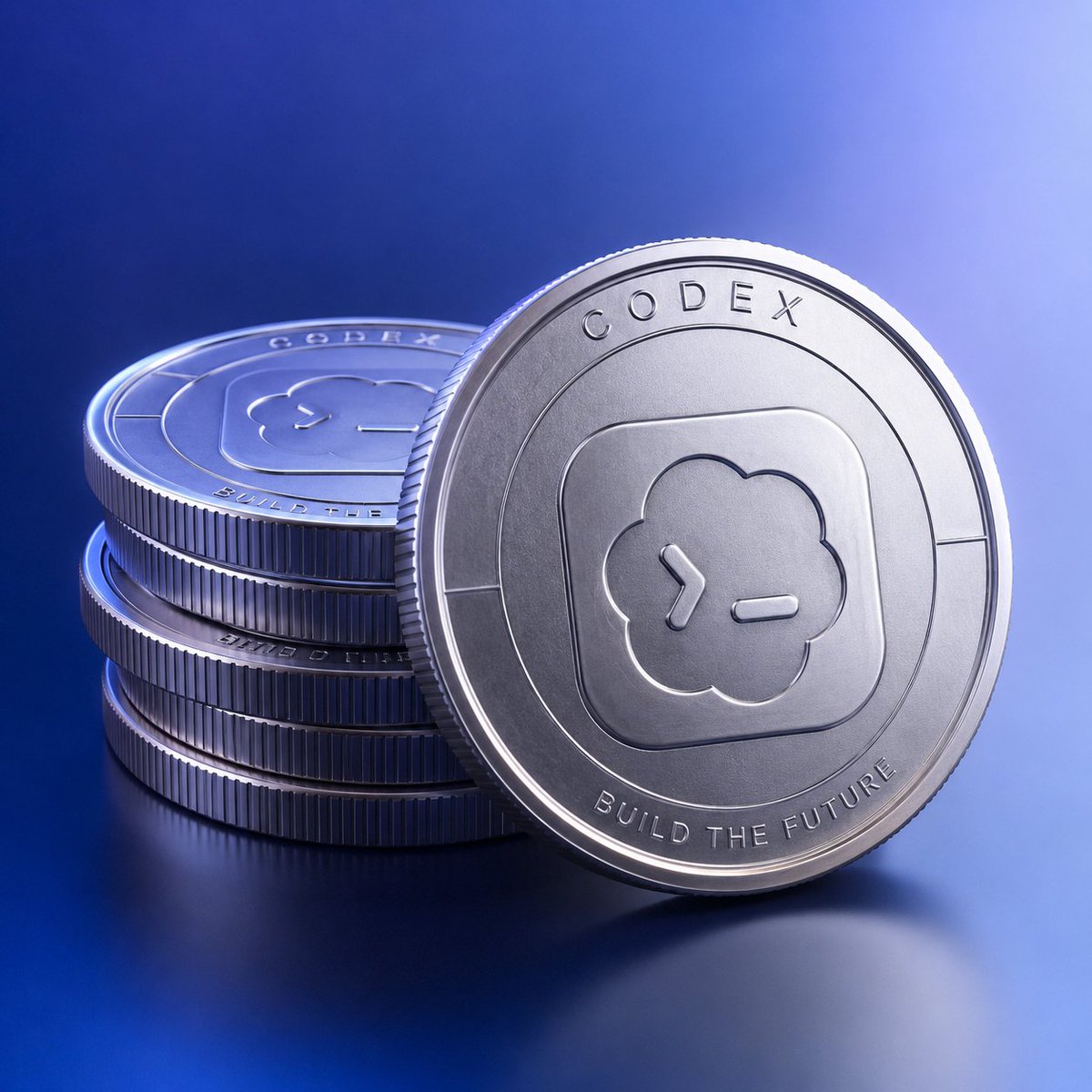

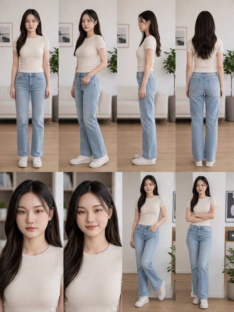
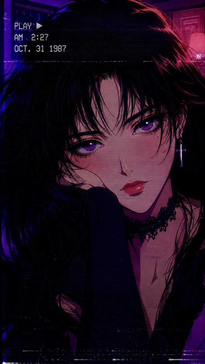

재사용 및 출처 참고 사항
사례를 미리 확인한 후 이 안내 메시지를 안전하게 사용하십시오.
- 1.프롬프트를 복사하거나 Dovoo의 생성 버튼을 사용하여 직접 엽니다.
- 2.사용 사례에 맞게 변수, 화면 비율 및 참조 이미지를 조정하십시오.
- 3.출판 또는 유료 사용 전에 저작권, 출처 표기 요건 및 브랜드 또는 초상권 관련 위험을 확인하십시오.