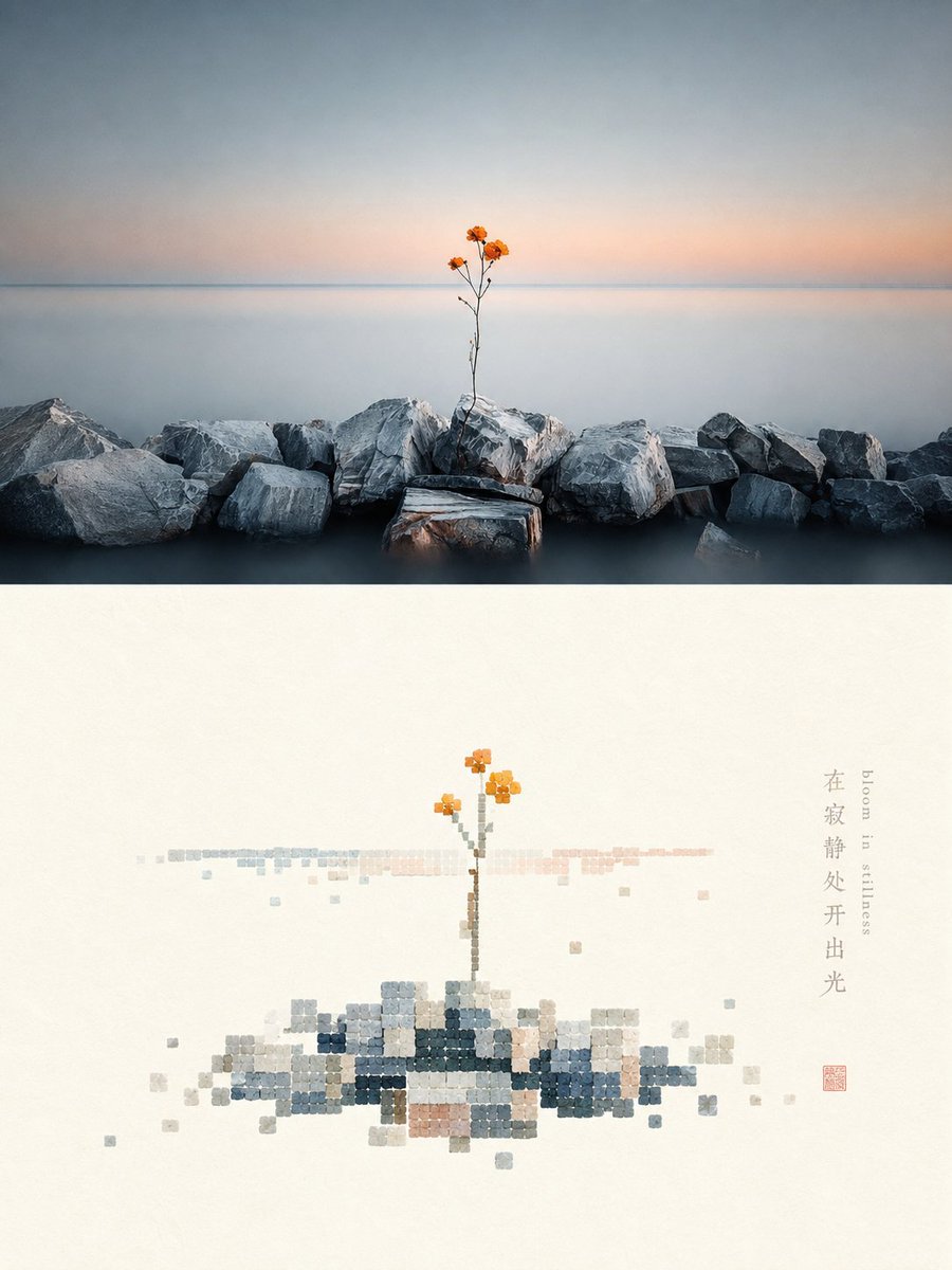
Shell-textured pixel art design poster
An image transformation prompt that converts an uploaded photo into a high-end design poster, splitting the frame into a real photo and a reconstructed shell-textured pixel art section.
これはグラフィック&ポスター向けのGPT Image 2プロンプトケースです。以下のコピー可能なプロンプトを使用して同様のビジュアルを生成し、再利用する前にAwesome GPT Image 2 Prompts帰属表示と商用利用権を確認してください。
プロンプトセット全体が必要ですか? グラフィック&ポスター 関連する例をもっと見るにはトピックハブを開くか、 GPT Image 2 プロンプトカタログ 完全な例の索引、再利用可能な構造、および出典の明記については、こちらをご覧ください。
Free 1K preview
Generate one preview image instantly, no sign-up required.
Free text preview doesn’t preserve reference-image consistency.
4000/4000
プロンプト
コピー準備完了プロンプト
Please turn each photo I upload into an independent high-end design poster, not a multi-image collage, with each photo output separately. The overall composition is a 3:4 vertical layout, with the upper and lower regions strictly 1:1 in height, each occupying 50% of the frame.

The upper part retains the original photo, maintaining the subject's identity, structure, posture, real texture, natural light and shadow, and original color atmosphere, with only slight high-end color grading to give it the texture of an art magazine, independent publication, or exhibition image. To adapt to the frame, the environmental background can be naturally extended, but the subject must not be stretched, distorted, or changed.

The lower part first understands the most memorable **subject, basic composition, perspective relationship, structural trend, visual memory points, and overall atmosphere** of the original photo, and then reconstructs it into a minimalist pixel landscape with a sense of material collage. Instead of completely copying the photo, delete irrelevant details and only keep the structures, trends, and visual memory points that best represent the original, summarizing them through the order of regular blocks and the texture of natural materials, so that people can instantly recognize its correspondence with the photo above.

Pixel modules are not standard digital color blocks, but like **small square and near-square fragments cut from rough shells, shell flakes, or natural mineral shell layers**. Maintain a clear geometric grid order, but the edges can be slightly chipped or not perfectly regular, with surfaces featuring natural bedding, powdery particles, slight bumps, wear, and uneven colors, mainly with a matte, natural, and gentle material feel. The core area of the subject is formed by relatively dense modules, with edges gradually decreasing, missing, breaking, and floating, allowing the form to naturally dissipate from clarity into white space. Strictly control the total number of modules to no more than 200, with individual module sizes being uniform or close to uniform, avoiding fine noise, standard mosaics, and a game pixel feel.

The composition maintains a relationship between **small-scale stamps and large areas of white space**, freely arranging positions based on the subject's own direction, proportion, and visual center, which can be off-center, edge-aligned, suspended, or partially cropped. The subject occupies about 30%–45% of the lower part, with the remaining space intentionally left blank. White space is not just a blank background, but a constituent element as important as the subject, module density, and disappearing boundaries, establishing a sense of breath, space, and pause through positive and negative forms, density, gathering and scattering, and asymmetric balance. It is better to delete information than to fill the screen, making the subject like a material stamp carefully placed on a large sheet of paper.

The color scheme extracts **the brightest, most vivid, and most vital colors from the upper photo and retunes them**, instead of taking average colors or faithfully copying original color values. Moderately increase brightness, purity, and transparency, naturally deriving clear sky blue, lake cyan, tender green, warm yellow, coral orange, peach pink, and other bright comprehensive colors from the original image, forming a warm and healing color rhythm through refreshing cold and warm relationships. Use a large amount of pure warm white or very light near-white coordinated with the original image's composite color temperature as a breathing space. The main colors are bright and energetic but not glaring, with local warm orange, golden yellow, coral red, or soft pink serving as sun-like highlight colors. Retain the slight natural color difference and bedding of the shell material itself, but avoid turning gray, old, or dirty. Avoid gray and dirty, old, low-saturation Morandi-style, dark brown filters, gloomy earth tones, fluorescent colors, and a cheap candy feel.

Text only makes minimal editorial intervention, with no language restrictions and no preset fixed titles or numbers. A small amount of words or short phrases can be freely extracted from the photo's subject, location, action, emotion, or metaphor, placed quietly in the white space or at the edge of the subject, forming a refined graphic relationship with the material modules without overwhelming the main subject.

The overall presentation is a high-end visual effect composed of **natural material collage, shell-textured pixels, regular geometric order, progressive fading, small-scale stamps, large-area artistic white space, and modern editorial layout**, more like a reconstructed poster from a contemporary material art and design studio rather than a common digital pixel painting. Avoid full duplication of photos, complex backgrounds, real details, standard solid color blocks, smooth vectors, plastic mosaics, strong pearlescence, game UI feel, filled screens, excessive text, and templated effects.
Best for
- - グラフィック&ポスター visual exploration
- - Image generation and reference-image edits
- - Reusable briefs that keep source attribution visible
Change these parts
- - Subject, product, character, or scene
- - Aspect ratio, camera, lighting, and background
- - Brand, text, color, and output constraints
Recommended model and settings
- - Model: gpt-image-2
- - Input mode: 画像から画像
- - Aspect ratio: source
- - Commercial status: review original source
How to use this prompt
- 1. Copy the prompt and preserve its structure for the first test.
- 2. Replace the subject, context, and publishing channel.
- 3. Change one camera, lighting, or style variable per iteration.
- 4. Inspect the output, source, text, and rights before reuse.
Limitations, source, and reuse cautions
- - Generated output is an editable draft, not factual, legal, or rights evidence.
- - Review the linked source, people, brands, logos, text, and third-party media before commercial use.
Awesome GPT Image 2 Promptsからインポートされました。出典の明記が必要です。商用利用の可否はallowedです。有料利用の前に、出典元の権利をご確認ください。
このカテゴリーのその他の事例
カテゴリー、入力モードの互換性、品質、およびリスクの低さに基づいて優先順位付けされています。
再利用と出典に関する注記
ケースを事前に確認してから、このプロンプトを安全に使用してください。
- 1.プロンプトをコピーするか、生成ボタンを使ってDovooで直接開いてください。
- 2.ご自身の用途に合わせて、変数、アスペクト比、および参照画像を調整してください。
- 3.公開または有料利用の前に、情報源の権利、帰属表示の要件、およびブランドまたは肖像権に関するリスクを確認してください。