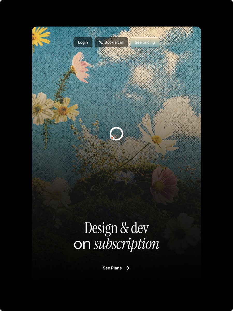
ハーフトーンの花柄ランディングページヒーロー
デザイン購読ランディングページ用の、ビンテージ風のハーフトーン花柄ウェブサイトヒーローモックアップを生成します。
これは製品および商業向けのGPT Image 2プロンプトケースです。以下のコピー可能なプロンプトを使用して同様のビジュアルを生成し、再利用する前にAwesome GPT Image 2 Prompts帰属表示と商用利用権を確認してください。
プロンプトセット全体が必要ですか? 製品および商業 関連する例をもっと見るにはトピックハブを開くか、 GPT Image 2 プロンプトカタログ 完全な例の索引、再利用可能な構造、および出典の明記については、こちらをご覧ください。
Free 1K preview
Generate one preview image instantly, no sign-up required.
2762/4000
プロンプト
コピー準備完了プロンプト
Goal: Create a polished vertical landing-page hero mockup for a design subscription service, with a nostalgic halftone editorial look and Figma-style web design precision.

Canvas: Portrait 3:4 image on a pure black outer background. Center a tall rounded-rectangle website card with large corner radius, occupying most of the frame and leaving thick black margins around it.

Main visual: Inside the card, use a dreamy upward-looking photograph-style scene of wildflowers against a blue sky with soft white clouds. Apply a strong vintage halftone dot texture across the entire card image. Add a dark black gradient overlay rising from the bottom so the lower half becomes moody and readable while the top remains bright sky blue. Visible floral elements should include exactly 9 main blossoms: 1 partial yellow flower in the top-left corner, 1 pink flower near the upper-left, 2 white daisies clustered left-middle, 1 large white cosmos on the right-middle, 1 white daisy near the bottom-left, 1 small bluish flower near lower center, 1 pink flower at lower-right, and 1 dark partially hidden white flower at the bottom-right edge, plus thin stems and tiny baby's-breath buds.

Top navigation: Place exactly 3 small pill buttons centered near the top of the card with subtle glass/blur styling and soft shadows. Button 1 text: "{argument name="login button text" default="Login"}" on a dark charcoal pill. Button 2 text: "{argument name="booking button text" default="Book a call"}" with a small white phone icon before the text on a warm dark translucent pill. Button 3 text: "{argument name="pricing button text" default="See pricing"}" on a pale frosted gray-blue pill. Use small clean sans-serif white text.

Center detail: Add one loading spinner in the middle of the card, made from a white circular ring with a small orange-red dot on the lower-left part of the ring. Keep it simple and crisp.

Hero typography: Near the lower third, center a large elegant white serif headline reading "{argument name="headline text" default="Design & dev\non subscription"}". The first line says “Design & dev”; the second line says “on subscription,” with the word “subscription” in italic serif. Use refined high-contrast type, generous letter spacing, and a luxurious editorial feel.

Call to action: Below the headline, center a small white CTA reading "{argument name="call to action text" default="See Plans"}" followed by a thin right arrow. Keep it minimal and aligned with the headline.

Style constraints: High-end web hero design, realistic floral sky background, halftone print texture, dark cinematic bottom fade, rounded card corners, no browser chrome, no extra logos, no watermark, no additional text beyond the 3 nav buttons, the headline, and the CTA.
プロンプト変数
プロンプトに表示される編集可能な引数プレースホルダーと、それらのデフォルト値。
変数
login button text
デフォルト
Login
変数
booking button text
デフォルト
Book a call
変数
pricing button text
デフォルト
See pricing
変数
headline text
デフォルト
Design & dev\non subscription
変数
call to action text
デフォルト
See Plans
Best for
- - 製品および商業 visual exploration
- - Image generation and reference-image edits
- - Reusable briefs that keep source attribution visible
Change these parts
- - Subject, product, character, or scene
- - Aspect ratio, camera, lighting, and background
- - Brand, text, color, and output constraints
Recommended model and settings
- - Model: gpt-image-2
- - Input mode: テキストから画像
- - Aspect ratio: source
- - Commercial status: review original source
How to use this prompt
- 1. Copy the prompt and preserve its structure for the first test.
- 2. Replace the subject, context, and publishing channel.
- 3. Change one camera, lighting, or style variable per iteration.
- 4. Inspect the output, source, text, and rights before reuse.
Limitations, source, and reuse cautions
- - Generated output is an editable draft, not factual, legal, or rights evidence.
- - Review the linked source, people, brands, logos, text, and third-party media before commercial use.
Awesome GPT Image 2 Promptsからインポートされました。出典の明記が必要です。商用利用の可否はallowedです。有料利用の前に、出典元の権利をご確認ください。
このカテゴリーのその他の事例
カテゴリー、入力モードの互換性、品質、およびリスクの低さに基づいて優先順位付けされています。
再利用と出典に関する注記
ケースを事前に確認してから、このプロンプトを安全に使用してください。
- 1.プロンプトをコピーするか、生成ボタンを使ってDovooで直接開いてください。
- 2.ご自身の用途に合わせて、変数、アスペクト比、および参照画像を調整してください。
- 3.公開または有料利用の前に、情報源の権利、帰属表示の要件、およびブランドまたは肖像権に関するリスクを確認してください。