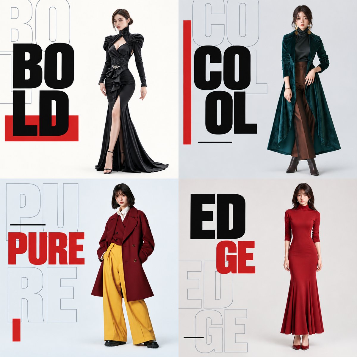
Fashion Campaign 4-Panel Collage Prompt
A sophisticated technical prompt for creating a 2x2 grid fashion campaign poster. It uses four reference images to maintain specific model features while applying a high-end typography design for a modern aesthetic.
これはグラフィック&ポスター向けのGPT Image 2プロンプトケースです。以下のコピー可能なプロンプトを使用して同様のビジュアルを生成し、再利用する前にAwesome GPT Image 2 Prompts帰属表示と商用利用権を確認してください。
プロンプトセット全体が必要ですか? グラフィック&ポスター 関連する例をもっと見るにはトピックハブを開くか、 GPT Image 2 プロンプトカタログ 完全な例の索引、再利用可能な構造、および出典の明記については、こちらをご覧ください。
Free 1K preview
Generate one preview image instantly, no sign-up required.
4000/4000
プロンプト
コピー準備完了プロンプト
Refer to the four attached full-body images of women and generate one square 4-panel image to be used as material for a fashion video.

[Final Form]
The overall aspect ratio is 1:1. Divide the screen into an even 2x2 grid, making each panel square. Place one woman in each panel for a total of four. In order of attachment, 1st = top left, 2nd = top right, 3rd = bottom left, 4th = bottom right. No outer borders, gaps between panels, or 3D frames are needed.

This is a modern fashion campaign featuring a sharp contrast between text size, solid fill and outlines, and overlapping versus empty space, using a limited range of elements. Keep the person's area clean and create a rich, art-directed composition for the text area. This is a poster image to be used as final video material. It should be a finished design, not a mockup. Each of the four images must stand as a complete poster on its own while maintaining unity as a whole.

[Maintaining Reference Subject: Priority Conditions Over Placement]
This is a common instruction set corresponding to the four full-body images of women provided by the user. Do not pre-set specific faces, body types, outfits, or hairstyles. The information for the person in each panel must come only from the image corresponding to that panel. Do not mix features or standardize the four women to a common face or model body type.

Maintain facial contours, eye/nose/mouth shapes and placement, expression, age, skin tone, hairstyle, and hair color exactly as shown in the reference. Maintain head-to-body ratio, neck length, shoulder width, torso length/width, hip width, limb length/thickness, and hand/foot size. Do not perform body corrections such as slimming the face, thinning the torso, lengthening legs, or stretching the body. Maintain the subject's pose, face/body orientation, gaze, arm/hand/leg positions, stance, and weight distribution. Do not flip horizontally. Carry over the shape, color, material, length, fit, and key folds or silhouettes of clothing, shoes, and accessories. Do not misinterpret loose clothing contours as body contours. Do not carry over the background, text, or borders of the reference photos.

[Method for Placing Subjects in Space]
Treat the person and clothing as a single unit, scaling them uniformly to place them. Do not apply different scaling to parts like the face, torso, or legs. Adjust placement while preserving the original silhouette rather than redrawing the pose to fit the frame. Ensure the entire outline, from top of head to soles of shoes, including hair and fingertips, fits within the panel. The height of the person should be roughly 80-85% of the panel height as a guide. If the subject has wide arms or clothing, scale down the whole person uniformly. Do not slim the body or cut off edges to fit. Set placement guides at y=7.5% and y=92.5% within the panel coordinate system. These are invisible guides. Place the whole person within these guides. Center the silhouette at y=50% while maintaining aspect ratio. Ensure visible clear space above the head and below the feet. Do not allow contact with the panel edges. Blend brightness and tone without changing silhouettes, and add subtle, natural contact shadows at the feet. Do not redraw features for 3D effect.

[Separation of Subject and Text]
The left ~35% of each panel is for typography, and the right ~65% is for the person. Do not draw a dividing line. Keep the person on the right and text/shapes on the left, ensuring no overlap with the body. Leave a clear gap. If fit is difficult, prioritize uniform scaling of the person.

[Typography Common Design]
Use the same condensed sans-serif font family, combining ultra-bold solid characters with bold outline characters. Design with size and layering without distorting characters. Use the following words: top left {argument name="top left text" default="BOLD"}, top right {argument name="top right text" default="COOL"}, bottom left {argument name="bottom left text" default="PURE"}, bottom right {argument name="bottom right text" default="EDGE"}. Use one main heading per panel, ensuring all letters are readable. Add one repeating outline of the same word as a supplementary element. Do not add other words or fine text. Maintain a clear size difference (helper text ~1.3-1.5x larger, in pale slate gray). Text overlaps should only happen in the left text area. No extreme perspective distortion or 3D effects. No barcodes or logos.

[Background and Color Palette]
Use bright backgrounds for all panels. Top left: ivory; Top right: cool gray; Bottom left: pale blue-gray; Bottom right: warm gray. Keep brightness levels similar. Avoid dark backgrounds. Use solid colors behind the person. Adjust brightness/warmth slightly to separate the silhouette naturally from the background. Main headings are ink black with vermilion red accents. Outlines are pale slate gray. Red is the same across all panels. Costume colors follow references.

[Composition of 4-Panel Text and Graphics]
Limit shapes to red rectangles and thin black lines. Strictly follow area separation. Create different compositions and centers of gravity for each panel.

Top Left - BOLD: Large solid text with offset outline overlap. Heading is BO/LD in two lines. Large black ultra-bold text occupies the upper-to-middle text area. One outline of BOLD is behind it, shifted slightly to the top left. Parts of the outline can be off-panel to the left.
プロンプト変数
プロンプトに表示される編集可能な引数プレースホルダーと、それらのデフォルト値。
変数
top left text
デフォルト
BOLD
変数
top right text
デフォルト
COOL
変数
bottom left text
デフォルト
PURE
変数
bottom right text
デフォルト
EDGE
Best for
- - グラフィック&ポスター visual exploration
- - Image generation and reference-image edits
- - Reusable briefs that keep source attribution visible
Change these parts
- - Subject, product, character, or scene
- - Aspect ratio, camera, lighting, and background
- - Brand, text, color, and output constraints
Recommended model and settings
- - Model: gpt-image-2
- - Input mode: テキストから画像
- - Aspect ratio: source
- - Commercial status: review original source
How to use this prompt
- 1. Copy the prompt and preserve its structure for the first test.
- 2. Replace the subject, context, and publishing channel.
- 3. Change one camera, lighting, or style variable per iteration.
- 4. Inspect the output, source, text, and rights before reuse.
Limitations, source, and reuse cautions
- - Generated output is an editable draft, not factual, legal, or rights evidence.
- - Review the linked source, people, brands, logos, text, and third-party media before commercial use.
Awesome GPT Image 2 Promptsからインポートされました。出典の明記が必要です。商用利用の可否はallowedです。有料利用の前に、出典元の権利をご確認ください。
このカテゴリーのその他の事例
カテゴリー、入力モードの互換性、品質、およびリスクの低さに基づいて優先順位付けされています。
再利用と出典に関する注記
ケースを事前に確認してから、このプロンプトを安全に使用してください。
- 1.プロンプトをコピーするか、生成ボタンを使ってDovooで直接開いてください。
- 2.ご自身の用途に合わせて、変数、アスペクト比、および参照画像を調整してください。
- 3.公開または有料利用の前に、情報源の権利、帰属表示の要件、およびブランドまたは肖像権に関するリスクを確認してください。