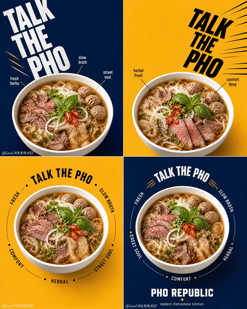
Pho Republic Campaign Grid
A 2x2 grid advertising campaign prompt for a noodle brand, focusing on consistent product photography with varied typographic styles.
Ini adalah contoh kasus GPT Image 2 untuk Produk & Komersial . Gunakan contoh siap salin di bawah ini untuk menghasilkan visual serupa, dan tinjau atribusi Awesome GPT Image 2 Prompts serta hak penggunaan komersial sebelum digunakan kembali.
Butuh seluruh rangkaian prompt? Gunakan Produk & Komersial Untuk contoh terkait lainnya, kunjungi pusat topik, atau buka GPT Image 2 katalog cepat untuk indeks contoh lengkap, struktur yang dapat digunakan kembali, dan atribusi sumber.
Free 1K preview
Generate one preview image instantly, no sign-up required.
4000/4000
Mengingatkan
Prompt siap salin
Create a flagship 2x2 campaign poster series for an original Vietnamese noodle brand named "PHO REPUBLIC", merging Orbit energy with Transit restraint. Use ultra-realistic commercial food photography, not illustration, not 3D render. The final artwork must present four coordinated square posters arranged in a strict 2x2 grid, each panel built from the same structural system with disciplined variation. The pho bowl must remain the absolute visual hero in every panel. Style lock: high-end graphic food advertising, bold editorial poster layout, product-first hierarchy, clean color-block backgrounds, oversized kinetic typography, youthful premium Asian street-dining branding, Cannes-level print campaign execution. Core campaign structure: four square panels with alternating deep navy blue and warm mustard yellow backgrounds. Each panel contains one large white pho bowl shown from the exact same slightly top-down camera angle. Bowl size, bowl height, bowl perspective, rim thickness, bowl diameter, and visual weight must be perfectly consistent across all four posters. The container must sit at an equal visual scale in every panel, acting as the fixed campaign anchor. Variation is allowed only in typography rhythm, circular text paths, callout placement, and directional movement around the bowl. Transit logic: simplify every panel so the layout feels flagship and globally polished. Reduce small labels, reduce decorative callouts, shorten copy, preserve more clean negative space, and let the bowl, background block, and primary typography do most of the work. Avoid flyer-like density. Each square should feel graphic, premium, and instantly readable. Orbit logic: create a coordinated movement system across the full 2x2 set. Panel one uses a strong descending diagonal text flow, panel two uses a mirrored inward-driving diagonal, panel three uses a controlled circular orbit around the bowl, and panel four uses a tighter circular return path that visually resolves the campaign. The four panels should feel like one connected visual sequence: launch, counter, orbit, resolve. Motion must feel crisp and graphic, not noisy. Food design: create a premium beef pho hero dish with richly detailed ingredients: glowing amber broth, thin rice noodles, sliced beef, beef balls, tendon or tripe accents, basil leaves, scallions, red chili slices, onion, fresh herbs, and subtle broth sheen. Ingredient styling may shift slightly between panels, but the bowl size and bowl dominance must never change. The dish must feel abundant, fragrant, hot, and highly craveable. Panel logic: 1. Top-left panel: deep navy background, oversized stacked headline moving diagonally from upper-left toward center, bowl anchored in the lower-middle zone, a few restrained callout markers near the rim. 2. Top-right panel: mustard background, mirrored bold typography driving inward from upper-right toward center seam, bowl anchored at the same scale and height as panel one, minimal graphic accents only. 3. Bottom-left panel: mustard background, centered bowl with a clean circular text orbit around it, fewer callouts than the top row, stronger negative space. 4. Bottom-right panel: deep navy background, centered bowl matching panel three exactly in scale and placement, tighter orbit text and a compact brand footer block to conclude the campaign. Typography and branding: use original English text only, never copy any existing wording. Use a bold master phrase such as "TALK THE PHO" as the campaign anchor across the series, varied in scale and rhythm but always consistent in brand voice. Add only a few short descriptors such as "fresh", "slow broth", "street soul", "herbal", and "comfort". Include a compact brand block reading "PHO REPUBLIC" with a subtitle such as "modern Vietnamese kitchen". Typography should feel oversized, architectural, witty, and kinetic, but always secondary to the bowls. Lighting: bright controlled studio food lighting with soft frontal illumination and subtle side shaping. The broth must glow warmly, herbs must feel crisp and fresh, meat textures must remain moist and realistic, and the white ceramic bowls must look clean, glossy, and dimensional. Keep shadows soft and controlled, with no muddy contrast. Materials and realism: realistic white ceramic bowls with identical shape and scale across all four posters, hot glossy broth, tender beef textures, springy noodles, fresh basil, crisp chili slices, subtle oil shimmer, clean matte background fields, premium print-ready sharpness, and integrated graphic elements that feel designed rather than pasted. Color system: strict alternating navy blue and mustard yellow fields, with restrained accents of red, white, black, and herb green. Keep the palette disciplined, high-contrast, and premium. Food colors must remain natural and appetizing. Quality and physical rules: all four panels must feel like one unified flagship campaign. Equal bowl size across every panel is mandatory. Equal bowl camera angle, equal bowl scale, equal bowl visual weight, and equal product dominance must be preserved. Keep the campaign clean, graphic, premium, and highly legible. No clutter, no warped rims, no type collisions, no weak food detail, no dead black patches, no oversaturated broth. Negative prompt: copied branding, copied text, inconsistent bowl sizes, inconsistent bowl height, inconsistent bowl perspective, different container scale between panels, warped bowl rims, blurry food, fake broth texture, messy layout, chaotic typography, cheap flyer look, low-resolution print feel, oversaturated food colors, excessive labels, cluttered callouts, cartoon rendering, CGI look, illustration style, product losing dominance, muddy shadows, dirty background.
Best for
- - Produk & Komersial visual exploration
- - Image generation and reference-image edits
- - Reusable briefs that keep source attribution visible
Change these parts
- - Subject, product, character, or scene
- - Aspect ratio, camera, lighting, and background
- - Brand, text, color, and output constraints
Recommended model and settings
- - Model: gpt-image-2
- - Input mode: Teks ke Gambar
- - Aspect ratio: source
- - Commercial status: review original source
How to use this prompt
- 1. Copy the prompt and preserve its structure for the first test.
- 2. Replace the subject, context, and publishing channel.
- 3. Change one camera, lighting, or style variable per iteration.
- 4. Inspect the output, source, text, and rights before reuse.
Limitations, source, and reuse cautions
- - Generated output is an editable draft, not factual, legal, or rights evidence.
- - Review the linked source, people, brands, logos, text, and third-party media before commercial use.
Diimpor dari Awesome GPT Image 2 Prompts . Atribusi diperlukan. Status penggunaan komersial adalah allowed ; tinjau hak sumber sebelum penggunaan berbayar.
Lebih banyak kasus dalam kategori ini
Diprioritaskan berdasarkan kategori, kompatibilitas mode input, kualitas, dan risiko yang lebih rendah.
Catatan penggunaan kembali dan sumber
Gunakan perintah ini dengan aman setelah melihat pratinjau kasus.
- 1.Salin perintah tersebut atau buka langsung di Dovoo dengan tombol pembuatan.
- 2.Sesuaikan variabel, rasio aspek, dan gambar referensi untuk kebutuhan Anda sendiri.
- 3.Sebelum mempublikasikan atau menggunakan untuk tujuan berbayar, verifikasi hak sumber, persyaratan atribusi, dan risiko merek atau citra.