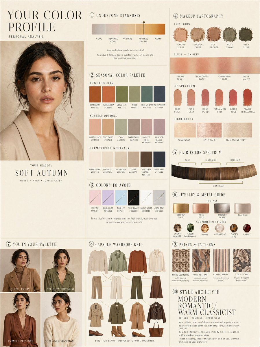
Tata letak profil warna pribadi mewah
Sebuah panduan tata letak editorial kompleks 10 panel untuk analisis warna pribadi, termasuk contoh warna dan grid lemari pakaian kapsul.
Ini adalah contoh kasus GPT Image 2 untuk Grafis & Poster . Gunakan contoh siap salin di bawah ini untuk menghasilkan visual serupa, dan tinjau atribusi Awesome GPT Image 2 Prompts serta hak penggunaan komersial sebelum digunakan kembali.
Butuh seluruh rangkaian prompt? Gunakan Grafis & Poster Untuk contoh terkait lainnya, kunjungi pusat topik, atau buka GPT Image 2 katalog cepat untuk indeks contoh lengkap, struktur yang dapat digunakan kembali, dan atribusi sumber.
Free 1K preview
Generate one preview image instantly, no sign-up required.
2671/4000
Mengingatkan
Prompt siap salin
LUXURY PERSONAL COLOR PROFILE — EDITORIAL LAYOUT
Studio portrait of subject as anchor — skin retouched to luminous glass-like perfection, preserved natural structure, realistic pore texture, soft directional key lighting, no facial alteration. Background: warm ecru parchment with subtle linen grain texture. Layout reads like a Vogue Italia beauty supplement printed on heavyweight matte stock. Structured editorial grid, 3-column asymmetric, wide negative space, serif condensed display headers, all labels in spaced uppercase tracking, cohesive warm ivory/sand/ecru background system throughout all panels, ultra-photorealistic 8K, soft diffused studio lighting, flat elegant surfaces, no drop shadows.
PANELS:
① UNDERTONE DIAGNOSIS — Tonal spectrum bar from cool ash to warm amber, precision needle marker on subject's reading. Labels: Cool / Neutral-Cool / Neutral / Neutral-Warm / Warm. Fine annotation text.
② SEASONAL COLOR PALETTE — 10–12 fabric-textured swatches in subject's optimal season. Each labeled with poetic color name and HEX. Grouped: Power Colors / Softest Options / Harmonizing Neutrals.
③ COLORS TO AVOID — Desaturated row of clashing tones with fine editorial strikethrough. Clean, non-harsh presentation.
④ MAKEUP CARTOGRAPHY — Eyeshadow gradient dust swatches / blush tones fanned on skin strip / lip spectrum barely-there to bold / highlighter finishes labeled: champagne, rose gold, pearlescent ivory.
⑤ HAIR COLOR SPECTRUM — Curved gradient strip: base, dimension, highlight, contrast tones. Gold bracket indicators on best options.
⑥ JEWELRY & METAL GUIDE — Flat-lay editorial render: yellow gold, rose gold, oxidized silver, platinum finishes alongside complementary stone tones. Minimal styling.
⑦ YOU IN YOUR PALETTE — 3–4 editorial lookbook frames, subject in palette-correct outfits. Mood labels: Quiet Luxury / Off-Duty Editorial / Evening Presence.
⑧ CAPSULE WARDROBE GRID — Outfit flatlay: tops, bottoms, outerwear, shoes, bag — all palette-correct. Coordinating lines showing interchangeability. Net-a-Porter editorial aesthetic.
⑨ PRINTS & PATTERNS — 4 fabric print thumbnails: micro geometric, tonal abstract, classic stripe, floral scale. One-line styling note per print.
⑩ STYLE ARCHETYPE — Single typographic panel. Style identity title set large (e.g. "Modern Romantic / Warm Classicist"). Three defining aesthetic words. Four-line editorial wardrobe philosophy note.
RENDER SPECS: Ultra-photorealistic, 8K, editorial magazine print quality, warm neutral color grading, soft diffused studio lighting consistent across all panels, one serif display font + one fine sans-serif body font, no gradients, flat matte surfaces only.
Best for
- - Grafis & Poster visual exploration
- - Image generation and reference-image edits
- - Reusable briefs that keep source attribution visible
Change these parts
- - Subject, product, character, or scene
- - Aspect ratio, camera, lighting, and background
- - Brand, text, color, and output constraints
Recommended model and settings
- - Model: gpt-image-2
- - Input mode: Teks ke Gambar
- - Aspect ratio: source
- - Commercial status: review original source
How to use this prompt
- 1. Copy the prompt and preserve its structure for the first test.
- 2. Replace the subject, context, and publishing channel.
- 3. Change one camera, lighting, or style variable per iteration.
- 4. Inspect the output, source, text, and rights before reuse.
Limitations, source, and reuse cautions
- - Generated output is an editable draft, not factual, legal, or rights evidence.
- - Review the linked source, people, brands, logos, text, and third-party media before commercial use.
Diimpor dari Awesome GPT Image 2 Prompts . Atribusi diperlukan. Status penggunaan komersial adalah allowed ; tinjau hak sumber sebelum penggunaan berbayar.
Lebih banyak kasus dalam kategori ini
Diprioritaskan berdasarkan kategori, kompatibilitas mode input, kualitas, dan risiko yang lebih rendah.
Catatan penggunaan kembali dan sumber
Gunakan perintah ini dengan aman setelah melihat pratinjau kasus.
- 1.Salin perintah tersebut atau buka langsung di Dovoo dengan tombol pembuatan.
- 2.Sesuaikan variabel, rasio aspek, dan gambar referensi untuk kebutuhan Anda sendiri.
- 3.Sebelum mempublikasikan atau menggunakan untuk tujuan berbayar, verifikasi hak sumber, persyaratan atribusi, dan risiko merek atau citra.