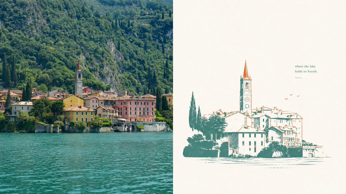
Lake Como Two-Color Print Diptych
Generates a split-screen travel composition pairing a realistic lakeside village photograph with a minimalist two-color vintage print version.
Il s'agit d'un exemple de visuel pour la catégorie { GPT Image 2 Graphique et affiche . Utilisez le visuel ci-dessous pour générer des éléments visuels similaires et vérifiez les conditions d'utilisation (attribution Awesome GPT Image 2 Prompts et droits d'utilisation commerciale) avant toute réutilisation.
Besoin de l'ensemble complet des invites ? Utilisez le Graphique et affiche Consultez le centre thématique pour plus d'exemples connexes, ou ouvrez le GPT Image 2 catalogue rapide pour l'index complet des exemples, les structures réutilisables et l'attribution des sources.
Free 1K preview
Generate one preview image instantly, no sign-up required.
2509/4000
Prompt
invite prête à être copiée
Goal: Create a two-panel horizontal composition comparing a real lakeside village photo with a simplified two-color misregistered print illustration of the same scene.

Canvas: Wide 16:9 landscape canvas, split exactly into 2 equal vertical panels.

Layout: Left panel is a realistic travel photograph; right panel is a minimalist poster-style illustration on warm off-white paper. No border between panels except the clean vertical split.

Left panel: Show a picturesque European lakeside village at the base of a steep, densely forested mountain. Include turquoise lake water filling the lower third, a row of pastel waterfront buildings in yellow, pink, cream, and terracotta, and one prominent church bell tower with a pointed reddish spire near the center-left. The mountain behind is lush deep green with rocky patches and tall dark cypress trees. Lighting is natural daylight, crisp but slightly softened, like a travel photo of Lake Como.

Right panel: Recreate the same village as a vintage two-color screenprint / risograph-style illustration. Use exactly 2 ink colors: teal-green for shadows, trees, outlines, and water marks; rusty orange for roof accents, tower spire, birds, and selective line details. Background is mostly empty warm ivory paper with subtle grain. The village illustration sits in the lower half, slightly right of center, with a tall church tower rising above the roofs. Lines are intentionally imperfect with slight color misregistration, sparse hatching, and broken ink texture. Add exactly 3 small orange birds to the upper right of the village. Add exactly 1 short quote above the illustration on the upper right reading {argument name="quote" default="where the lake\nholds its breath."} and exactly 1 small horizontal teal line underneath it.

Style: Editorial travel-poster aesthetic, quiet negative space, elegant imperfect printmaking, two-color ink, calm lake atmosphere, refined minimalism, nostalgic European village mood.

Parameters: The scene is {argument name="location" default="a Lake Como waterfront village"}; the main ink colors are {argument name="primary ink color" default="deep teal-green"} and {argument name="accent ink color" default="rusty orange"}; the paper background is {argument name="paper color" default="warm ivory"}.

Constraints: Use exactly 2 panels, exactly 2 ink colors in the right panel, exactly 3 birds, exactly 1 quote block, and exactly 1 underline. Do not add logos, watermarks, extra captions, people, boats, or modern objects.
Variables d'invite
Espaces réservés aux arguments modifiables présents dans l'invite, avec leurs valeurs par défaut.
Variable
quote
Défaut
where the lake\nholds its breath.
Variable
location
Défaut
a Lake Como waterfront village
Variable
primary ink color
Défaut
deep teal-green
Variable
accent ink color
Défaut
rusty orange
Variable
paper color
Défaut
warm ivory
Best for
- - Graphique et affiche visual exploration
- - Image generation and reference-image edits
- - Reusable briefs that keep source attribution visible
Change these parts
- - Subject, product, character, or scene
- - Aspect ratio, camera, lighting, and background
- - Brand, text, color, and output constraints
Recommended model and settings
- - Model: gpt-image-2
- - Input mode: Texte vers image
- - Aspect ratio: source
- - Commercial status: review original source
How to use this prompt
- 1. Copy the prompt and preserve its structure for the first test.
- 2. Replace the subject, context, and publishing channel.
- 3. Change one camera, lighting, or style variable per iteration.
- 4. Inspect the output, source, text, and rights before reuse.
Limitations, source, and reuse cautions
- - Generated output is an editable draft, not factual, legal, or rights evidence.
- - Review the linked source, people, brands, logos, text, and third-party media before commercial use.
Importé de Awesome GPT Image 2 Prompts . L'attribution est requise. Le statut d'utilisation commerciale est allowed ; veuillez vérifier les droits d'auteur avant toute utilisation payante.
Plus de cas dans cette catégorie
Priorisé par catégorie, compatibilité du mode d'entrée, qualité et risque moindre.

Réutilisation et notes de source
Utilisez cette invite en toute sécurité après avoir prévisualisé le dossier.
- 1.Copiez l'invite ou ouvrez-la directement dans Dovoo avec le bouton de génération.
- 2.Ajustez les variables, le format d'image et les images de référence en fonction de votre cas d'utilisation.
- 3.Avant toute publication ou utilisation payante, vérifiez les droits d'auteur, les exigences d'attribution et les risques liés à la marque ou à l'image.