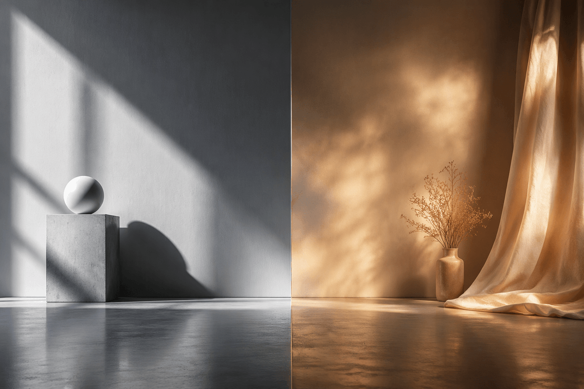
Split-Screen Hard vs Soft Light Interior
A photorealistic side-by-side studio scene comparing crisp cool hard sunlight with warm diffused atmospheric light for cinematic visual studies.
Il s'agit d'un exemple de visuel pour la catégorie { GPT Image 2 Intérieur et architecture . Utilisez le visuel ci-dessous pour générer des éléments visuels similaires et vérifiez les conditions d'utilisation (attribution Awesome GPT Image 2 Prompts et droits d'utilisation commerciale) avant toute réutilisation.
Besoin de l'ensemble complet des invites ? Utilisez le Intérieur et architecture Consultez le centre thématique pour plus d'exemples connexes, ou ouvrez le GPT Image 2 catalogue rapide pour l'index complet des exemples, les structures réutilisables et l'attribution des sources.
Free 1K preview
Generate one preview image instantly, no sign-up required.
1554/4000
Prompt
invite prête à être copiée
Create a photorealistic cinematic split-screen interior still comparing two lighting moods, divided exactly down the vertical center by a thin straight seam. On the left half, show a cool monochrome minimalist studio corner with a smooth gray plaster wall and polished concrete floor; include exactly 2 geometric objects: a square concrete pedestal block near the lower left-center and a matte white sphere resting on top of it. Strong hard sunlight enters from an unseen window at the upper left, casting sharp diagonal window-frame shadows across the wall, the pedestal, and the floor, with a crisp oval shadow from the sphere. On the right half, show a warm amber-toned bohemian corner with a textured brown plaster wall and reflective concrete floor; include exactly 3 main objects: one small ceramic vase on the floor, one delicate bundle of dried branches inside the vase, and one sheer golden curtain hanging from the top right and pooling onto the floor. The right side lighting should be soft, diffused, glowing, and atmospheric, with mottled golden sunlight patterns on the wall and curtain. Use a wide 3:2 horizontal composition, symmetrical comparison layout, low camera height, realistic material textures, subtle floor reflections, no people, no text, no logos. The overall concept is {argument name="comparison theme" default="hard light versus soft light"}, with the left side in {argument name="left color mood" default="cool grayscale minimalism"} and the right side in {argument name="right color mood" default="warm golden ambience"}.Variables d'invite
Espaces réservés aux arguments modifiables présents dans l'invite, avec leurs valeurs par défaut.
Variable
comparison theme
Défaut
hard light versus soft light
Variable
left color mood
Défaut
cool grayscale minimalism
Variable
right color mood
Défaut
warm golden ambience
Best for
- - Intérieur et architecture visual exploration
- - Image generation and reference-image edits
- - Reusable briefs that keep source attribution visible
Change these parts
- - Subject, product, character, or scene
- - Aspect ratio, camera, lighting, and background
- - Brand, text, color, and output constraints
Recommended model and settings
- - Model: gpt-image-2
- - Input mode: Texte vers image
- - Aspect ratio: source
- - Commercial status: review original source
How to use this prompt
- 1. Copy the prompt and preserve its structure for the first test.
- 2. Replace the subject, context, and publishing channel.
- 3. Change one camera, lighting, or style variable per iteration.
- 4. Inspect the output, source, text, and rights before reuse.
Limitations, source, and reuse cautions
- - Generated output is an editable draft, not factual, legal, or rights evidence.
- - Review the linked source, people, brands, logos, text, and third-party media before commercial use.
Importé de Awesome GPT Image 2 Prompts . L'attribution est requise. Le statut d'utilisation commerciale est allowed ; veuillez vérifier les droits d'auteur avant toute utilisation payante.
Plus de cas dans cette catégorie
Priorisé par catégorie, compatibilité du mode d'entrée, qualité et risque moindre.
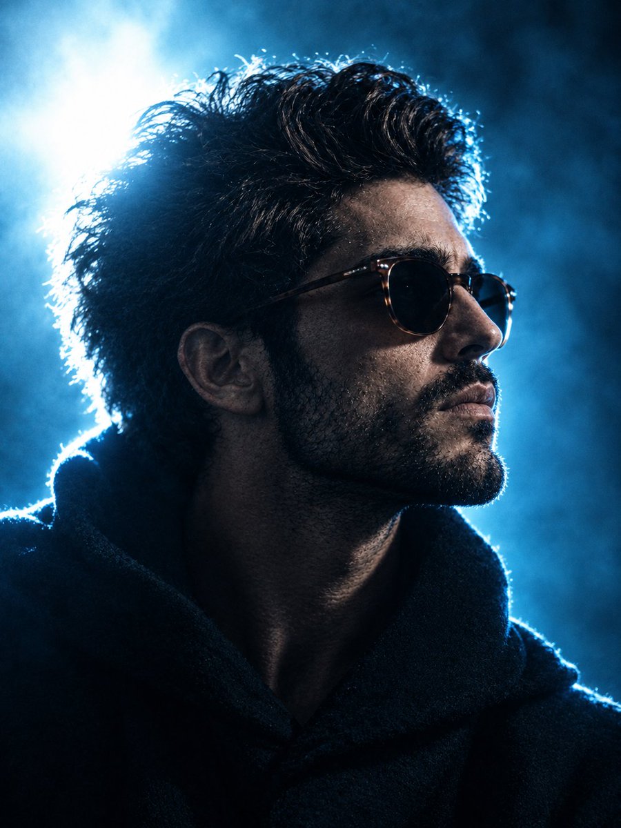
Cinematic Blue Backlit Portrait
Texte vers image

Studio Portrait of Woman with Sunglasses
Texte vers image
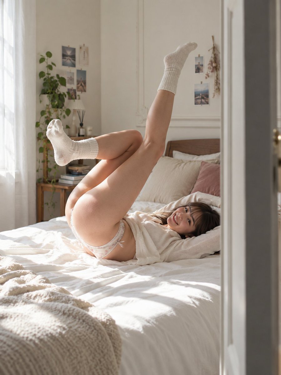
Morning Bed Stretching Legs Prompt
Texte vers image
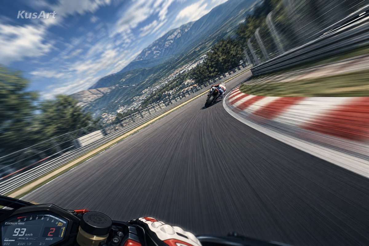
MotoGP POV Cornering Shot
Texte vers image
Tuxedo Cat Photo and Line Art Diptych
Texte vers image
GPT Image 2 Prompt: Garden Dappled Light
Texte vers image
Réutilisation et notes de source
Utilisez cette invite en toute sécurité après avoir prévisualisé le dossier.
- 1.Copiez l'invite ou ouvrez-la directement dans Dovoo avec le bouton de génération.
- 2.Ajustez les variables, le format d'image et les images de référence en fonction de votre cas d'utilisation.
- 3.Avant toute publication ou utilisation payante, vérifiez les droits d'auteur, les exigences d'attribution et les risques liés à la marque ou à l'image.