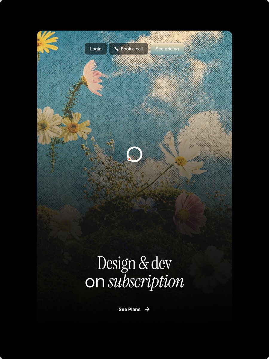
Image principale de la page d'accueil florale en demi-teintes
Génère une maquette de page d'accueil de site web vintage à motif floral en demi-teintes pour un abonnement de design.
Il s'agit d'un exemple de visuel pour la catégorie { GPT Image 2 Produit et commercial . Utilisez le visuel ci-dessous pour générer des éléments visuels similaires et vérifiez les conditions d'utilisation (attribution Awesome GPT Image 2 Prompts et droits d'utilisation commerciale) avant toute réutilisation.
Besoin de l'ensemble complet des invites ? Utilisez le Produit et commercial Consultez le centre thématique pour plus d'exemples connexes, ou ouvrez le GPT Image 2 catalogue rapide pour l'index complet des exemples, les structures réutilisables et l'attribution des sources.
Free 1K preview
Generate one preview image instantly, no sign-up required.
2762/4000
Prompt
invite prête à être copiée
Goal: Create a polished vertical landing-page hero mockup for a design subscription service, with a nostalgic halftone editorial look and Figma-style web design precision.

Canvas: Portrait 3:4 image on a pure black outer background. Center a tall rounded-rectangle website card with large corner radius, occupying most of the frame and leaving thick black margins around it.

Main visual: Inside the card, use a dreamy upward-looking photograph-style scene of wildflowers against a blue sky with soft white clouds. Apply a strong vintage halftone dot texture across the entire card image. Add a dark black gradient overlay rising from the bottom so the lower half becomes moody and readable while the top remains bright sky blue. Visible floral elements should include exactly 9 main blossoms: 1 partial yellow flower in the top-left corner, 1 pink flower near the upper-left, 2 white daisies clustered left-middle, 1 large white cosmos on the right-middle, 1 white daisy near the bottom-left, 1 small bluish flower near lower center, 1 pink flower at lower-right, and 1 dark partially hidden white flower at the bottom-right edge, plus thin stems and tiny baby's-breath buds.

Top navigation: Place exactly 3 small pill buttons centered near the top of the card with subtle glass/blur styling and soft shadows. Button 1 text: "{argument name="login button text" default="Login"}" on a dark charcoal pill. Button 2 text: "{argument name="booking button text" default="Book a call"}" with a small white phone icon before the text on a warm dark translucent pill. Button 3 text: "{argument name="pricing button text" default="See pricing"}" on a pale frosted gray-blue pill. Use small clean sans-serif white text.

Center detail: Add one loading spinner in the middle of the card, made from a white circular ring with a small orange-red dot on the lower-left part of the ring. Keep it simple and crisp.

Hero typography: Near the lower third, center a large elegant white serif headline reading "{argument name="headline text" default="Design & dev\non subscription"}". The first line says “Design & dev”; the second line says “on subscription,” with the word “subscription” in italic serif. Use refined high-contrast type, generous letter spacing, and a luxurious editorial feel.

Call to action: Below the headline, center a small white CTA reading "{argument name="call to action text" default="See Plans"}" followed by a thin right arrow. Keep it minimal and aligned with the headline.

Style constraints: High-end web hero design, realistic floral sky background, halftone print texture, dark cinematic bottom fade, rounded card corners, no browser chrome, no extra logos, no watermark, no additional text beyond the 3 nav buttons, the headline, and the CTA.
Variables d'invite
Espaces réservés aux arguments modifiables présents dans l'invite, avec leurs valeurs par défaut.
Variable
login button text
Défaut
Login
Variable
booking button text
Défaut
Book a call
Variable
pricing button text
Défaut
See pricing
Variable
headline text
Défaut
Design & dev\non subscription
Variable
call to action text
Défaut
See Plans
Best for
- - Produit et commercial visual exploration
- - Image generation and reference-image edits
- - Reusable briefs that keep source attribution visible
Change these parts
- - Subject, product, character, or scene
- - Aspect ratio, camera, lighting, and background
- - Brand, text, color, and output constraints
Recommended model and settings
- - Model: gpt-image-2
- - Input mode: Texte vers image
- - Aspect ratio: source
- - Commercial status: review original source
How to use this prompt
- 1. Copy the prompt and preserve its structure for the first test.
- 2. Replace the subject, context, and publishing channel.
- 3. Change one camera, lighting, or style variable per iteration.
- 4. Inspect the output, source, text, and rights before reuse.
Limitations, source, and reuse cautions
- - Generated output is an editable draft, not factual, legal, or rights evidence.
- - Review the linked source, people, brands, logos, text, and third-party media before commercial use.
Importé de Awesome GPT Image 2 Prompts . L'attribution est requise. Le statut d'utilisation commerciale est allowed ; veuillez vérifier les droits d'auteur avant toute utilisation payante.
Plus de cas dans cette catégorie
Priorisé par catégorie, compatibilité du mode d'entrée, qualité et risque moindre.
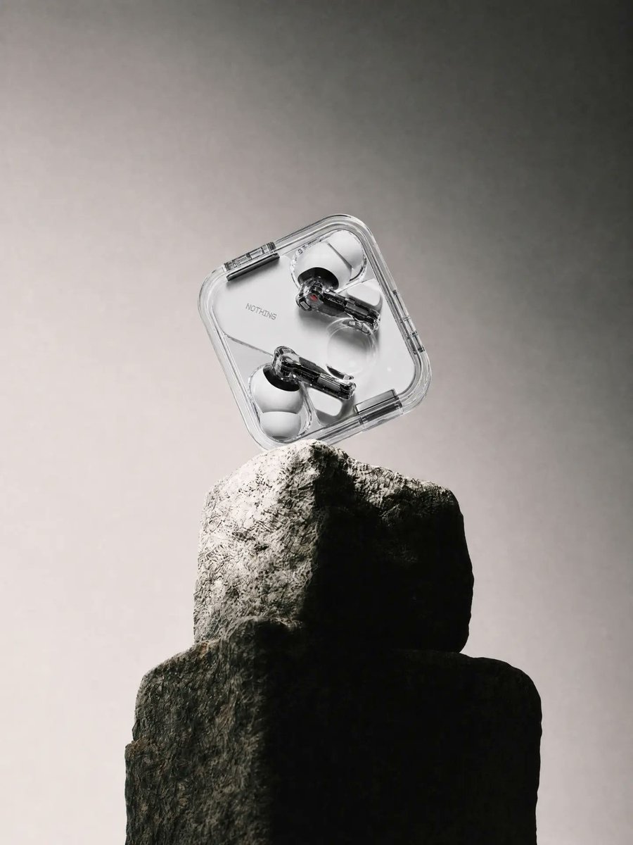
Transparent Earbuds on Stone Pedestal
Texte vers image
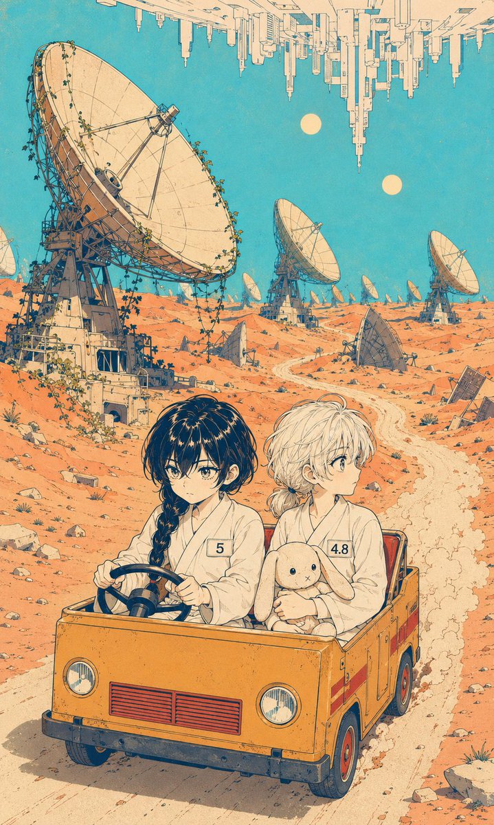
Manga Desert Radio Telescope Road Trip
Texte vers image
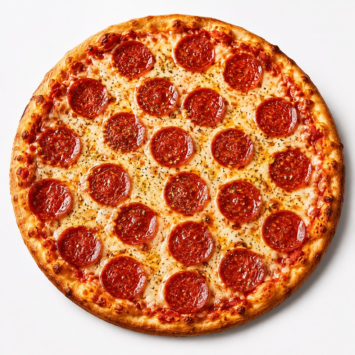
Overhead Pepperoni Pizza Photo
Texte vers image
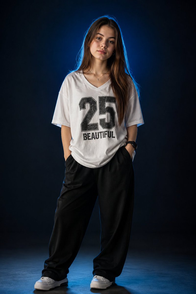
Fashion Studio Portrait with Blue Rim Lighting
Texte vers image
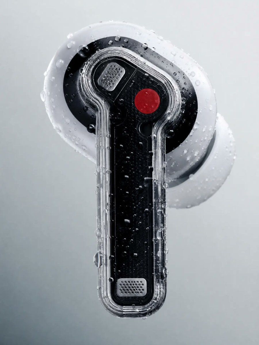
Wet Transparent Earbud Macro
Texte vers image
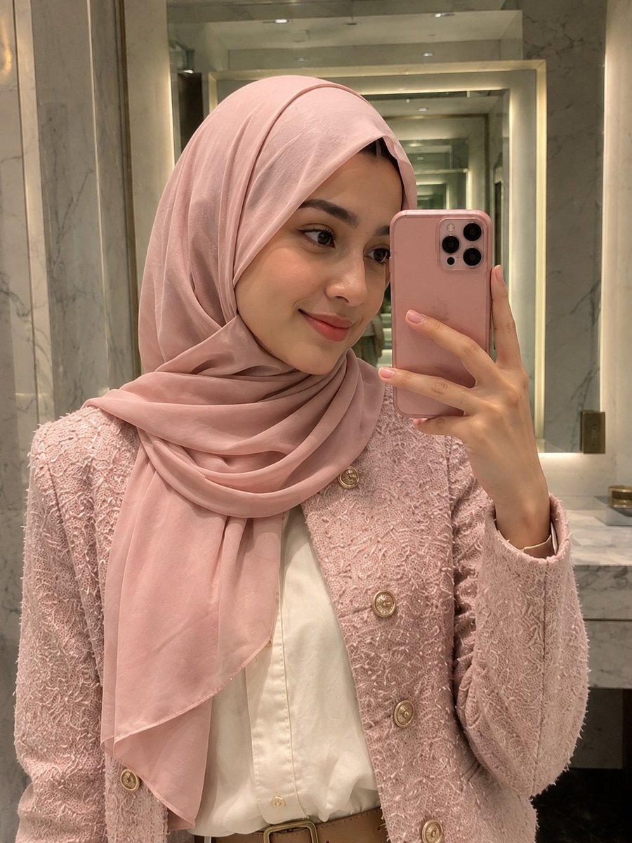
Pink Hijab Mirror Selfie Portrait
Texte vers image
Réutilisation et notes de source
Utilisez cette invite en toute sécurité après avoir prévisualisé le dossier.
- 1.Copiez l'invite ou ouvrez-la directement dans Dovoo avec le bouton de génération.
- 2.Ajustez les variables, le format d'image et les images de référence en fonction de votre cas d'utilisation.
- 3.Avant toute publication ou utilisation payante, vérifiez les droits d'auteur, les exigences d'attribution et les risques liés à la marque ou à l'image.