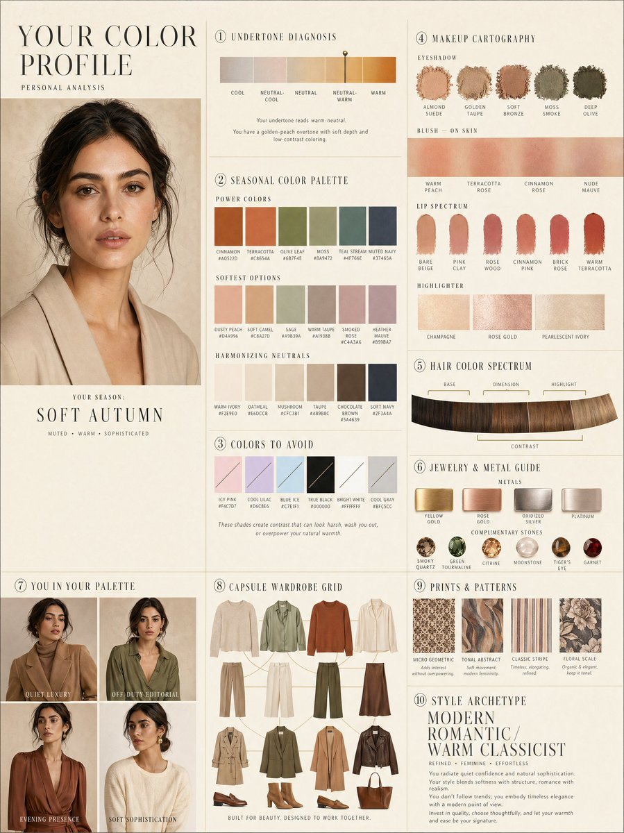
Diseño de perfil de color personal de lujo
Un diseño editorial complejo de 10 paneles para el análisis personal del color, que incluye muestras de color y cuadrículas de vestuario cápsula.
Este es un ejemplo GPT Image 2 para Diseño gráfico y carteles . Utilice la plantilla lista para copiar que aparece a continuación para generar imágenes similares y revise la atribución de Awesome GPT Image 2 Prompts y los derechos de uso comercial antes de reutilizarla.
¿Necesitas el conjunto completo de indicaciones? Usa el Diseño gráfico y carteles centro de temas para ver más ejemplos relacionados, o abra el GPT Image 2 catálogo de avisos Para ver el índice completo de ejemplos, las estructuras reutilizables y la atribución de fuentes.
Free 1K preview
Generate one preview image instantly, no sign-up required.
2671/4000
Prompt
Mensaje listo para copiar
LUXURY PERSONAL COLOR PROFILE — EDITORIAL LAYOUT
Studio portrait of subject as anchor — skin retouched to luminous glass-like perfection, preserved natural structure, realistic pore texture, soft directional key lighting, no facial alteration. Background: warm ecru parchment with subtle linen grain texture. Layout reads like a Vogue Italia beauty supplement printed on heavyweight matte stock. Structured editorial grid, 3-column asymmetric, wide negative space, serif condensed display headers, all labels in spaced uppercase tracking, cohesive warm ivory/sand/ecru background system throughout all panels, ultra-photorealistic 8K, soft diffused studio lighting, flat elegant surfaces, no drop shadows.
PANELS:
① UNDERTONE DIAGNOSIS — Tonal spectrum bar from cool ash to warm amber, precision needle marker on subject's reading. Labels: Cool / Neutral-Cool / Neutral / Neutral-Warm / Warm. Fine annotation text.
② SEASONAL COLOR PALETTE — 10–12 fabric-textured swatches in subject's optimal season. Each labeled with poetic color name and HEX. Grouped: Power Colors / Softest Options / Harmonizing Neutrals.
③ COLORS TO AVOID — Desaturated row of clashing tones with fine editorial strikethrough. Clean, non-harsh presentation.
④ MAKEUP CARTOGRAPHY — Eyeshadow gradient dust swatches / blush tones fanned on skin strip / lip spectrum barely-there to bold / highlighter finishes labeled: champagne, rose gold, pearlescent ivory.
⑤ HAIR COLOR SPECTRUM — Curved gradient strip: base, dimension, highlight, contrast tones. Gold bracket indicators on best options.
⑥ JEWELRY & METAL GUIDE — Flat-lay editorial render: yellow gold, rose gold, oxidized silver, platinum finishes alongside complementary stone tones. Minimal styling.
⑦ YOU IN YOUR PALETTE — 3–4 editorial lookbook frames, subject in palette-correct outfits. Mood labels: Quiet Luxury / Off-Duty Editorial / Evening Presence.
⑧ CAPSULE WARDROBE GRID — Outfit flatlay: tops, bottoms, outerwear, shoes, bag — all palette-correct. Coordinating lines showing interchangeability. Net-a-Porter editorial aesthetic.
⑨ PRINTS & PATTERNS — 4 fabric print thumbnails: micro geometric, tonal abstract, classic stripe, floral scale. One-line styling note per print.
⑩ STYLE ARCHETYPE — Single typographic panel. Style identity title set large (e.g. "Modern Romantic / Warm Classicist"). Three defining aesthetic words. Four-line editorial wardrobe philosophy note.
RENDER SPECS: Ultra-photorealistic, 8K, editorial magazine print quality, warm neutral color grading, soft diffused studio lighting consistent across all panels, one serif display font + one fine sans-serif body font, no gradients, flat matte surfaces only.
Best for
- - Diseño gráfico y carteles visual exploration
- - Image generation and reference-image edits
- - Reusable briefs that keep source attribution visible
Change these parts
- - Subject, product, character, or scene
- - Aspect ratio, camera, lighting, and background
- - Brand, text, color, and output constraints
Recommended model and settings
- - Model: gpt-image-2
- - Input mode: Texto a imagen
- - Aspect ratio: source
- - Commercial status: review original source
How to use this prompt
- 1. Copy the prompt and preserve its structure for the first test.
- 2. Replace the subject, context, and publishing channel.
- 3. Change one camera, lighting, or style variable per iteration.
- 4. Inspect the output, source, text, and rights before reuse.
Limitations, source, and reuse cautions
- - Generated output is an editable draft, not factual, legal, or rights evidence.
- - Review the linked source, people, brands, logos, text, and third-party media before commercial use.
Importado de Awesome GPT Image 2 Prompts . Se requiere atribución. El estado de uso comercial es allowed ; revise los derechos de la fuente antes de su uso comercial.
Más casos en esta categoría
Priorizados por categoría, compatibilidad con el modo de entrada, calidad y menor riesgo.
Notas sobre la reutilización y la fuente
Utilice esta opción de forma segura después de previsualizar el caso.
- 1.Copia la solicitud o ábrela directamente en Dovoo con el botón de generación.
- 2.Ajusta las variables, la relación de aspecto y las imágenes de referencia según tus necesidades.
- 3.Antes de publicar o utilizar el servicio de forma remunerada, verifique los derechos de autor, los requisitos de atribución y los riesgos relacionados con la marca o la imagen de la persona.