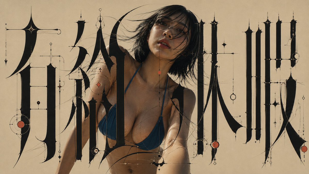
Architectural Typographic Portrait Fusion
A complex design prompt that integrates Japanese typography and portrait photography into a single architectural visual structure, avoiding simple collage techniques.
Dette er et GPT Image 2 -eksempel på en prompt for Grafik og plakat . Brug den kopieringsklare prompt nedenfor til at generere lignende visuelle elementer, og gennemgå Awesome GPT Image 2 Prompts -kreditering samt kommercielle brugsrettigheder før genbrug.
Denne prompt er designet til flere referencebilleder. Vi åbner Dovoo med prompten og det tilgængelige forhåndsvisningsbillede; tilføj de resterende referencer i Dovoo før generering.
Free 1K preview
Generate one preview image instantly, no sign-up required.
Free text preview doesn’t preserve reference-image consistency.
Hurtig
Klar til kopiering
Create a new, fully integrated single artwork in a 16:9 widescreen format, using the two attached images as a visual design blueprint.

IMAGE A: Experimental Japanese typography art.
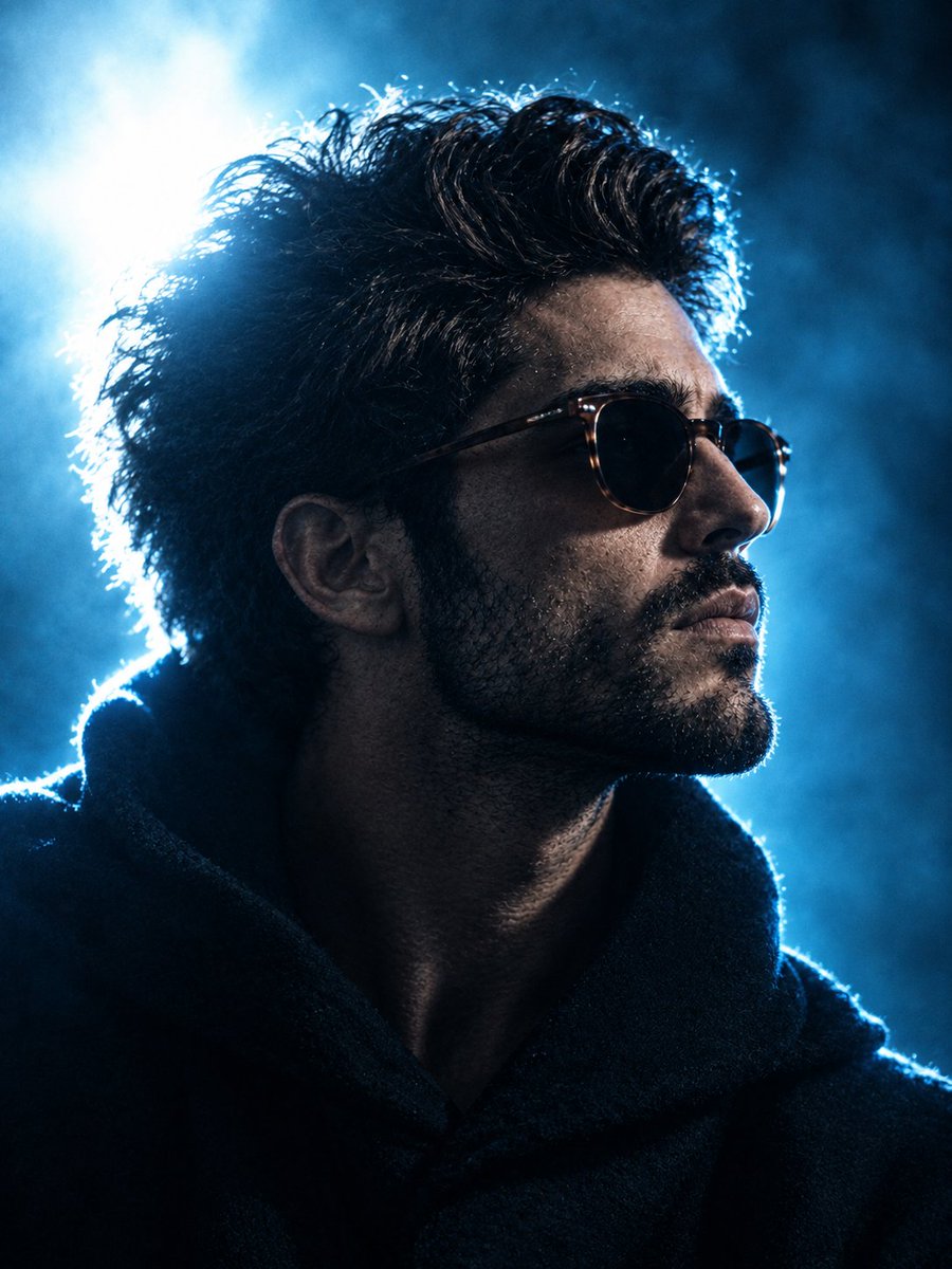
IMAGE B: Live-action portrait.

==================================================
ABSOLUTE GOAL

Do not make a simple collage where Image B is just cut out and pasted onto Image A as a background.
Do not simply overlay the letters from Image A onto the person in Image B.
Do not think of them as separate combinations like "Background + Person," "Photo + Text," or "Person + Decoration."

Use Image A and Image B as design blueprints to construct the final piece.
Rebuild everything—the person, letters, black surfaces, thin lines, negative space, light, color, contours, foreground/background relationships, and decorations—as a single, inseparable visual structure designed simultaneously from the start.

The final image should not be "a person inside typography," but rather a state where the person's very existence establishes the typographic composition.

==================================================
CORE COMPOSITION PRINCIPLE

Do not compose the typography first and insert the person afterward.
Compose the typography and the person simultaneously as one inseparable visual structure.

Do not treat the person as an independent subject.
Treat the face, hair, neck, shoulders, arms, clothing, body contours, and the negative space created by the body as typographic components equal in status to the giant letters, black strokes, fine lines, circular ornaments, and vermilion accents.

Aim for a state where, if the person were removed, the typography composition itself would feel incomplete.

==================================================
IMAGE A / TYPOGRAPHY PRESERVATION

Maintain to the maximum extent the elements present in Image A:
Basic character structure, number of characters, major placement, giant black strokes, extreme thick-thin contrast, ultra-elongated forms, giant curved strokes, needle-like tips, long S-curves, ultrafine horizontal/vertical lines, circles, rings, beads, pendulum-like ornaments, vermilion accents, greige background, and the overall left-center-right composition.

Do not change the characters to different ones. Do not change the character count. Do not revert to normal Japanese fonts, standard Mincho, Gothic, or brush calligraphy.

However, to fully integrate the person and typography, you may re-adjust local stroke positions, layering, line paths, character spacing, and some negative spaces as long as the overall composition holds. Prioritize completing the design philosophy of Image A through integration with the person over rigid character preservation.

==================================================
TYPOGRAPHIC CHARACTER

Typography is an experimental, sculptural form merging Japanese, high-contrast Mincho, Blackletter, Art Nouveau, illuminated manuscripts, precision machinery, architectural drawings, and high jewelry.
- Main vertical strokes are extremely thick.
- Horizontal and auxiliary lines are hair-thin (extreme thick-thin contrast).
- Massive black surfaces, very long thin lines, giant crescent curves, sharp pointed ends.
- Strokes like blades or feathers, geometric line structures.
- Typography must feel like architecture. Treat characters as structural elements building the screen rather than "text for reading."

==================================================
PERSON IDENTITY PRESERVATION

For the person in Image B, strongly maintain: facial features, proportions, eyes, nose, mouth, contour, hairstyle, hair color, unique characteristics, clothing, and body silhouette.

Do not change to a different person. Do not significantly change age perception. Do not change the hairstyle or clothing design.

However, the original photo's background, lighting, color temperature, contrast, shadows, and specific environment do not need to be maintained. Re-render the person as if photographed specifically for this artwork while preserving their recognizable identity. Do not paste the source photograph.

==================================================
PHOTOREALISTIC PERSON

The person must maintain complete photorealistic expression. Do not stylize into anime, manga, line art, painting, vector, or posterized skin. No black outlines.
- Real human skin texture, natural pores, subtle skin variation, individual hair strands, realistic facial detail, real fabric texture, natural photographic depth, editorial fashion photography, subtle photographic grain.
The person should not look like CG or illustration.

==================================================
PERSON AS TYPOGRAPHIC COMPONENT

Do not treat the person as an independent model inside typography.
The person's face functions as both a face and a bright organic shape between giant black letters.
- Design space around the face as typographic negative space.
- Use hair flow as a visual extension of fine decorative lines.
- Echo shoulder curves with giant curved strokes.
- Relate arm angles to horizontal or diagonal line directions.
- Connect black clothing parts with the visual mass of black strokes.
- If the outfit has red, coordinate it with the vermilion accents in Image A.
- Use the silhouette as a composition part equal to the giant letters.

==================================================
NEGATIVE SPACE

Do not treat space around the person as just "person space."
The gaps between face and letters, neck and fine lines, shoulders and black strokes, arms and letters must be designed intentionally like counters, kerning, and leading. The negative space created by the person determines the balance of the entire typography.

==================================================
MULTI-LAYER INTERWEAVING

Simple two-layer structures (person in front, letters in back) are prohibited. Create at least multiple levels of depth.
Example: Giant stroke A -> Behind person. Person's hair -> In front of stroke A. Fine line B -> In front of some hair. Different hair clump -> In front of line B. Giant stroke C -> In front of shoulders. Arm -> In front of stroke C. Vermilion line D -> Crosses part of the outfit. Another line -> Disappears behind the person.
Typography must physically weave around the person.

==================================================
HAIR INTEGRATION

Treat hair as the most important integration point. Keep individual hair strands natural. No uniform cutout boundaries. Intersect fine hair strands with typographic fine lines. Some hair is front, some is back. Art Nouveau curves should echo hair curves, but do not deform the hair into letters.

==================================================
EDGE INTEGRATION

Do not create a uniform Photoshop-like cutout boundary. No white/black outlines or universal shadows. Contact between person and letters should vary: some places fully obscured, some slightly overlapping, some lines passing through, some negative space. Do not unify contour treatments.

==================================================
SHARED LIGHTING

Ensure the person and typography share the same visual space. The greige background should subtly reflect on skin and clothing. Near black strokes, create very weak light occlusion (not strong 3D shadows, but subtle light changes). No flashy rim lights or overly cinematic lighting.

==================================================
COLOR SYSTEM

Strictly limit the palette:
- BACKGROUND: Warm matte greige (~#C9BBA8).
- BLACK: Near-perfect black (~#060403).
- IVORY: Pale ivory (~#F2E4CE).
- RED: Muted vermilion (~#B14D3B, use sparingly, <3%).
Maintain natural skin tones but integrate their temperature/saturation with the final work.

==================================================
ORNAMENT SYSTEM

Extend fine decorative lines from endpoints, joints, and curves of giant letters. Elements: small black/ivory/vermilion circles, rings, beads, diamonds, drops, stars, pendulums, fine horizontal/vertical lines. Do not scatter randomly; every ornament must have a structural relationship with the typography and person.

==================================================
COMPOSITION

16:9 aspect ratio. Maintain Image A's left-center-right structure. Giant structures on sides, person near center (slightly left). The person shouldn't dominate like a poster hero; the entire integrated structure is the lead. Focus on face, hair, shoulders, and upper body. The person's silhouette should complete the shape of the central text block.

==================================================
VISUAL HIERARCHY

1. Giant jet-black shapes. 2. Person's face. 3. Wide greige negative space. 4. Hair-thin lines. 5. Small vermilion accents. Create strong contrast in density. Do not fill the screen with decoration; keep space around the face quiet.

==================================================
SURFACE & TEXTURE

High-end print quality. Matte background with subtle paper texture. No aging, dirt, or heavy noise. Keep fine photographic textures in the person and apply a subtle common print grain to both to unify them.

==================================================
DEPTH

Not a full 3D work. Flat high-end editorial graphic feel with very shallow layering only at intersection points (Flat graphic typography + photorealistic human + subtle spatial layering).

==================================================
STYLE

High-end mixed-media fashion editorial, avant-garde Japanese graphic design, architectural/sculptural lettering, Art Nouveau/Blackletter influence, precision vector linework, luxury book cover, minimal, quiet, strange, precise, refined, elegant, sophisticated.

==================================================
ABSOLUTE AVOID

No direct cut-and-paste, no simple overlays, no side-by-side placement. No 100% front/back separation. No uniform outlines, no anime/illustration/vector styles. No standard fonts, no brush calligraphy, no neon, no cyberpunk, no gold/metallics, no 3D letters, no strong drop shadows, no lens flares, no gradients, no colorful backgrounds. No extra Japanese/English text/logos/watermarks.

==================================================
FINAL VISUAL TEST

When looking at the image, one should not feel the person is in front of or behind the letters. Every part of the person must be integrated into the typographic composition principles. If the person is removed, the typography should look broken. If the typography is removed, the person's placement should look unnatural. The human figure is not placed inside the typography; the human figure is part of the typography. Rebuild the entire art.
Best for
- - Grafik og plakat visual exploration
- - Image generation and reference-image edits
- - Reusable briefs that keep source attribution visible
Change these parts
- - Subject, product, character, or scene
- - Aspect ratio, camera, lighting, and background
- - Brand, text, color, and output constraints
Recommended model and settings
- - Model: gpt-image-2
- - Input mode: Flere billeder til billeder
- - Aspect ratio: source
- - Commercial status: review original source
How to use this prompt
- 1. Copy the prompt and preserve its structure for the first test.
- 2. Replace the subject, context, and publishing channel.
- 3. Change one camera, lighting, or style variable per iteration.
- 4. Inspect the output, source, text, and rights before reuse.
Limitations, source, and reuse cautions
- - Generated output is an editable draft, not factual, legal, or rights evidence.
- - Review the linked source, people, brands, logos, text, and third-party media before commercial use.
Flere sager i denne kategori
Prioriteret efter kategori, kompatibilitet med inputtilstande, kvalitet og lavere risiko.

Genbrug og kildenoter
Brug denne prompt sikkert efter at have gennemgået sagen.
- 1.Kopier prompten, eller åbn den direkte i Dovoo med genereringsknappen.
- 2.Juster variabler, billedformat og referencebilleder til din egen brug.
- 3.Før udgivelse eller betalt brug skal du verificere kilderettigheder, krav til kreditering og risici forbundet med branding eller lighed.