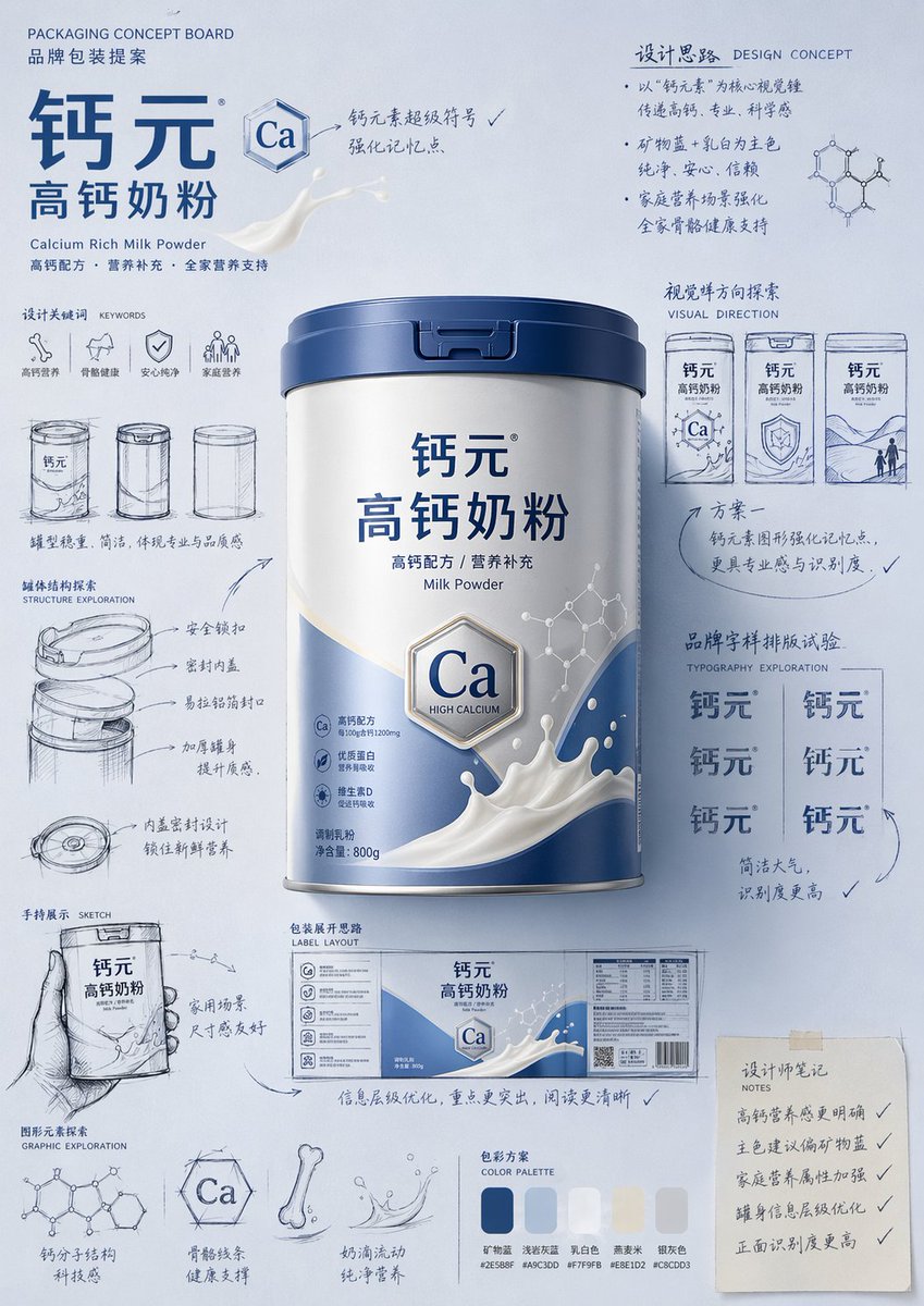
لوحة مقترحات تصميم التغليف
دليل مفصل للغاية لإنشاء مقترحات تصميم عبوات المنتجات بأسلوب الرسم اليدوي الاحترافي ولوحات الأفكار المفاهيمية.
هذا GPT Image 2 لحالة المنتج والتسويق . استخدم النموذج الجاهز للنسخ أدناه لإنشاء صور مشابهة، وراجع حقوق الإسناد Awesome GPT Image 2 Prompts وحقوق الاستخدام التجاري قبل إعادة الاستخدام.
هل تحتاج إلى مجموعة كاملة من المطالبات؟ استخدم المنتج والتسويق للاطلاع على المزيد من الأمثلة ذات الصلة، أو افتح مركز المواضيع. GPT Image 2 كتالوج سريع للاطلاع على فهرس الأمثلة الكامل، والهياكل القابلة لإعادة الاستخدام، ونسب المصادر.
Free 1K preview
Generate one preview image instantly, no sign-up required.
Free text preview doesn’t preserve reference-image consistency.
4000/4000
المطالبة
نموذج جاهز للطباعة
Please generate a "hand-drawn packaging proposal board style" product introduction poster for {argument name="product name" default="milk powder"}.

If I provide a product image, please use it as the main reference, retaining the core visual characteristics, packaging form, colors, materials, brand identity, and overall temperament of the product. Prioritize the main color tone and color relationships from the product image for the design.
If I do not provide a product image, please automatically generate a product appearance and packaging design that fits the positioning of {argument name="product name" default="milk powder"}, and automatically match natural and reasonable main, auxiliary, and background colors based on the product attributes, category characteristics, and temperament.

Overall poster style requirements:
This is not a standard e-commerce detail page or a simple studio-shot poster, but a creative proposal board that integrates "product finished image + packaging design sketches + brand concept development process." The overall presentation is a high-aesthetic, high-completion brand design display image, as if a designer is presenting a packaging concept proposal.

Visual requirements:
- Vertical composition
- Use a unified background with a brand feel; the background color should be naturally determined by the product itself and not fixed to any one color.
- Color schemes should coordinate with product attributes: if there is a reference image, prioritize inheriting its main and brand colors; if not, automatically generate a reasonable color scheme based on the product name.
- Place the most complete and eye-catching product main visual in the center, with realistic textures, 3D lighting, and commercial finish effects.
- Surround the product with multiple auxiliary visual elements: packaging sketches from different angles, structural sketches, local form explorations, hand-held display drafts, packaging unfolding ideas, and brand lettering layout experiments.
- Add natural and casual black or dark hand-drawn line art, arrows, circles, symbols, and handwritten Chinese annotations to give the image a strong sense of "design process" and "creative proposal."
- The finished product image should be relatively refined and realistic, while the sketch parts should be relatively casual and dynamic, creating a contrast between the "finished product + design sketches."
- The layout should look relaxed and free, but overall it must have order, rhythm, and a visual center, reflecting a high-end graphic design feel.
- Small graphics, symbols, or interesting elements related to the product can be added appropriately to enhance brand memory points.
- The final effect should have a sense of branding, creativity, process, and visual impact.

Color principles:
- Do not fix a yellow background.
- Automatically select the main color tone based on product type, material, use, consumer experience, and brand temperament.
- The background color, product color, text color, and sketch line art color should coordinate with each other.
- High-saturation monochromatic backgrounds or soft, unified color schemes can be used, as long as the overall image has a brand feel and visual impact.
- Colors should naturally serve the product rather than overshadow it.

Style keywords:
Packaging design proposal board, brand concept development, hand-drawn sketches, design process feel, moodboard, creative review draft, product finished rendering, visual experimentation, commercial design poster.

Special notes:
- If there is a reference product image, prioritize following it and do not deviate from the product itself.
- If there is no reference image, automatically generate reasonable product appearance, packaging, and color schemes based on the product name, maintaining overall style consistency.
- The focus of the image is "product introduction + creative design process display."
- Do not make it look like a common e-commerce detail page, a promotional poster, or overly neat and stiff; do not lack sketches and handwritten annotations; avoid a cheap feel or an immature cartoon style.
متغيرات المطالبة
عناصر نائبة قابلة للتعديل موجودة في موجه الأوامر، مع قيمها الافتراضية.
عامل
product name
تقصير
milk powder
Best for
- - المنتج والتسويق visual exploration
- - Image generation and reference-image edits
- - Reusable briefs that keep source attribution visible
Change these parts
- - Subject, product, character, or scene
- - Aspect ratio, camera, lighting, and background
- - Brand, text, color, and output constraints
Recommended model and settings
- - Model: gpt-image-2
- - Input mode: صورة إلى صورة
- - Aspect ratio: source
- - Commercial status: review original source
How to use this prompt
- 1. Copy the prompt and preserve its structure for the first test.
- 2. Replace the subject, context, and publishing channel.
- 3. Change one camera, lighting, or style variable per iteration.
- 4. Inspect the output, source, text, and rights before reuse.
Limitations, source, and reuse cautions
- - Generated output is an editable draft, not factual, legal, or rights evidence.
- - Review the linked source, people, brands, logos, text, and third-party media before commercial use.
مستورد من Awesome GPT Image 2 Prompts . يلزم ذكر المصدر. حالة الاستخدام التجاري هي allowed ؛ يرجى مراجعة حقوق المصدر قبل الاستخدام المدفوع.
المزيد من الحالات في هذه الفئة
يتم تحديد الأولويات حسب الفئة، وتوافق وضع الإدخال، والجودة، وانخفاض المخاطر.

إعادة استخدام الملاحظات ومصادرها
استخدم هذا التنبيه بأمان بعد معاينة الحالة.
- 1.انسخ الرسالة أو افتحها مباشرة في Dovoo باستخدام زر الإنشاء.
- 2.قم بتعديل المتغيرات ونسبة العرض إلى الارتفاع والصور المرجعية لتناسب حالة استخدامك الخاصة.
- 3.قبل النشر أو الاستخدام المدفوع، تحقق من حقوق المصدر، ومتطلبات الإسناد، ومخاطر العلامة التجارية أو التشابه.